|
0 Comments
Ideas
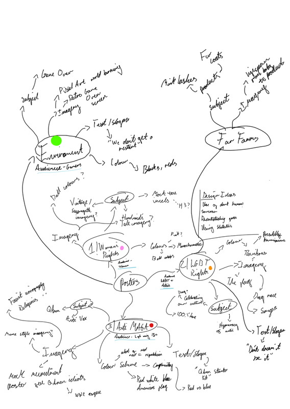
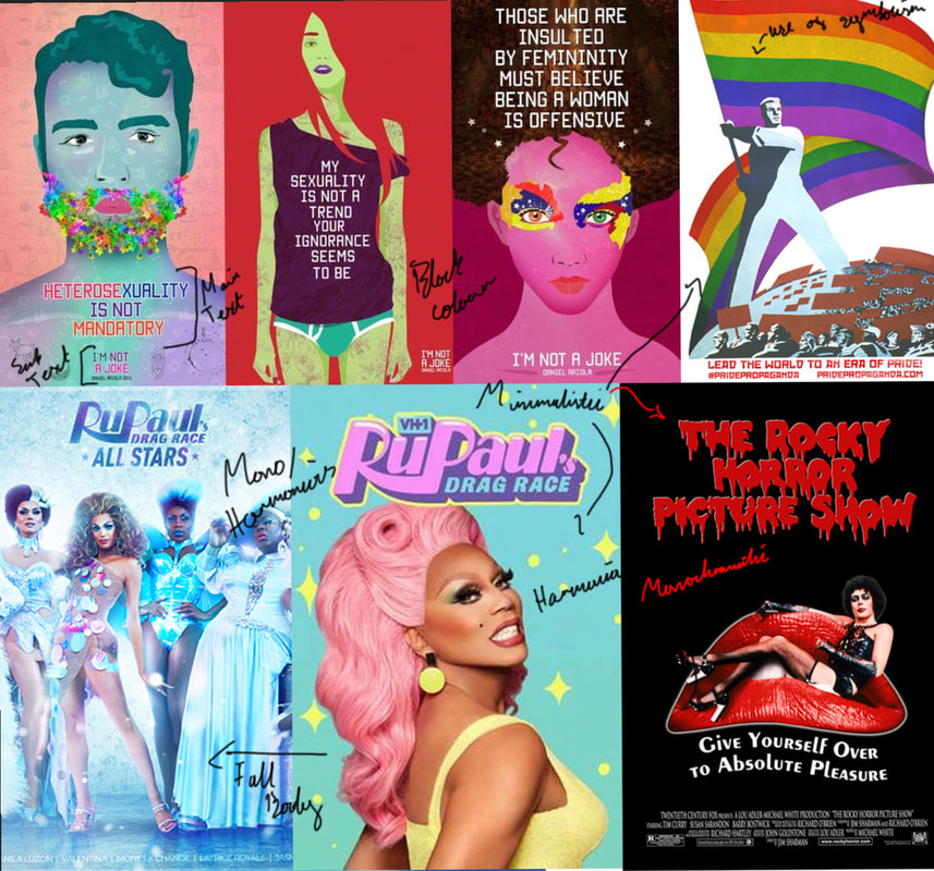
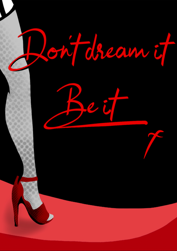
My first idea was to create a pro LGBT poster using iconography from iconic queer media such a “Rupaul’s Drag Race” and “Rocky Horror Picture Show”. I wanted to go with a rather simplistic design either utilising a harmonious or monochromatic colour scheme, to allow the imagery and message to be the main focus. The target audience of this poster would be the closeted people around the world who aren’t able to be themselves.
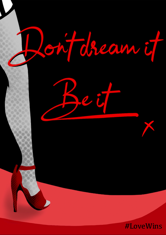
Final Evaluation Upon feedback it was pointed out to me that the “x” on the poster looked a bit like an “f” due to how I had drawn it. In light of this, I elected to change the “x” to a more standardised and recognisable font. It was also suggested to me to add a hashtag or charity logo to the bottom of my poster to make it more obvious what the message is to those who may not be familiar with media and imagery. A problem I had previously identified as being a possibility. With the addition of “The Trevor Project” logo (a charity focused around suicide prevent for LGBTQ+ people) I think the message is somewhat cleared up however it still relies on an audience being at least somewhat familiar with the charity. It is for this reason I have included a version with the hashtag “#LoveWins” something a bit more synonymous with the LGBT community. After this alternation was made, I then superimposed my poster onto a photo of a bathroom stall poster frame. I choose this setting as it is one of the locations this poster would fit considering the audience and message of this piece. I have reviewed the Advertising Standards Agency’s guidelines and I believe this poster is in full accordance with them.
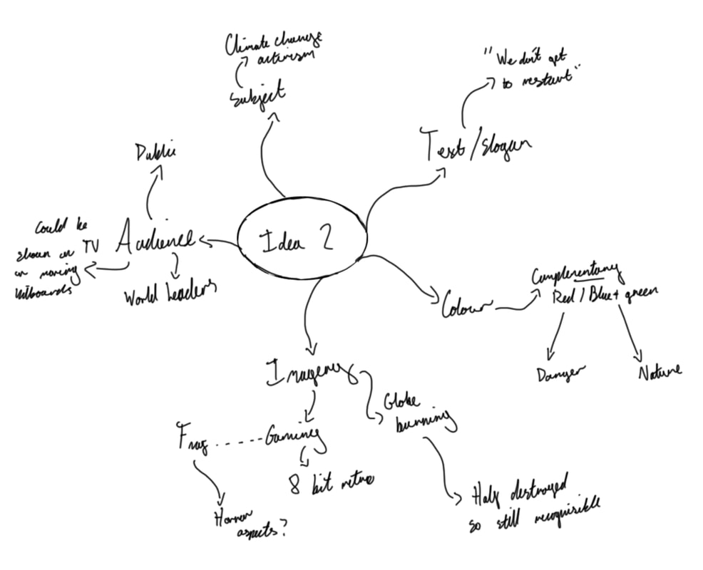
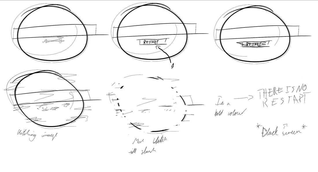
My second idea was to do something based around the impending doom that is climate change and the fact that we don’t get a second chance. It is from the “no second chance” that I got the idea to use gaming as a metaphor for two reasons. Firstly it’s a blunt and direct way to convey the message thanks to the minimalist nature of 8 bit. And secondly it’s a subliminal comment about how some governments and cooperations around the world are treating climate change like a game. One they seem to be forgetting that we can’t restart. For this idea I wanted to utilise a complementary colour scheme, contrasting the natural connotations of blue and green, with the danger and despair of red and black. Colours which would be applied to a semi-destroyed pixel art styled globe. Accompanied with text that read something along the lines of “there is no restart” or “we don’t get to restart”. The target audience would be the general public but more so global leaders.
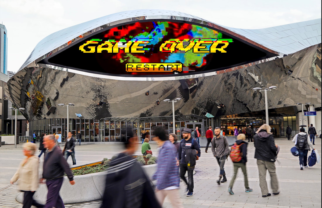
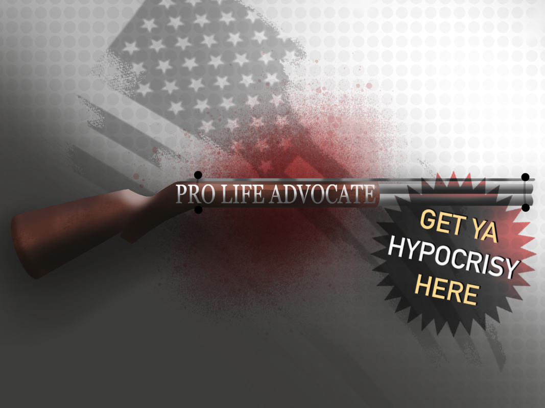
Final EvaluationUpon peer feedback it was pointed out to me that the message of the overall animation was hard to understand, due to the fact it is such a short clip, and so it is rather hard to see everything happening. To fix this I could either reduce the frame rate or alternatively I could include a short prelude to the main clip. Which would show a world slowing becoming more and more burnt before the final “GAMEOVER” screen would appear. I think this idea would definitely help to clear up any misunderstandings about the imagery and message. Following this feedback, I then superimposed this poster onto what I would consider I prime spot for it to be placed/shown. That being on animated billboards such as the one above New Street Station in Birmingham, from which this image originates. I have reviewed the Advertising Standards Agency’s guidelines and I believe this poster is in full accordance with them. The only consideration I thought might apply to this piece, is the rules around photosensitive epilepsy. However I do not believe this animation features any flashing lights that would trigger epilepsy. Outcome ThreeFor this idea I wanted to do something based around American right wing politics. Initially I contemplated a couple of different ideas and topics along the same vein of mocking the right wing but ultimately I decided to do this one as it was the least inflammatory of all them. But even so I think it’s still a rather charged subject matter. This idea is specifically targeted at the pro-life pro-gun activists to point out the hypocrisy of having these two beliefs. That they’re against killing a “child” and yet happily advocate for the freedom to wield literal weapons capable of killing an unmeasurable number of people. The colour scheme for this poster would be either harmonious (browns and red) or complementary(red and blue). The optimal place for this poster would theoretically at a gun shop in America. Though given the fact that a gun shop owner is hardly going to support gun regulations or want to criticise their clientele, it is very unlikely this would ever happen.
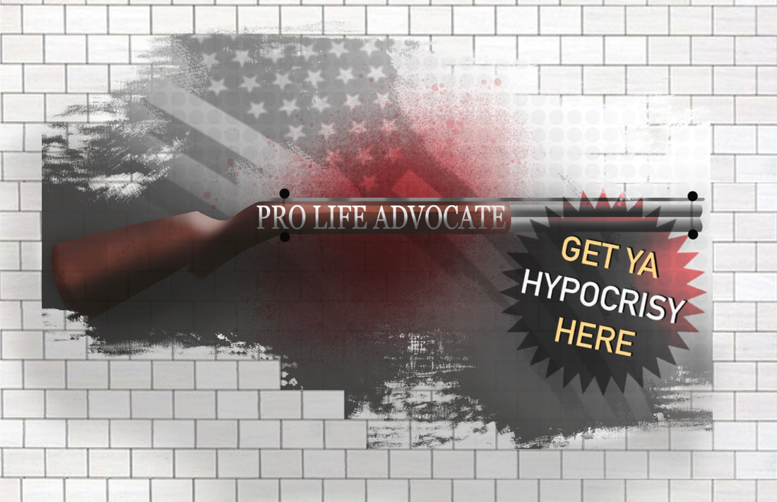
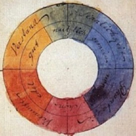
Final Evaluation During the group feedback it was suggested that I add either a hashtag or charity logo to the bottom of my poster to really hown in the message and further link it to a real world application. As such I decided to do just that and go with “Brady” an American charity that campaigns for tighter gun control. It was also suggested to me to add some blue to my poster as red, white and blue are the American flag colours. This is also something I thought about originally when creating my poster my due to the constraints of the project I had to choose a harmonious colour scheme. Hence the brown, red and yellow in the main poster. However despite this I decided to include a version with a splash of blue just to show my other idea. After all this, I then superimposed my poster on a white brick wall which I hoped would emulate the wall of a gun shop. I intentionally made the image look distressed as I wanted it to resemble an old memorial, in keeping with the aesthetic. Upon reviewing the Advertising Standards Agency’s guidelines, I do not believe this poster is invalidation of any guidelines. Though I would admit it is skirting the line. The area of concern is the rules around offensive content as this poster may be deemed offensive to some. However as this poster does not encourage discriminate against people based on age, disability, gender, gender reassignment, marriage, civil partnership, pregnancy, maternity, race, religion, belief, sex or sexual orientation, I do not believe it is invalidation of the rules. The Colour WheelA Very Brief History
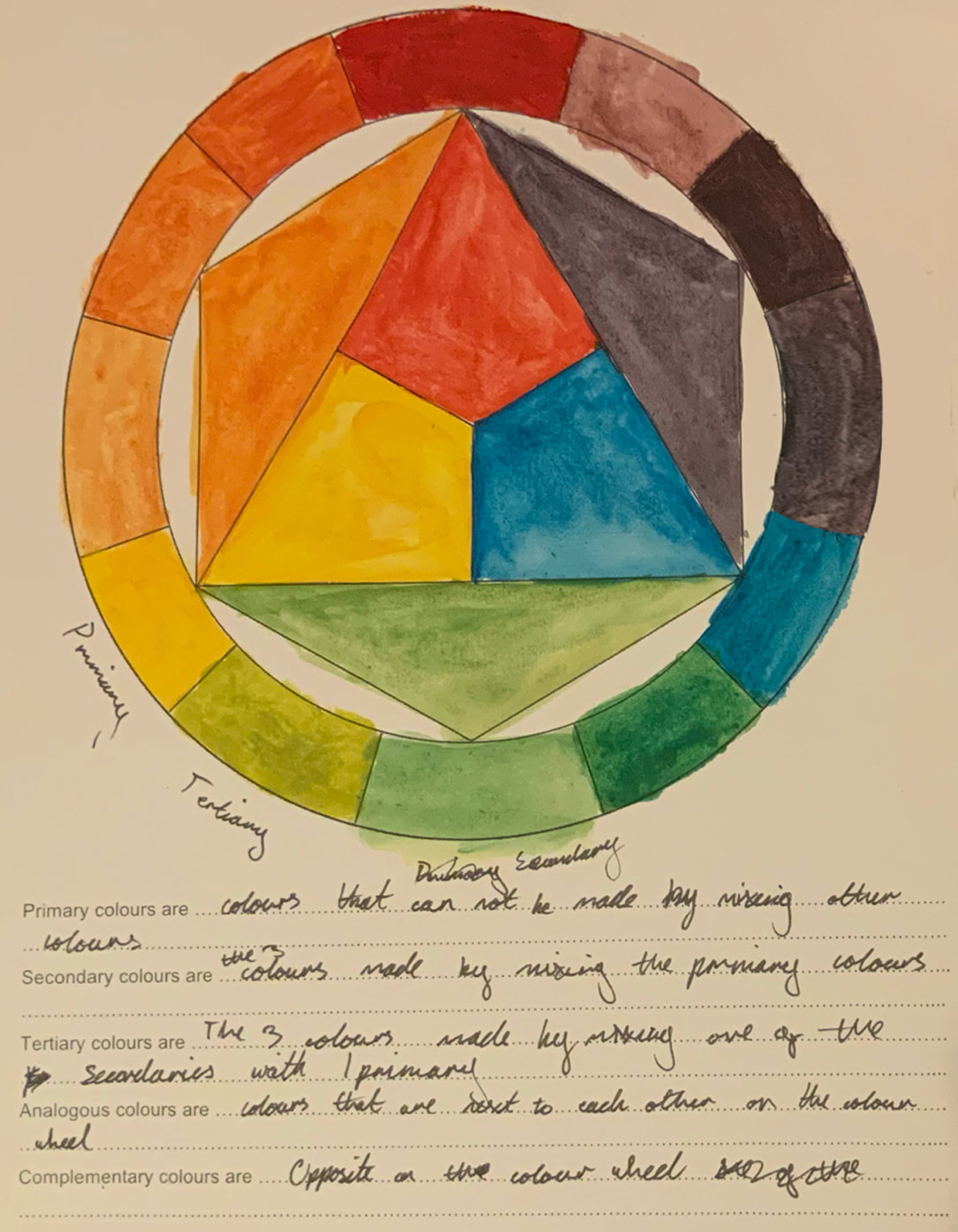
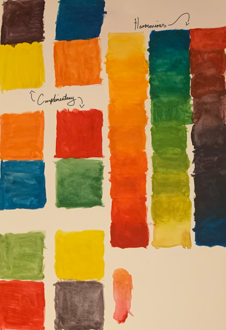
Colour Relations
All colours have unique relationships to other colours, these relationships are called:
Colour TheoriesPsychological Theories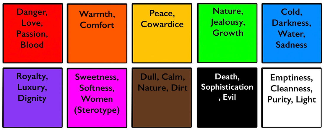 All colours have unique psychological connotations to them that come from either the environment one grows up in, or have just embedded in the human psyche from evolution. Such as the colour red which most would associate with danger. However other such connotations include: Historical AssociationsWe associate some colours with certain historical themes and events. Of course this can differ based on the area in which a person grows up, but typically there is a consensus. Some of the more widely shared associations include:
ReferencesMost of the information in this blog is from my tutor Jess from lessons on the 2/11/21 and the 9/11/21.
BibliographyLate 19th Century
|


 RSS Feed
