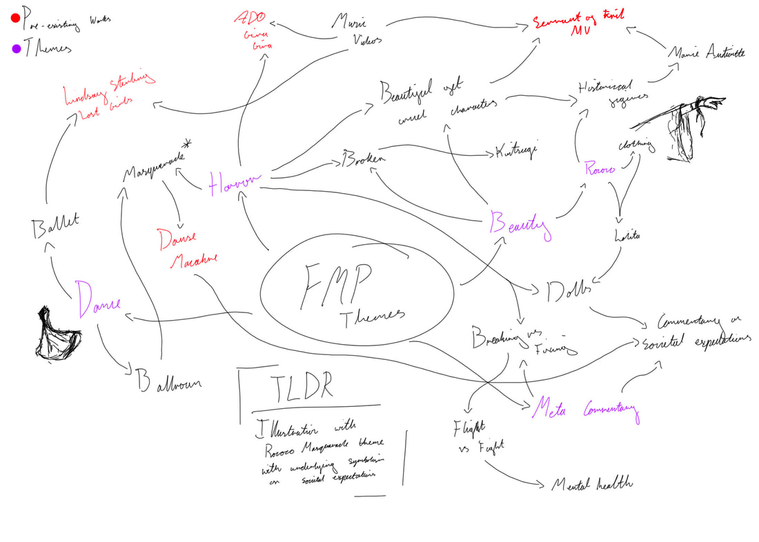
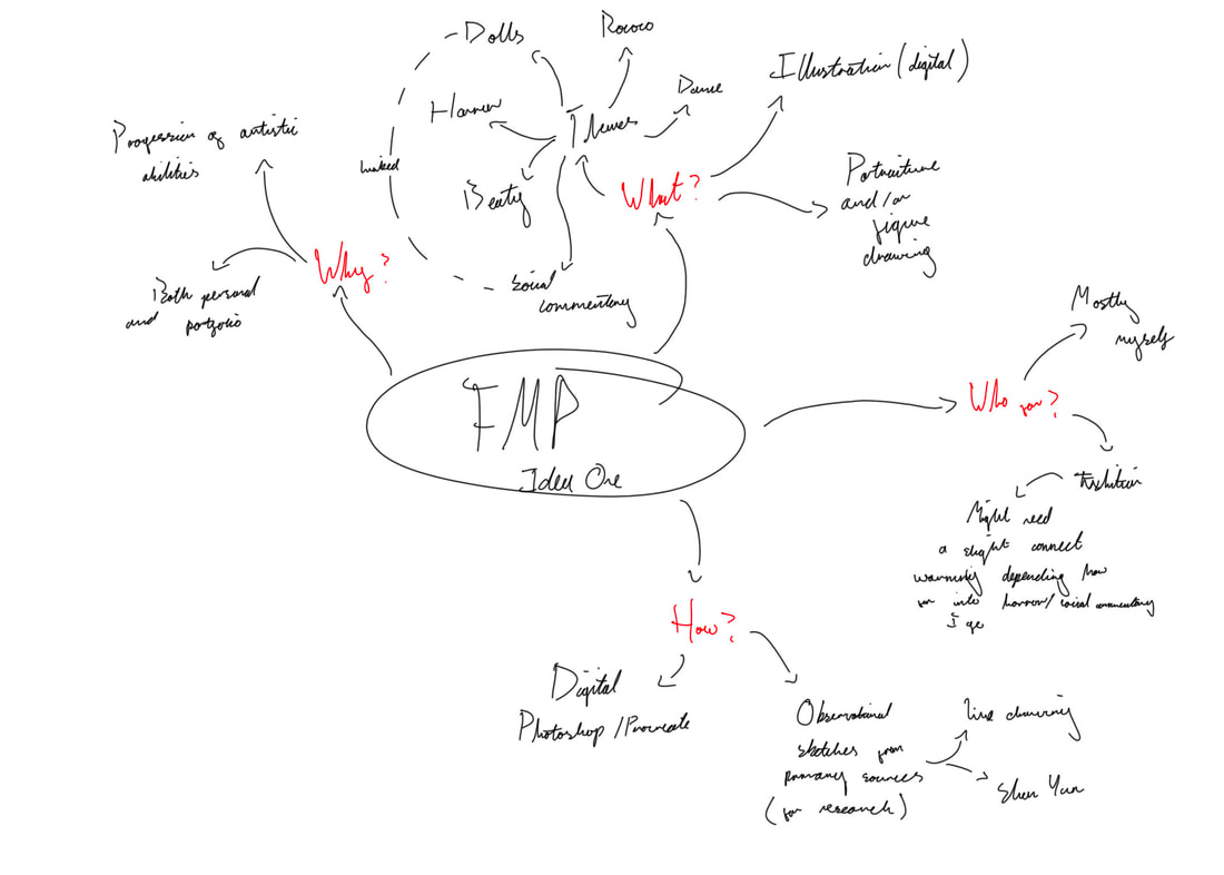
Project EvaluationMy concept for this project was to combine several of my interests with an overarching theme of meta commentary. The themes I specifically wished to explore were Rococo, beauty, horror and dance, I also intended to explore Japanese and traditional western illustration techniques.
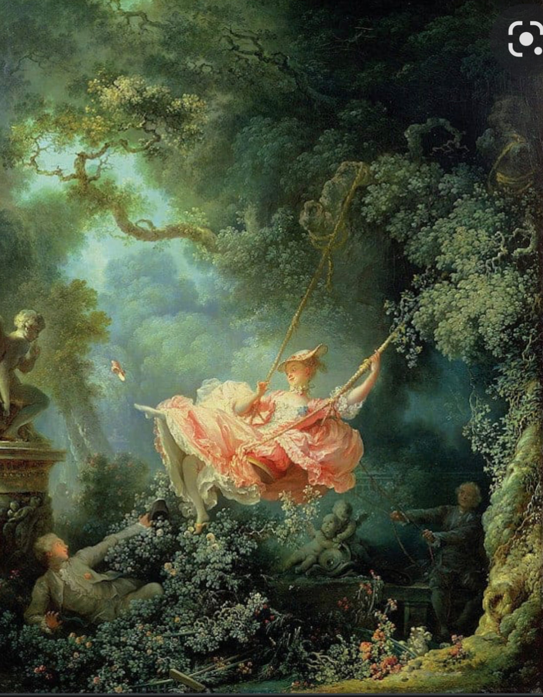
As such I approached this project with an open mind, being acutely aware this project could get very complicated very fast. Thanks to the many overarching themes and loose ends I had linking everything together, from inspiration to symbolism, and techniques. Needless to say, I may have been a tad over ambitious with this project brief. However with that being said, I do think I accomplished most of what I set out to do. Exploring how classical imagery and motifs can be re-contextualised to have new meanings in the modern world, and how them meanings can reflect real life issues and struggles. The main material I used was my iPad and digital art software. Given how illustration is often linked with digital art (particularly if the illustration is for commercial use) I think it’s quite clear how this links to my chosen speciality. I also used a bit of screen printing which has further relevance, as I am interested in textile design. And screen printing is one of the methods more commonly used to produce textiles. Meanwhile I was also able to expand my technical skills, looking at how to draw movement, design patterns and use a variety of brushes to elevate my digital artwork. All things relevant to illustration and design. When creating this body of work, I tried my best to plan it based around the design cycle, creating a flow chart in which sections in my project would correlate to steps of the design cycle. Steps I believe I have met at every interval. With that being said, I did however have to change my initial plan due to time constraints. As I originally planned to have an extra step between my digital art and my final piece. That would allow me a little more time to explore other ideas/ combine a few from my digital art section. However, this was ultimately not possible due to the nature of digital art, in that each piece takes a lot of time and effort to complete. Time I didn’t have. Along the way of making this project, I have encounter many a problem. One such being, how my work could potentially be misconstrued due to the nature of the more sensitive topics I touched on in my project. Particularly in relation to my masked portrait, given how it could be read as having underlying messages about sexual exploitation and religion, if one were to over-analysis it. Two topics which by themselves I don’t necessarily mind, its more a problem of the implication when you combine the two ideas. To counteract this potential problem, I tried my best to lean away from such connotations by reshaping the focus of the piece with lighting to draw attention away from such bold associations. Ultimately reframing the piece. I could’ve also removed certain elements that lent themselves to symbolism, however I felt it wasn’t necessary. The other very obvious problem I encountered would of course be time, which I have mentioned previously. To counter this dilemma, I had to make a number of concessions switching out some complex illustration styles for others that took less time. As well as prioritising certain work over others to ensure deadlines (both for the exhibition and project) were met. From this, I learned never to underestimate the sheer quantity of hours digital paintings can take. In the future, when I inevitably start another digital painting again, I will be sure to give myself adequate time. Despite some of the limitations that come with digital art (i.e. cost) it is however rather sustainable, as after all there are no waste products since it is digital. Meanwhile the screen printing has a few environmental concerns but since we used water based ink instead the traditional PVC based inks, most concerns were avoided. With that being said, it is still important to consider the biodegradability of what you are printing onto. However as I only printed onto paper and off-cuts of fabrics, the impact is minimal. Specifically with the fabric as I’m re-using bits that would otherwise go to waste. If I were to continue developing this project, I could take it in the direct of creating mock Rococo era portraits using digital art methods. Perhaps doing something akin to Francois Boucher’s Portrait of Madame de Pompadour or maybe even Jean-Honoré Fragonard’s The Swing. This way I could explore even more elaborate compositions while still refining my digital rendering skills. The main problem with this idea of course being time, as something as elaborate as that, could easily take weeks. All in all, I believe this project was a success as I was able to explore a lot of different interests of mine, from history to Japanese illustration, gothic art and fashion. And develop them in such a way that was effective in the process of telling a narrative through an image. I was also able to explore and experiment with a range of different traditional and contemporary illustration techniques. All which will further my knowledge and skills moving forward in my desired specialty, that of course being illustration.
0 Comments
As I decided to lay my project out in stages rather then by week, I figured it would make more sense to put the weekly reflection on a separate blog post. Week OneThe first week went mostly to plan. I was able to generate three unique ideas for a project, and select the one I felt would best keep me engaged and challenge my artistic abilities. However despite these achievements I was not quite able to finish writing up everything on my blog yet, as it took me quite some time to come up with each idea. I don’t necessarily think this is a time management problem, more just a problem with me not being inspired by anything not covered by my first two ideas. Despite spring-boarding ideas off my peers. But ultimately, I did manage to come up with a third idea with a little help from my tutor. Next week I need to finish writing up my ideas on my blog, as well as doing research. Week TwoThis second week didn’t quite go to my initial plan as I was quite conscious of time. So I decided to instead start doing some sketches from my primary research of Shen Yun and flowers, in preparation of me designing/making my artwork. I specifically chose to draw from these two things as I knew for certain these were things I was going to include in my work. Given how they had themes of movement, narratives and naturalism, three topics I could link back to my research into Rococo art, whenever I actually got around to doing the said research. I also looked some design features of rococo patterns and fashion which I also knew I was going to include. Despite this not being to plan, I still think this week was pretty successful in terms of preparing to go forth with my ideas. I was also able to finish my generating ideas blog post which I didn’t from the week before. However, I am sensing the beginning a pattern here, whereby I’m always running out of time. Next week I will begin doing some sketches for my digital art alongside doing some research. Week ThreeDuring this week I conducted some research on illustration techniques, looking at various shading and sketching techniques. Specifically looking into the work of a few artists I knew I was going to draw inspiration from. I also sketched out some initial ideas. According to the my planner I should have been on the laser cutter workshop, however I was running out of time so I had to prioritise certain things over others. I also wasn’t entirely sure how I could fit laser cutting into my project so I elected to for-go it to save time. Next week I should write up my research, and begin sketching out ideas. Week FourThis is one of the few weeks that actually went according to my planner. As this week was primarily taken up with writing my essay, and doing some primary research such as going to Wolverhampton art gallery and Compton Verney. The first had some Georgian era paintings (same time period as rococo) and the second had Georgian and Baroque paintings and architecture. I also went to Attingham park, a national trust house and estate with baroque and rococo influences. While there I made sure to make a list of some paintings I thought might be useful for my essay, so I could refer to them at a later date. A slight constraint I faced this week was simply trying to find art that was firstly, the right time period and secondly, something I could actually use as evidence in my essay. Ultimately, I’m not sure if any of the art I saw will be applicable to my essay as I need specific evidence to support my points, evidence I’m more likely to find in France. But of course, going to France isn’t something that’s realistic going to happen. Next week I intent to make a start on generating outcomes. I also still need to catch up on the research. Week FiveThis week I started on my first outcome for my digital art section. As I was cautious of the time I decided to go with an illustration style that was by design messy. This would allow me to save time I otherwise wouldn’t have been able to. Comparing this to my original planner, this is somewhat on schedule, even if it wasn’t what I originally had planned. But regardless, it is still progress. Again my major constraint I faced for this week was time, given how I knew I’d need more time at the end of the project to make more complex illustrations. Next week I should continue working on generating outcomes, trying to squeeze in writing up research whenever I can. Week SixDuring this week I created my second outcome, again having to change the illustration style and concept because of time constraints. I also still did not get a chance to write up the research as all of my time was taken up brain-storming, drawing and adjusting my second outcome. Comparing this to my planner, I am technically on track. I just need to remember to write up the research and update my blog with the progress I’ve made on my outcomes. Hopefully this is something I will be able to squeeze in next week in-between the making of my third design and screen printing, but honestly I’m not overly optimistic. Week SevenDuring this week I designed and made my screen prints, one the the few weeks that aligned with my planner. I also started on my third outcome, getting as far as the rending stage but not quite finishing it yet. This is something I intend to carry on into the next week. Again my main problem here is that I’m running out of time. A problem I think I can chase back to my habit of overthinking things, particularly in relation to my work. Which I pack the the brim with carefully considered symbolism, most of which isn’t even obvious without an explanation. A problem I don’t even necessarily know if I have a solution to, as that is just the way my brain works. Week EightSo with that in mind… as I said in the previous week, I began this week by finishing off rendering my third outcome. Once I had completed that I began work on my fourth outcome, however I was not quite able to finish it as finishing the previous outcome had set me back a bit. But with that being said, I managed to get as far beginning the first sections of the render. It also probably doesn’t help that this particular piece of work is a digital painting, recurring a lot of attention to detail and work hours. Comparing this week to my planner, it is clear that I greatly underestimated the amount of time I would need to make each individual outcome. As on my planner I have this week down as book binding, something that simply didn’t have time to do. With that in mind hopefully I can find another way to incorporate book making into a later week, perhaps when I consider presentation ideas for the exhibition. Next week, it is very possible I may just start on making my final piece even if my fourth outcome isn’t finished. As I need to prioritise it for the sake of the exhibition. Week NineAlthough I hadn’t finished my fourth outcome yet, I decided to move onto to making my final piece as I was running out time. Especially since I knew I needed to get the final piece done before the exhibition. And so this week was dedicated to making my final piece, specifically the planning phrase which including brainstorming, moodboard, sketching, rough colour and sketch refining. On my planner I have this week down as development but it is clear I greatly underestimated the amount of time it would take to create my final piece. Next week I intend to carrying on with my final piece, moving onto the rendering phrase of it. Week TenAs expected this week was entirely taken up with my continuing my final piece. Attempting to complete the complex rendering and lighting effects I need to add. Ultimately however, I was not quite able to completely finish it all during this week and so I will carrying on the with the finishing touches in the next week. When conferring with my planner, this week went very much to plan as I did indeed work on my final piece. I didn’t however print out my final like how I have intended, but this was because I changed my mind about how I was going to present my final at the exhibition. It was also partly because it wasn’t done yet. Again my major problem this week was time, especially as I knew I needed to give myself enough time to make a digital painting like this. Week ElevenThis week was a mad rush to get my final piece done in time for the exhibition, as I result of rushing I’m not entirely happy with my final piece as their after a couple of things that could’ve done with a little extra care such as some shadow mapping. But it is what it is. This week went in a similar direction to my planner, in that I was preparing for the exhibition. I just didn’t quite anticipate that I would still be working on my final piece during the beginning of the week. Over the next week (which happens to be a half term) I need to as much done as is physically possible, that includes writing up research, blog, evaluations, exhibition, everything. Week TwelveI spent the entirety of the half term doing as much of my blog as was physically possible, doing all the writing from blog post 2 up until the fourth outcome of blog post 4. At which point I had to stop writing so I could actually finish the fourth outcome, as I hadn’t had chance to yet. I then later went back and wrote up my fourth outcome, final piece, exhibition and anything else I had missed.
Though I am glad this week happened to fall on a week off, as it allowed me a little more time. I certainly didn’t feel like it made much difference, as I was still struggling and overworking myself. I also ended up losing two days to a migraine, a problem I seem to suffer from rather frequently, so that just delayed things further too. Ultimately, I did get everything done but not without an extreme level of stress I never want to repeat again. When deciding how to display my work I first had to consider who my audience were. Ordinarily if I were to publish my work on social media or in a publication of sorts, the audience may be slightly more specific. But since I only really had the intention to exhibit my work at the end of year show at my college, the audience was a bit more vague. As it would primarily be made up of fellow creative students, their friends/family, college staff and potential future students. As such there weren’t as many limitations as would traditionally be, if I was making my piece for a client or publication. And so I was free to exhibit my work however I pleased. With that in mind, it then become a matter of what type of display/presentation method(s) would best suit my digital art and allow it flourish. Some methods I considered are as follows: Display Methods• Print-outInitially I intended to print out my work on gloss photographix paper using the high quality printing the college has. However after doing a brief experiment with printing out one of my development, it was clear the printer just didn't do my work justice as I tend to use a lot of dark colours that are rather difficult to see on the printout. Pros
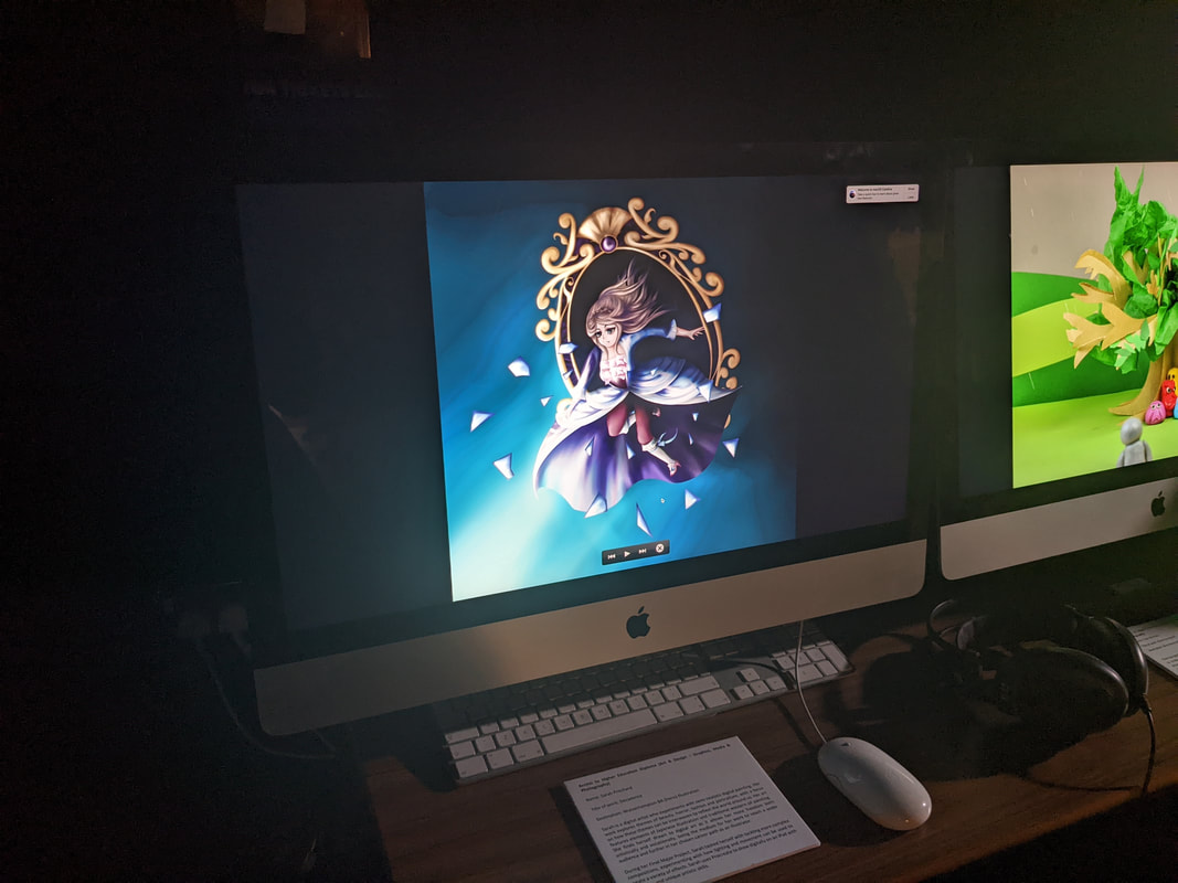
• Digital DisplayFollowing this, my tutor then suggested displaying my work on a screen and it would provide enough lumination to clearly see the darker colours and it would make the vivid highlights pop more. Pros
• Magazine/Book FormatHowever, I did also consider other options such as a magazine/book format. The idea here being that it would enable me to show several screenshots of the making process of my work. Something that would allow me to show the full breathe of the hard work that goes into each piece, from concept to final render. However I was not overly keen on this idea as my making process is particularly messy and I don't like showing unfinished work. With that being said, I did create a digital magazine with the help of my tutor in InDesign. So I had that option available for displaying my work. Pros
Other OptionsThere are also some more unrealistic display methods I considered if time and money were not a problem. Them being: • MerchandiseThere is also option of commercialising my work, printing it onto merchandise which I could potentially sell. Merchandise such as t-shirts, mugs, magnets, keyrings, mousepads, etc. Things I have technically done in the past with my freelancing work by way of third party websites. Though this method is technically not out of the realm of possibility, due to the cost of such an venture (both if I were to create these merchandise myself and if I were to go through a third party) it seems a tad unrealistic. Pros
• Large Scale Display ScreenIf I had the resources available, I could display my work on a large digital screen. Whether that be a billboard or just an excessively large screen. This way I would be able to showcase my work in exquisite detail, at such a grandiose size that would undoubtedly leave quite the impact on an audience. Besides the obvious problem of this being wildly unreasonable, due to lack of financial resources, there is also the problem of my work becoming pixelated at such high resolutions. Despite my work being in one of the highest resolutions Procreate allow (without crashing the program), it still had some resolution issues under closer inspection. For context my work was made in a 2732 x 2048 pixel canvas, the optimal size for my device. Pros
The Job of an Art CuratorOrdinarily in professional art galleries, the management of exhibitions would be placed in the hands of an art curator. Who’s job it is to procure, care, display and light the work. They are also in charge of editing the collection, bringing in/ taking away pieces that don’t fit, or would look better elsewhere. Notable art curators include Hans Ulrich Obrist (1968-current) and Carolyn Christov-Bakargiev (1957-current). References Initial information provided in spoken lecture delivered by E.Jukes in May/2022
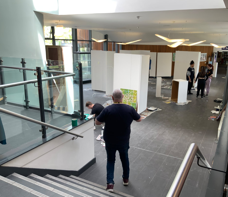
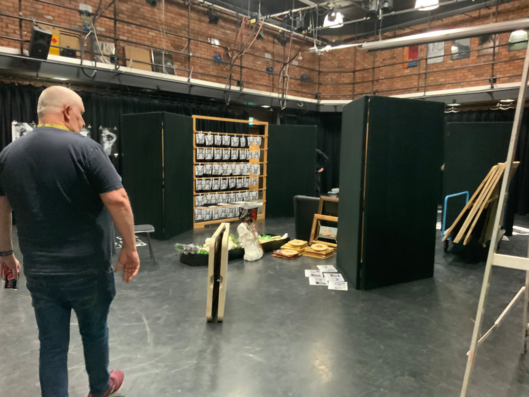
Placement within ExhibitionThe next thing I needed to consider was where within the exhibition my work was going to go. I had three options open to me: the foyer, the theatre and the media room. Each with its own pros and cons.
in the corner of the room, next to two films. My thinking being that it would best stand out, when next to something that is drastically different to my own work. Given that the rest of the room was filled with other static imagery such as photography and a few character designs, the corner seemed my best option. Artist StatementAccess to Higher Education Diploma (Art & Design – Graphics, Media & Photography) Name: Sarah P
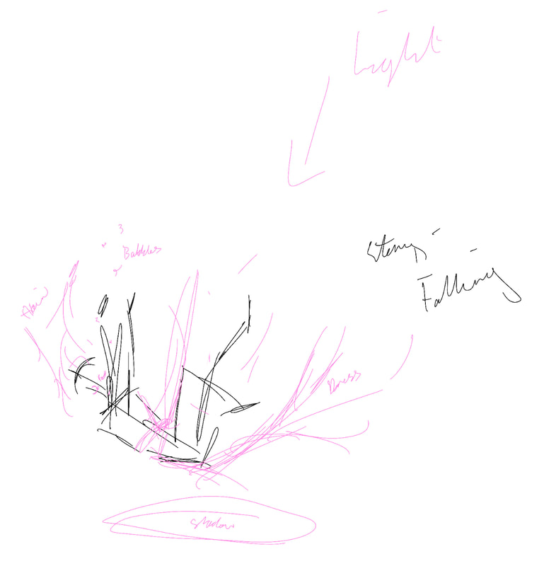
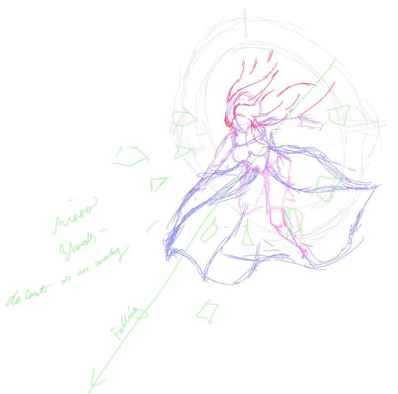
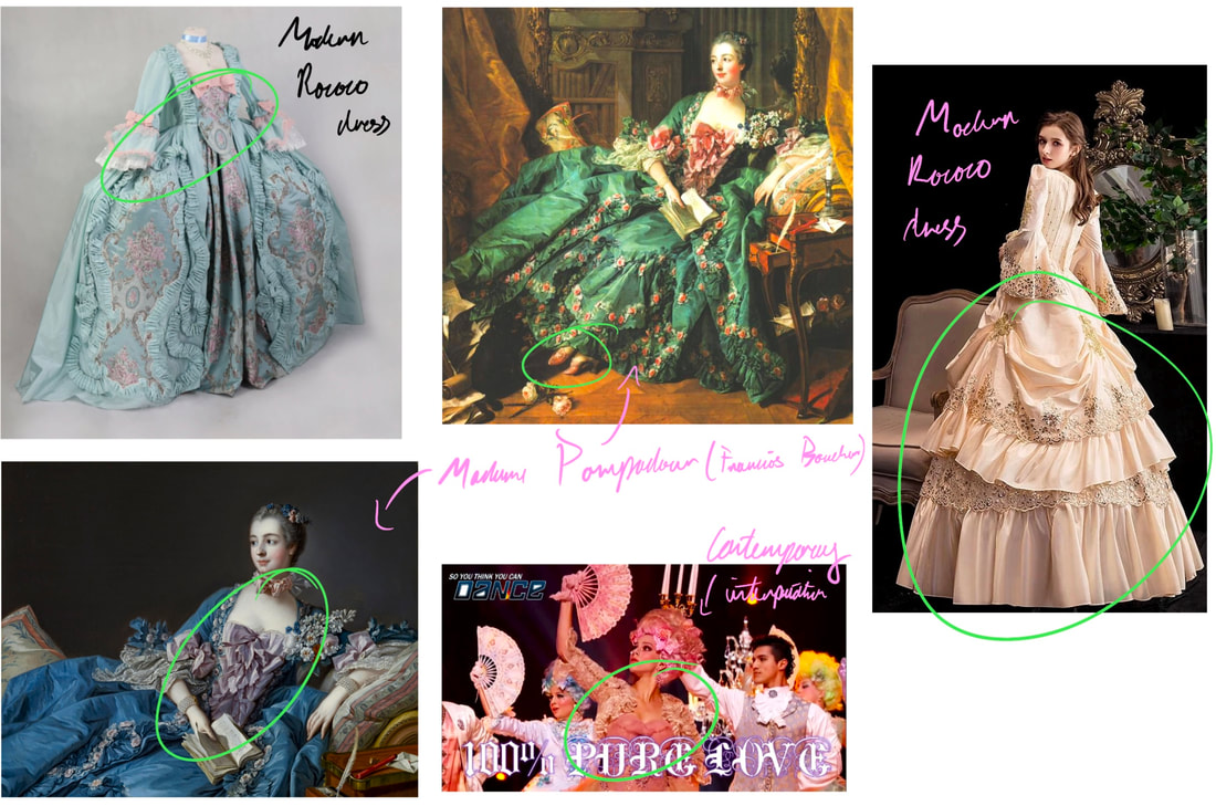
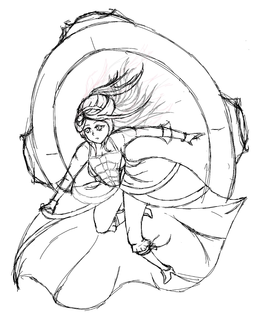
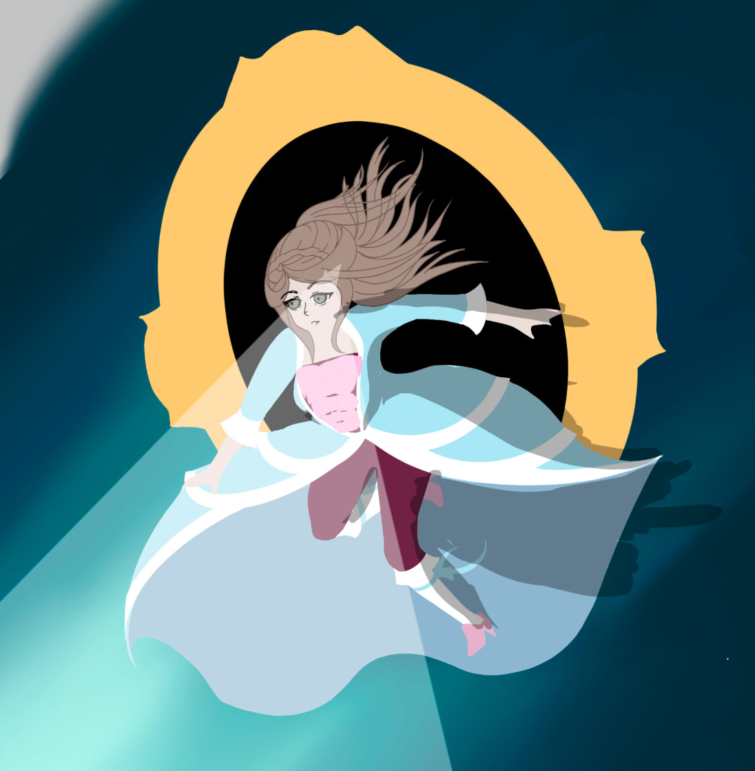
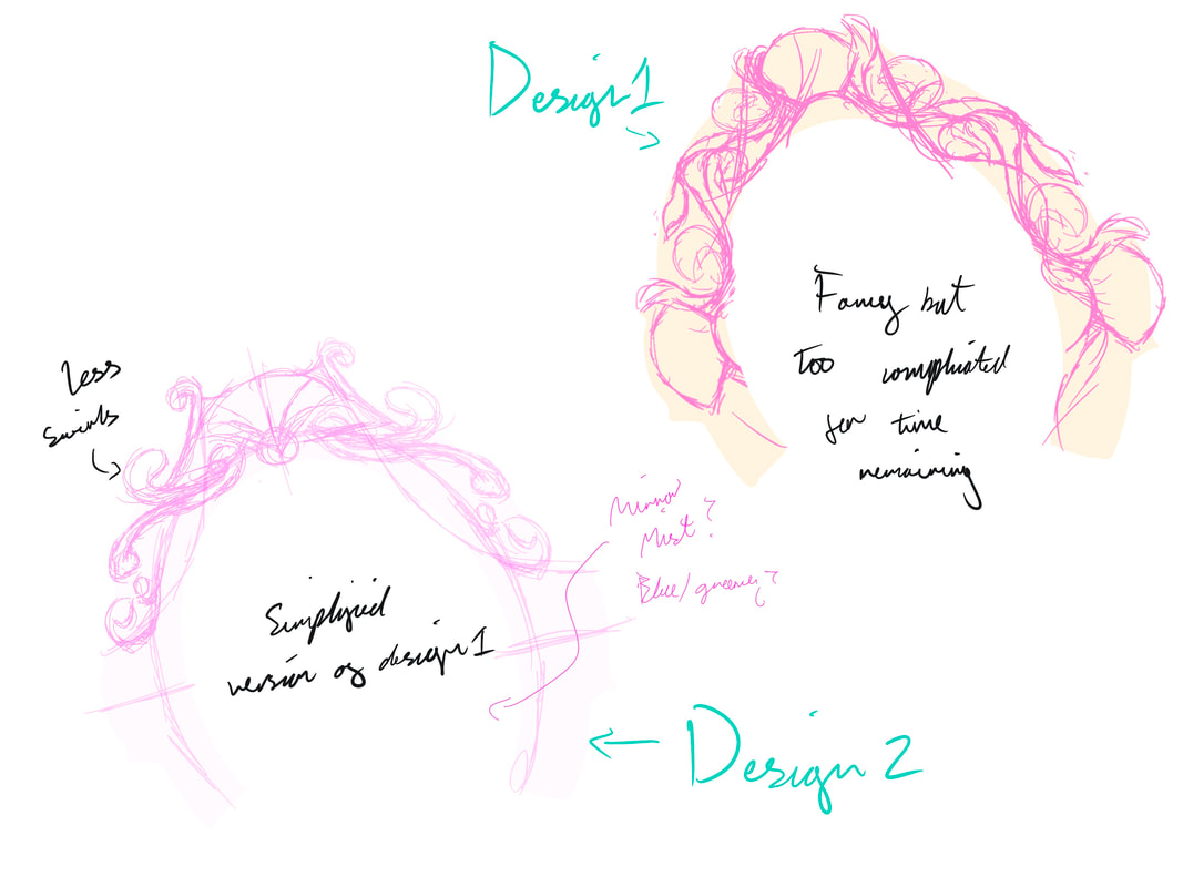
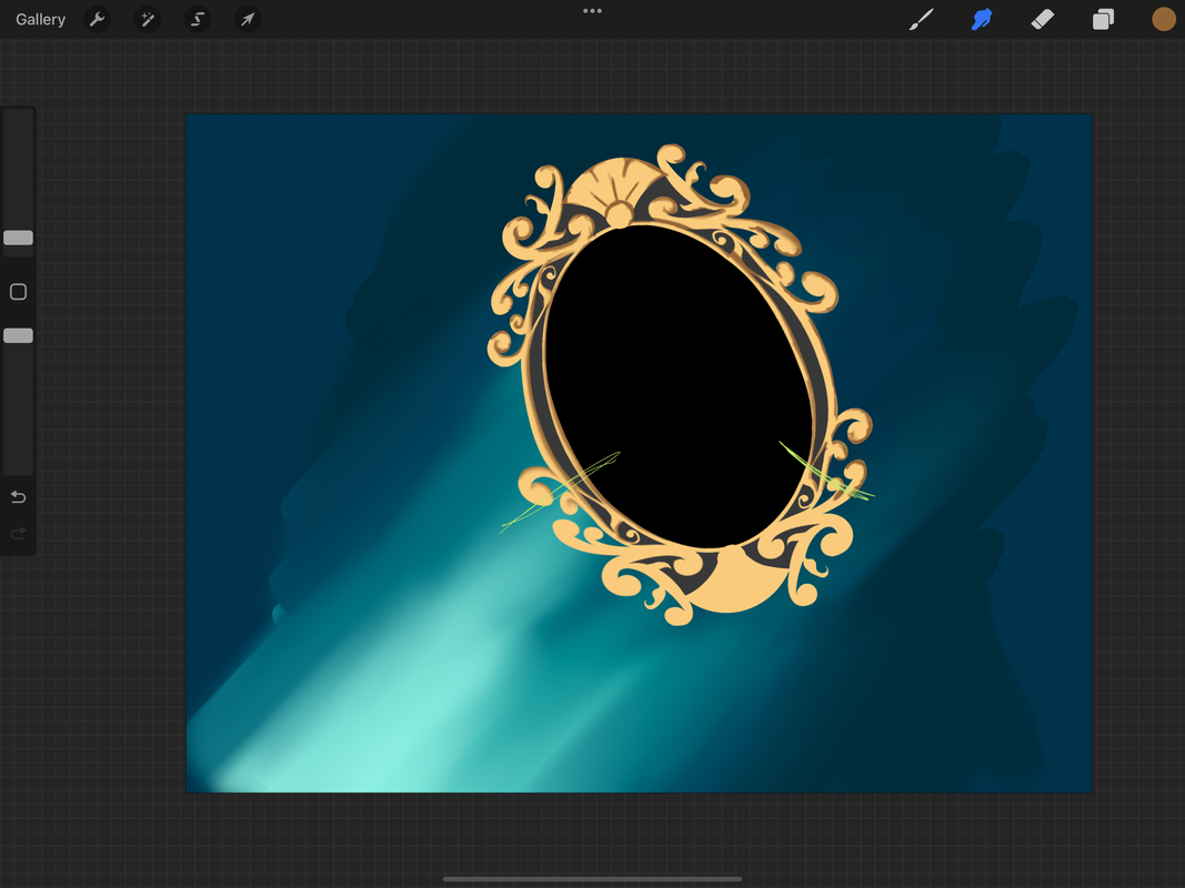
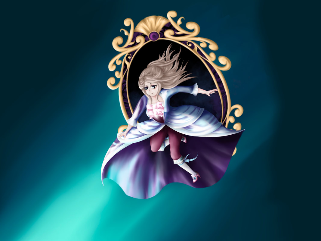
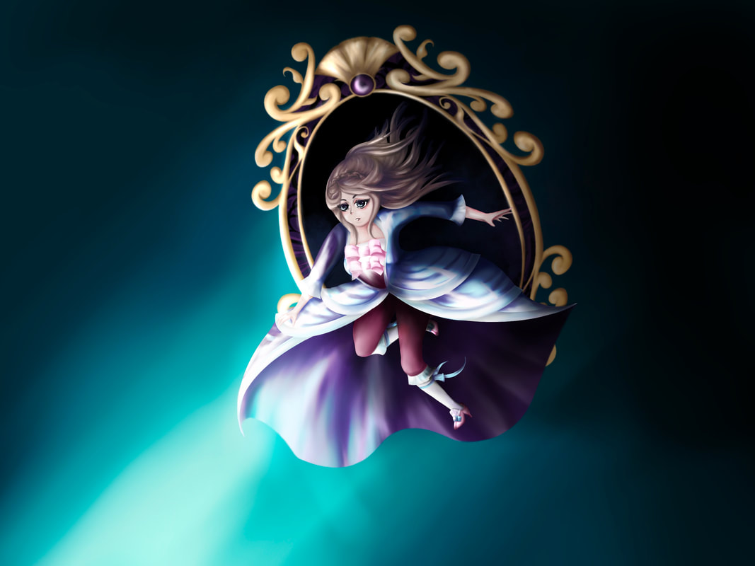
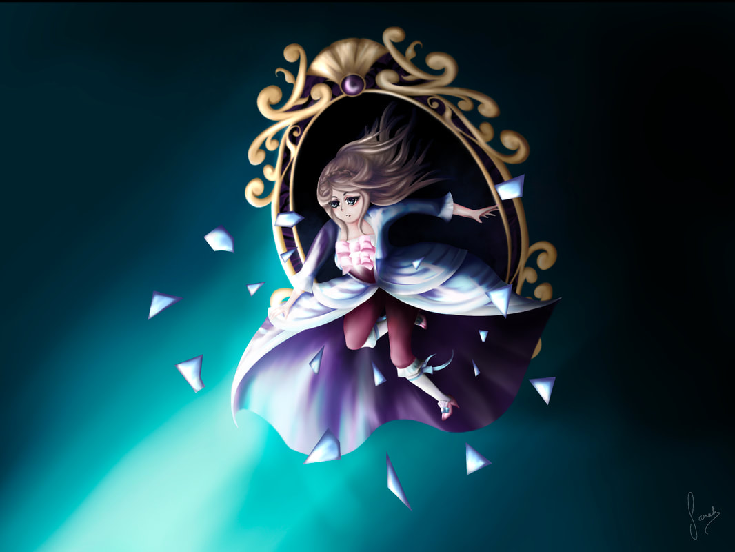
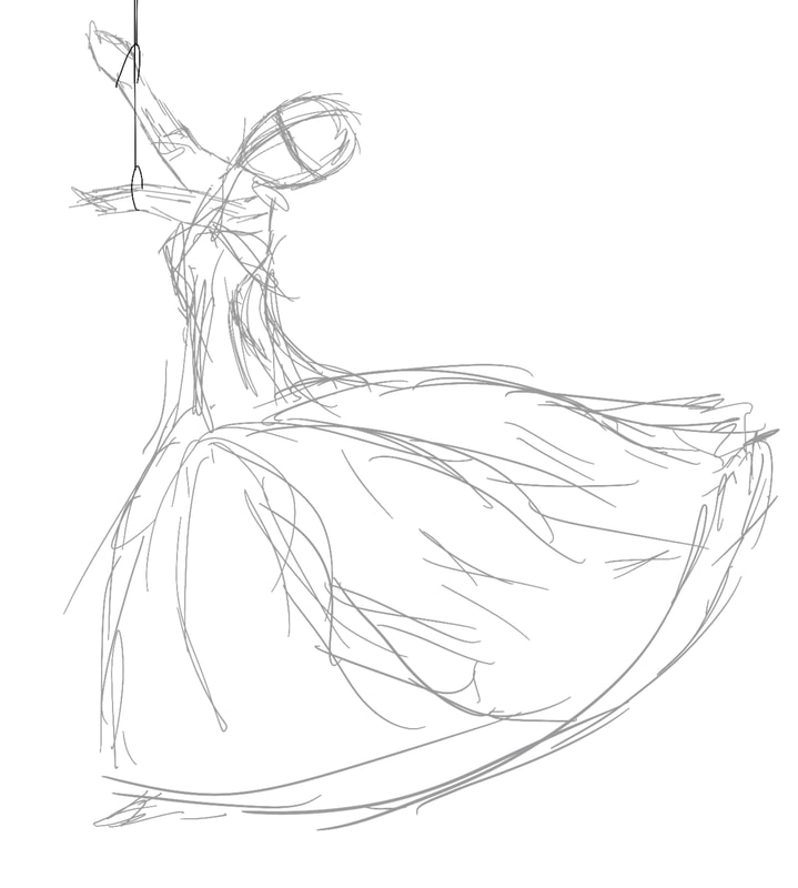
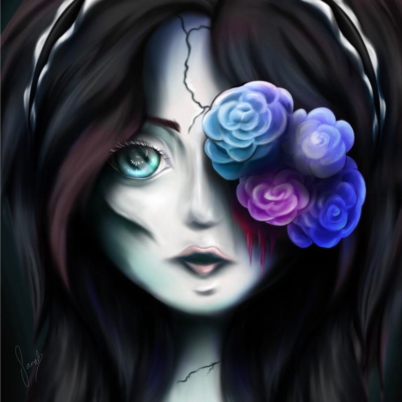
Title of work: Decadence Destination: ——————BA (hons) Illustration Sarah is a digital artist who experiments with semi-realistic digital painting. Her work explores themes of beauty, horror, fashion and portraiture, with a focus on how these themes can be interwoven to reflect the world around us. Her art features elements of Japanese illustration and traditional western oil painting. She finds herself drawn to digital art as it allows her more freedom both artistically and vocationally, being the medium for her work to reach a wider audience and further in her chosen career path as an Illustrator. During her Final Major Project, Sarah tasked herself with tackling more complex compositions, experimenting with how lighting and movement can be used to create a variety of effects. Sarah uses Procreate to draw digitally on an iPad with precision and unique artistic skills. PlanningFor my final design, I wanted to create something that encompassed all (or at least most) of the themes I was looking at. Given how this was a rather demanding ask I created three sketches using my moodboard/plan I created in conjunction. My moodboard features a variety of influences from music videos, underwater photograph, Japanese illustration and contemporary rococo art. My first idea was a simple illustration of a woman in a flowing dress sinking into water. The idea bring there's be under lining connations of mental health. Similarly with the second it would also be a women underwater, but more focussed on the face. Something which would allow me to do a complete portrait in the semi realism style I liked so much. However I felt this wasn't challenging enough as it was too similar composition wise to other work I had done in the past. In the end, I decided on the third sketch, an overall more complicated piece both in terms of composition and connations. I felt this would best allow me to showcase the skills I had learnt over the year and challenge myself to improve further. Sketches/ConceptConceptMy concept behind this illustration was that it would be illustration in the semi-realism style with a few hints of contemporary Japanese illustration, that would explore themes of over fairytales, dolls, poisonous wealth, and how a person can break free of these confines. Initial Sketch/ Rough ColourTo create this illustration I used a pose reference I found online, to ensure my proportions and perspective were correct. However I did change a few things such as the legs, so it would better fit in with my concept. Following my initial sketch, I then created a rough guide for the colours I was thinking of using, so I had a brief idea of how my illustration would look, that I could also refer back to later. Sketch RefinementsI refined some of the elements of my initial sketch, adding in additional details and changes. In particular, I changed up the hair as I felt the loose hair was too messy and made the rest of the illustration look unpolished. I based the hair style on some images I found online. Although this is very clearly not historically accurate for Rococo period attire (like how I initially wanted it to be), I decided to make the outfit more of a contemporary twist on Rococo, to enable me to show more of the details I otherwise wouldn't be able to such as the legs. Which I needed visible in order to show the movement and falling motion of the woman in the image. However with that being said, the rest of the outfit is very much based on features of Rococo dresses such as the overcoat/skirt. Which I specifically decided to draw cinched at the waist, with cascading tiers of fabric making up the bulk of the skirt. Something reminiscent of a lot of Rococo dresses I had seen in painting from the era. The V shaped corset with bows is directly inspired by Francois Boucher’s 1756 portrait of of Madame Pompadour, a woman who was a leading style icon of the Rococo era. Likewise the neckline and sleeves are also directly inspired by the painting. RenderingDress - Colour ChoicesNext I began the rendering process, first change I made was the dress colours. I decided to change the colours as I felt the purple not only didn’t fit in terms of colour theory (as purple is associated with power and royalty) but because it was too dark. Something which I had a feeling would become a bigger problem later when I did all the lighting effects. I decided to replace the purple with light blue and pink, as those are two colours often associated with innocence and youth. And I figured the light colours would compliment the dark of the background quite well. I then drew up a rough lighting plan to make it easier for me to plan out how I wanted the lighting/shadows to look. Before I began blending, I first look up images of how to draw silk. I then mimicked the technique using a lot of smooth light colours to give the illusion of light bouncing off the material. Corset and Shoes - DesignWhen I began work on the corset, I decided to change the number and shape of the bows as I felt the previous design made the bodice looked out of proportion with the number of bows. Next change I made was the shoes, which I designed based on Rococo shoes with the frill, gem and low back. Characteristics I identified after conducting some brief research, looking at images of rococo era paintings/illustrations and modern remakes of Rococo shoes. Skin and Eyes - Design/Shading ChoicesI then moved onto the skin which I shaded in a semi-realistic anime style. Using pinks and browns to make up the shadow and give the skin a slight blush like what you might expect from an oil painting. The eyes meanwhile are very overdrawn in an anime esque style, I choose to do this to make the woman look more doll-like, linking back in with some previous themes I explored. It also furthers the narrative elements of the piece as it could imply she is a doll breaking out of the world that binds her, whatever that may be. Mirror DesignAfter I had done the full render for the woman, I began work on the mirror. I decided to design the mirror based on Rococo motifs particularly the swirls and shells featured in the period’s interior design. I actually produced two design for the mirror as the one I initially made, upon review I felt it was too complicated for the time I had left since I was already running out of time. And so I opted to make a second less intricate design. However I still prefer the first design, but I suppose that’s something to keep in mind for the future. I choose a gold and purple colour scheme for the mirror as they are two colours entwined with wealth and privilege. When both are used together it could imply the over indulgence of such things to the point where they are bad and poisonous. It is from this idea that I came up with the title for my piece, Decadence. A word which summaries my entire concept quite well, when it comes to both the good and bad connotations that go with the word. Important to note, I only rendering the top half of the mirror as the rest would be obscured by the dress. LightingNow I had rendered all elements of my illustration, I then completed the after effects such as lighting using dark blue and purples for the shadow and neon blues and white for the lighting. I specifically chose these colours to further fit with the atmosphere of the piece, with it being hopeful yet dark. Likewise I added in some blue and purple mist coming out of the background of the mirror to give it a mysterious allure. Mirror ShardsFinally I added the mirror shards, I tried my best to model these after another illustration I had seen using mirror shards. Given the how a mirror is rather difficult to draw by definition, I tried to make the surface look as reflective as possible using vivid highlights and darker contours to imply the dispersion of light. Evaluation
first being the mirror frame and shards. As I don’t believe I blended them into the background sufficiently, as they still look a bit like they’re popping out of the canvas and not in a good way. Particularly the right side of the frame could’ve done with some adjusts. Whether that be bringing back some of the bold reflective light that is present on the left side onto the right, or blending some of the background shadow with the frame. Or both. Perhaps it may also be a result of me forgetting to add the harsh shadow that the dress would cast on the frame, especially when the light source is so bright and singular. A faux pas I can put down to simply running out of time and having too much on my mind of things I needed to get done. Ultimately this is a time management problem, partly my fault as maybe I didn’t manage my time as efficiently as I could’ve, but also this could just be a result of doing these kinds of illustrations. As complex illustrations like this always take a lot of time and effort to do.
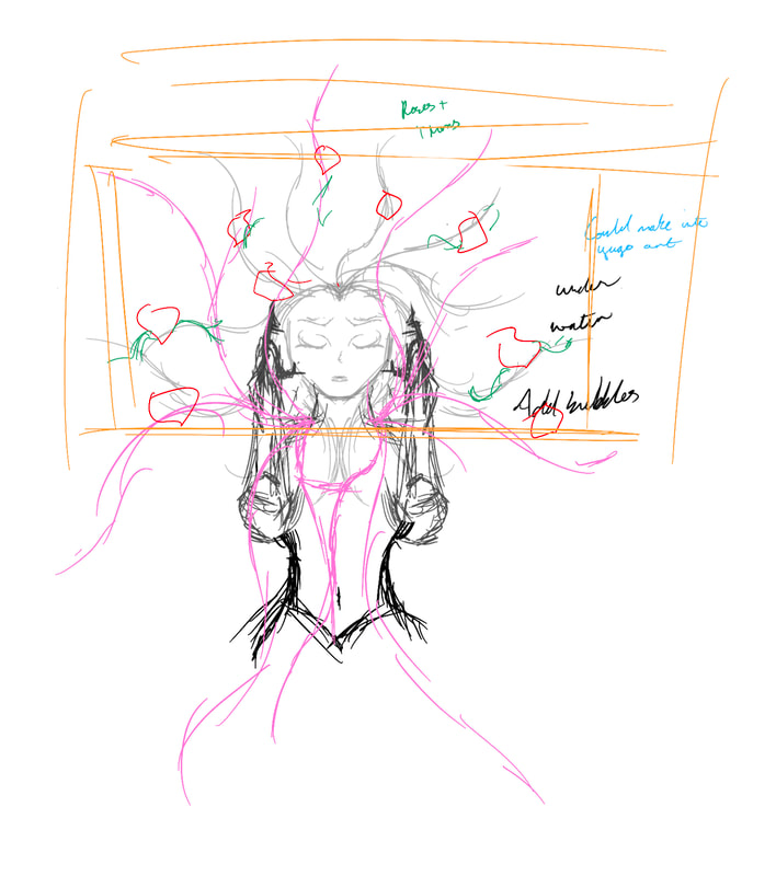
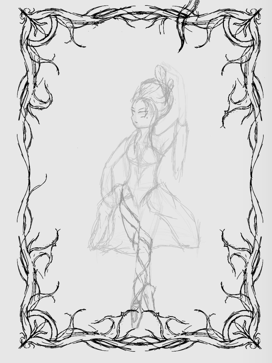
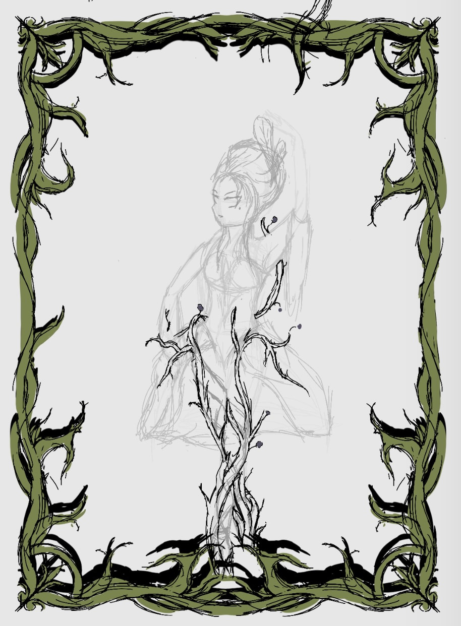
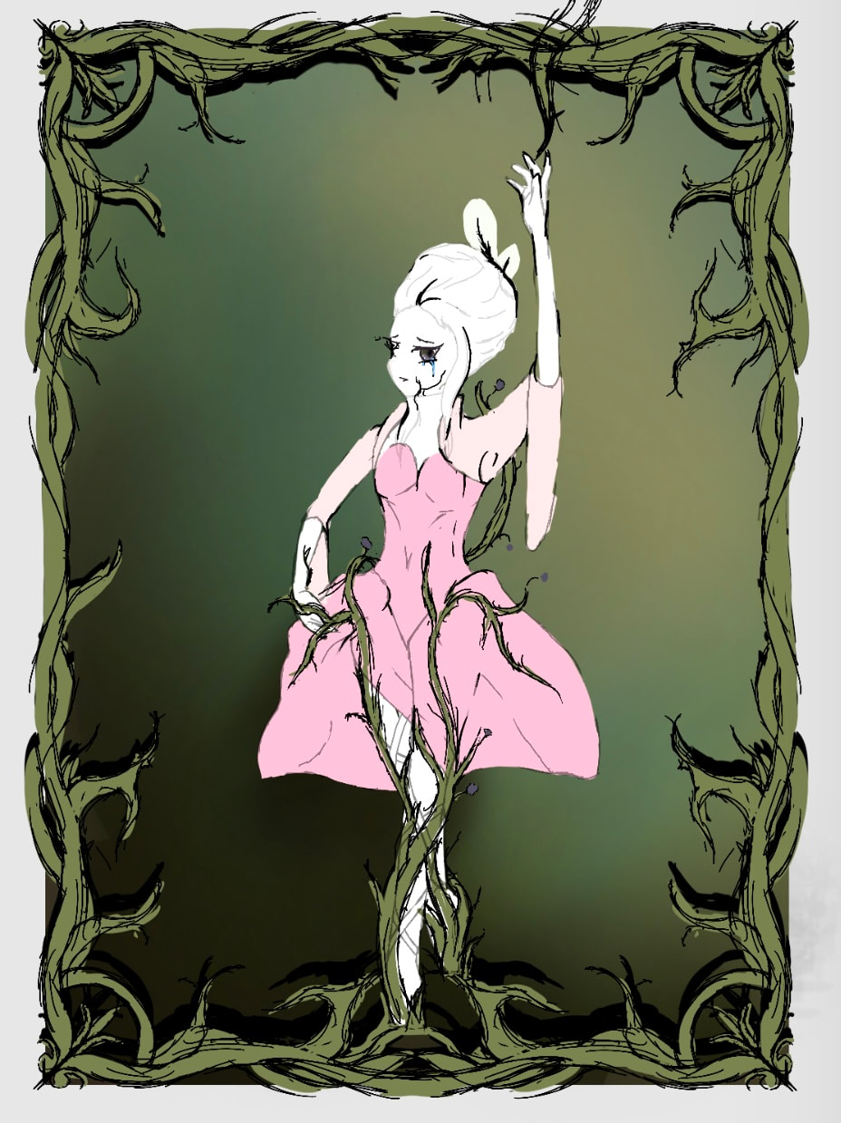
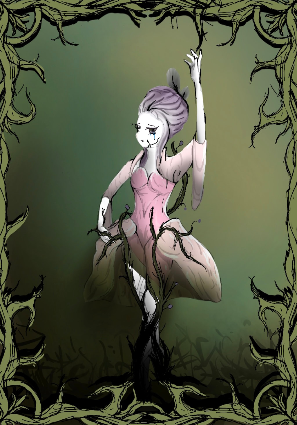
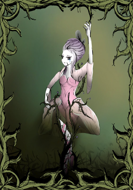
But other then these blunders, I have quite happy with how this piece turned out. Both as an individual piece and as the final piece of my project. As it encompasses all my main themes and styles I explored during this project, in a way that is poetically beautiful yet tragic. It is at this stage I began sketching and creating my digital artworks. Following on from some of my initial ideas, and developing them into new ones. Outcome OneSketches/ConceptFor my first outcome I decided to base it around fairytales and classical imagery. Combining a ballerina from a music box with the princess aesthetic and wall of thorns that are reminiscent of sleeping beauty. I specially chose to use a ballerina from a music box as it is poetical beautiful and yet tragic. As the ballerina is forced to live out her live continuously going around in circles unable to move yet all while smiling. Or at least that is the case if you personify the music box ballerina. I had the idea to combine this with the wall of thorns to give the illusion of passing time, that the ballerina has been like that for so long, vines and thorns started to grow around her. The addition of the thorns themselves is also quite poetic given their use in literature to symbolism the growth of something that looks beautiful but is toxic. For the ballerina’s dress/outfit I decided to go with something Rococo inspired that still had the legs exposed to show the thorns growing up her. In the end I heavily based the outfit on a pre-existing garment created for a dance performance from the 12th season of So You Think You Can Dance. I decided to use this as I was very pushed on time and didn’t have the time to design my own unique outfit, as much as I wished I could’ve. I also designed the thorns to resemble the shells and swirls of the patterns found in Rococo interior design. RenderingFor the rendering I decided to go with a green and pink colour scheme as it tied into the whole nature theme and pink specifically is typically associated with traditional gender roles. A theme that would work quite well in this twisted fairytale esque image. For the rendering style, I decided to go with a somewhat rough and messy style. Both as a way of saving time, and because this messy style went quite well with the story telling aspect of this piece. The idea that this scene has been left unkempt and decaying, so much so that its reflected in the style of the illustration. To make this piece I first blocked out the colours before going back in to add various lighting and shading details. I elected to give the bottom of the skirt a green gradient as I felt it would help give the skirt the illusion it was fading in from the background. Therefor making it seem like even the clothing was being consume by the plant life. Additionally the green would also double as a shading effect, allowing the brighter pinks above to stand out more. I also decided to draw back in some of the lines in black, to make certain features stand out more. It was at this stage I also decided to draw the ballerina crying to make it more obvious that she was unhappy with her current situation. Similarly I also added the reaching up hand to imply that she is trying to climb out, reaching onto one of the above vines to try and pull herself out. But ultimately failing as her fragile porcelain body doesn’t have the strength, yet again another metaphor for mental health struggles. Evaluation
Outcome TwoSketches/Concepts
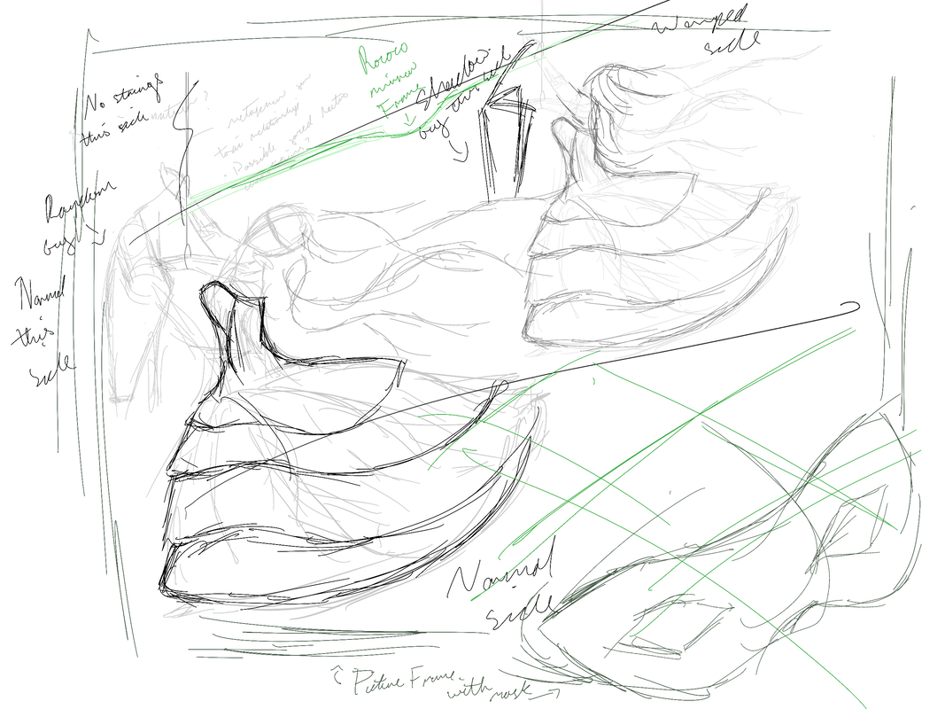
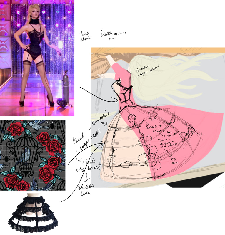
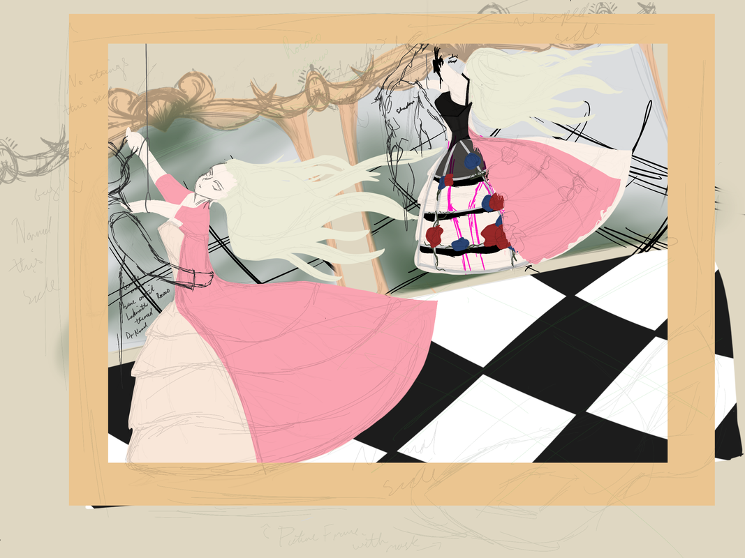
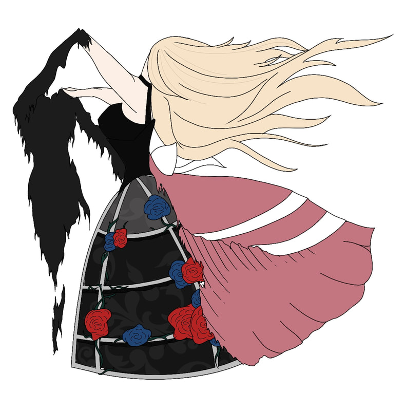
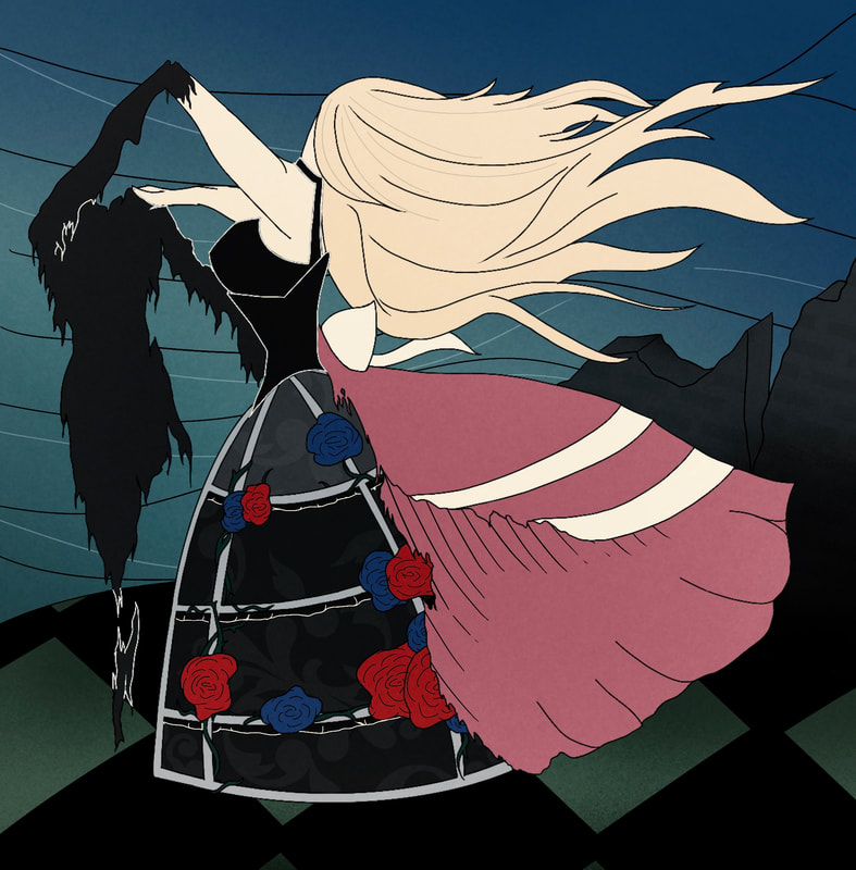
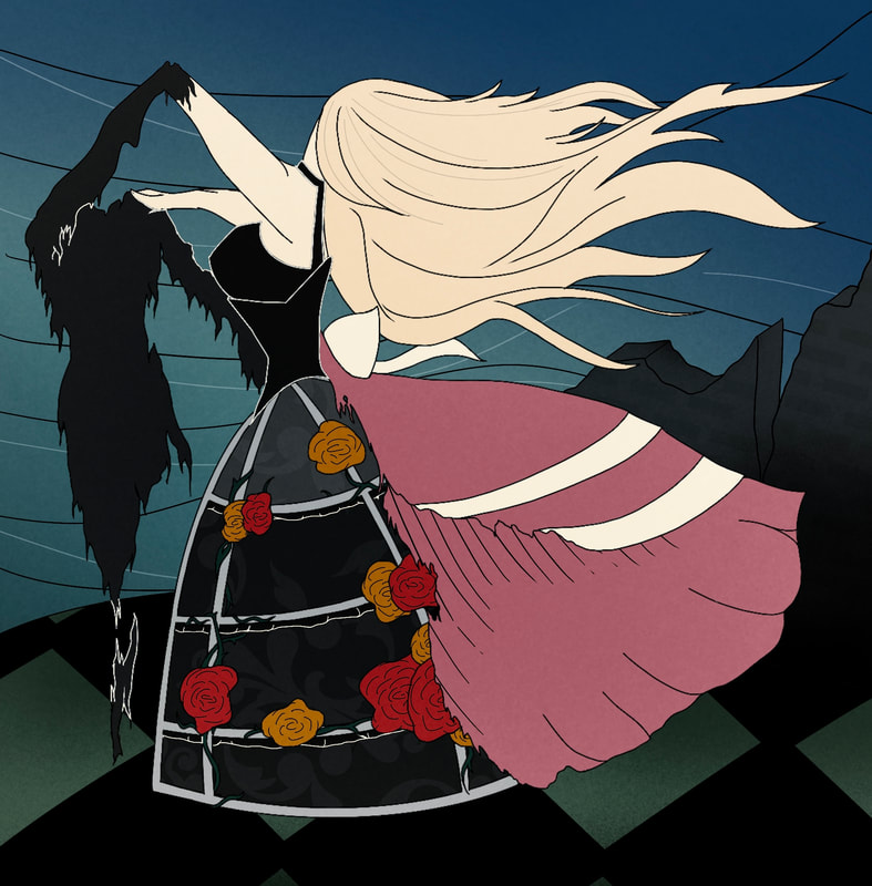
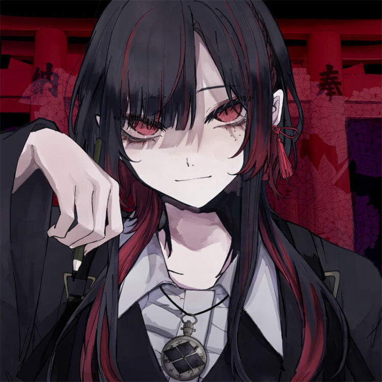
Japanese illustration style, but ultimately I had to make some changes. But regardless, this is by far my most complicated of ideas, both in terms of concept and execution. My idea behind this concept was to tell a story of a haunted ball that is seemingly normal at first glance but it is not until you look in the mirror at the back of the piece, that the reality of the situation is revealed to you. As after all mirrors can’t lie. This entire piece is one giant metaphor for going along with the flow of things, allowing oneself to be sweep away and not realising how bad things actually are. My use of traditional period clothing and architecture is meant to give the piece an additional layer, that being wrapped up in tradition refusing to move forward (or forcing others to live by past values) can hurt you as much as it does others. Evident in the decrepit reality reflected in the mirror, that has a lot to do with my design with my design choices. When designing the dress on the mirror side, I wanted to make it as beautiful and simultaneously “messed up” as is possible. The first element of my design I want to explain is the crinoline (hoop skirt) which I designed to resemble a bird cage therefore showing how the woman is like a bird in a cage. I also added roses and vines growing up and around the crinoline to show the passing of time, that is had clearly been there for awhile without the women realising. Roses are also symbolic of love but given the wider context of this piece, it transforms their meaning from some beautiful to something toxic. The next element is the corset, which I decided to base around Violet Chachik’s concept for the “Death Becomes Her” runway from Rupaul’s Drag Race. The concept being that the corset is unnaturally tight, slowly suffocating her. A element which would fit right in with the sickly warped theme I was going for, as it further shows the damage this warped perception of reality is having on the lady in the illustration. Similarly, I also decided to add a choker and singular strap to complete the neckline of the dress, as it almost looks like a collar and lead. Something which implies the control and objectification of the woman. Which depending on where you go with it, has a lot of connotations. When I put this design for the mirror dress back into the illustration, I decided to add part of the original dress back on top of it, to make it more obvious it was the reflection of the women and not someone entirely different. About the dance partner the women is dancing with, on the “normal” side it is a well dressed man but on the mirror side it is a shadow. I chose to do this to not only show that it is a cruel illusion but also to villainise whoever or whatever is behind this twisted ball. Therefore furthering the story telling aspect of this piece. Colour choices, I went with pink for the original dress as it very stereotypically and traditionally considered a feminine colour. Meanwhile the use of black, blue, red and green on the mirror side is meant to tie back in with the gothic elements of the piece, showing the dark, bleach reality. RenderingAfter realising I wouldn’t have enough time to do the full illustration like how I wanted, I decided to just focus on a cross section of the sketch. Though I realised this would probably cut out most of the wider context I was going for, I still elected to do so. I choose to do the mirror dress section as it was the part I’d put the most the most thought into. It was at this part I also decided to change the illustration style I was going with to something a little less time consuming. In the end I decided to use the Japanese Ukiyo-e prints style as it was something that was still had relevance to my project but fitted with the time constraints I was working with. Once I had decided the style, I began work on the line art in keeping with the Ukiyo-e style. I then did the colour blocking using the same colours I had previously decided on when I did the initial colour block. However I slightly turned down the saturation, so it would be more in a kin to Ukiyo-e prints. As for the shading, I only used some line art to try and show lighting, as I noticed ukiyo-e prints don't have much shading, other then the occasional line art. After this I then worked on the background, I decided to go with something at least somewhat inspirated by my original concept. Opting to keep the checkered ballroom floor (that resembled a chess board) and swapping out the elaborate wall and mirror design for an old collapsed wall. I specifically decided to change the wall as I felt the old design wouldn't work with this new style but still wanted to go with something in keeping with the narrative I was trying to tell with this piece. I decided on a broken down wall as it would give the illusion that this scene was taking place in an old ruined ballroom, therefore expanding on the theme of decay and delving deeper in the gothic aspects I already had running through my piece. The rest of the background is a greeny blue gradient remuisant the blue sky and water backdrops featured a lot in ukiyo-e prints. I also added some lines in the back of the background, again to resemble ukiyo-e. Evaluation
have the same impact but original idea might have. If I had more time I think I would have stuck to my initial concept, and/or added more detail to the ukiyo-e version I made. Details such as making the dress and scenery more detailed, for example making the crinoline out of bones or adding more gothic motifs such as lace, to really give it that gothic feel. Outcome ThreeSketches/concept
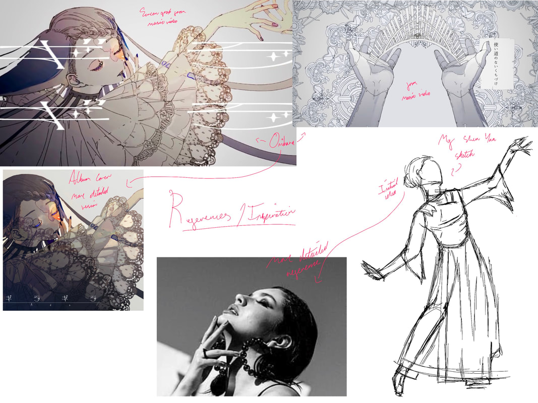
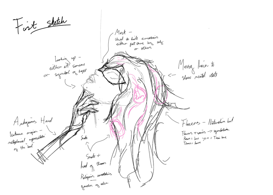
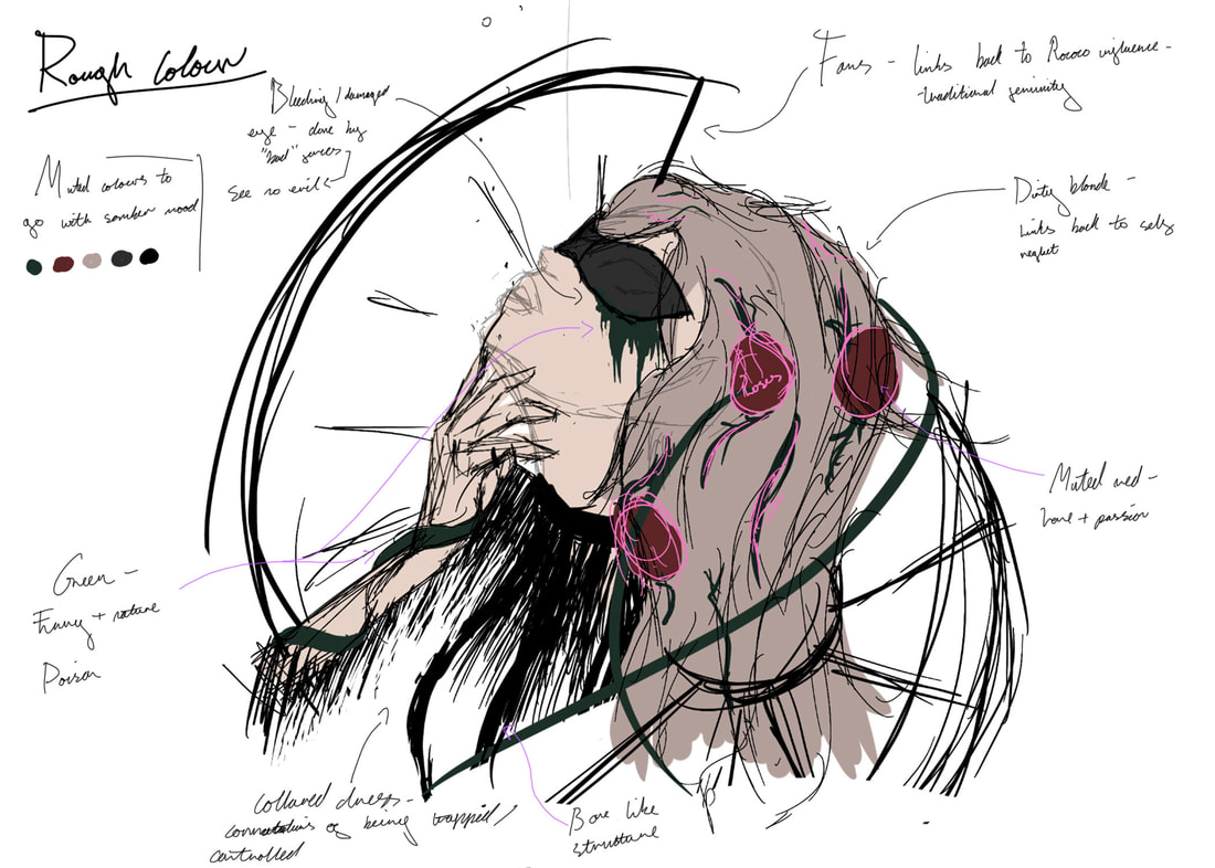
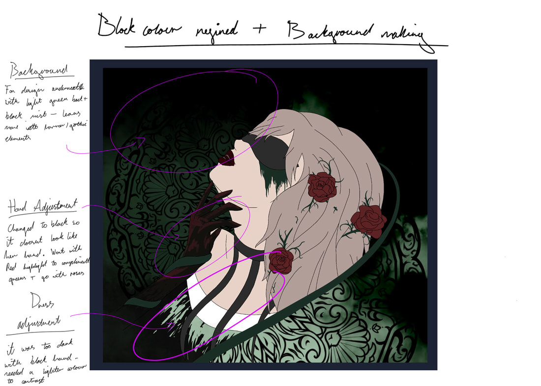
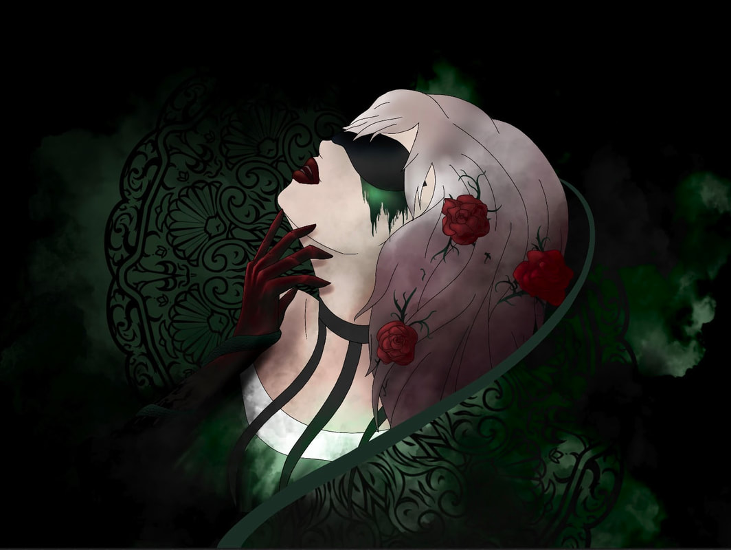
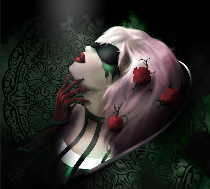
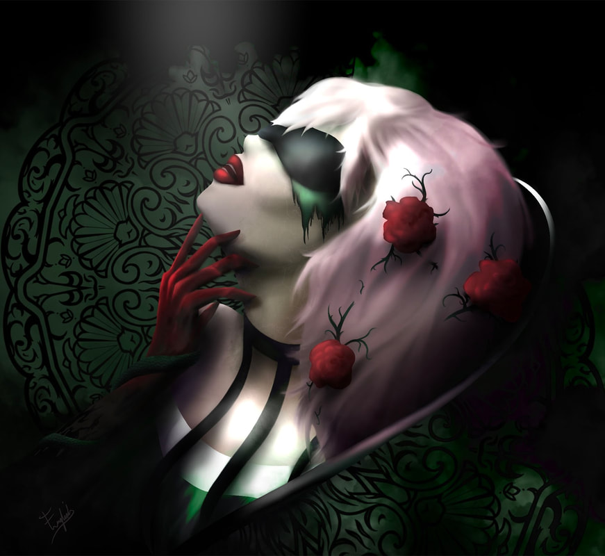
forefront of my mind at the time, specifically because the style and story of the music video was so close to my own concept for my project. With this is mind, I wanted to create something reminiscent of the iconic album cover. I decided to use one of my Shen Yun sketches as the initial base for the piece, later utilising a reference I found online to ensure I was drawing the perspective of the face right. After I had drawn out the initial frame, I began adding in the various design/story telling elements I would use to craft my narrative. Such as the hair, which I intentionally drew messy and unkept to show a lack of self care, indicative of struggles be it physical or mental. I also added in roses and thorns for a similar reason as my last piece, that is a metaphor for toxic love, given how roses and symbolic of love but thorns are symbolic of sin/hardship. I’ve also used it as a way to show the passing of time yet again, as the idea of something growing into the hair, indicts it has been there quite sometime. Meanwhile the mask is used as a storytelling tool to show how the woman in the illustration is blind to her surroundings, using a mask specifically implies she is being kept in the dark by a third party. As, if it were her own choice I would’ve opted to draw her with her eyes closed, and not obscured. Penultimately, I also decided to add the hand, an idea I originally got from the reference I used. But rather then drawing the hand as clearly belonging to the woman (like it is in the reference)I decided to make the owner of the hand a bit more ambiguous. Therefore changing the meaning from just a women posing, to the idea that someone is making her look up for reason unknown. Given the hand gesture and the mask it is impossible to deny that this piece doesn’t have some almost erotic undertones. Though that wasn’t my intention it is not an impression I shy away from. As linking it in this way further explores themes of objectification and the distressing effects such things can have on a person. However given that this is a very sensitive subject I wanted to make my intentions with this piece could not be misconstrued, and so I decided to add a snake coiling around the arm to further solidify this third party entity was one of malicious intent. Upon reviewing my sketch, it also occurred to me that this piece could have some religious connotations given my use of imagery somewhat associated with Christianity such as the snake and head of thorns. Though again I can’t say this was done intentionally, given the wider context of my work it could be a comment on traditional gender roles often backed by religious sectors, and the damage they can inflict upon unwilling participants. However considering how this is a particularly charged issue, I think it’s probably better if I don’t delve too deep into it. After finally concluding all my various design choices, I then created the rough colour so I would have a plan to work off for the rendering. It is at this stage I decided to add in the fans to help frame the piece, and give it that contemporary feel by way of making it look like something out of an editorial shoot. RenderingTo start of the rendering process, I first completed the line art before blocking in the colours and designing the fan. The design for the fan is based off of Rococo architecture and patterns, sporting a lot of shells and botanical looking swirls. It is a completely original design created by myself. I then added the fan into the piece creating the backdrop and making a few adjustments. Such as handing red highlights to the hand and taking back some of the black of the dress as there was too much black and it was hard to differentiate between layers. It is at this point I ran into a problem that being wasn’t going to be able to get all of the lighting detail I wanted if I continued to work in this anime illustration style and so I decided to change plan and instead go with a style I knew would allow me to do all the extravagance I wanted, that being semi-realism. To switch it up I just took off the line work and began working on deepening the shadows and bringing out highlights. I also smoothed out some of the lines, particularly the hair to make it look more realistic drawing some strands coming out. Around this time I started leaning into more vivid unrealistic colours that were definitely not part of the original plan. Most of these adjustments I made to make certain elements stand out more for just fit better with the overall harmony of the piece. A good example of this is the hair which I added a pink ombré to to compliment reds of the arm and rose and juxtapose the heavy green of the backdrop. Evaluation
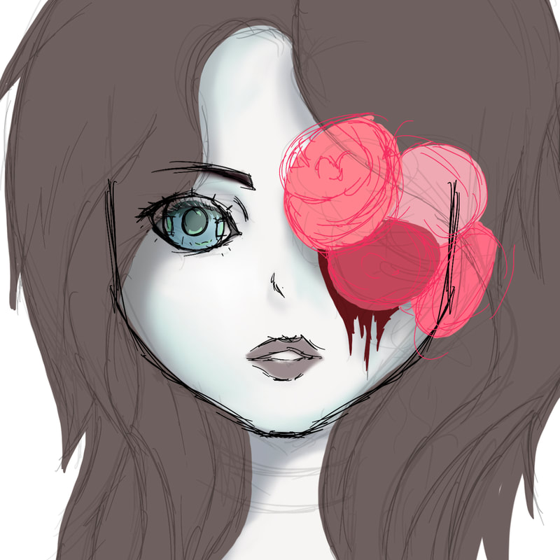
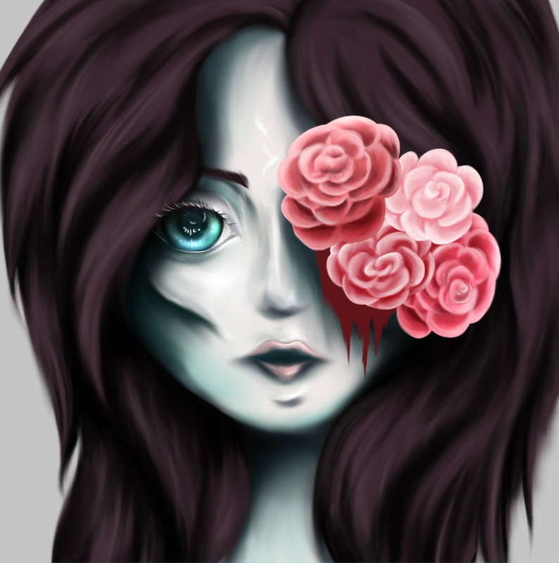
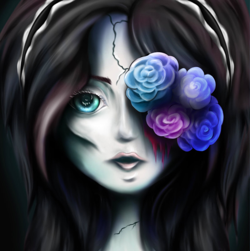
change my plan half way through. It explores a lot of the themes I was looking to (and some extras) in a way that has allowed me to experiment with illustration and digital painting like I set out to. My only qualm however, is that I would still rather like to explore my original sketch/concept just in a different style that would be more fitting. Perhaps in thick black and white line art style. Outcome FourSketches/ ConceptThis illustration aims to explore the subject matter of dolls and the symbolic nature they possess as the ideal vision of beauty. And how by turning it on its head, it can be used to show the damage such beauty standards can inflict on the individual. A rather abstract message but one I intend to convey using several story telling design elements such as the girl’s “missing” eyes. The implication here being that someone has removed her eyes, whether that be herself (so she no longer has to see the horrific world she supposedly lives in), or that someone has removed them to make her vulnerable. And replaced the one with a glass eye. The literal interpretation of “see no evil”. When you combine this with the idea that the girl is a doll (or rather being made into a doll), it implies the removal of free will. A metaphor for how women are often depicted in traditional media as sex objects, void of free will over how they are viewed. Considering how this is a rather abstract and complex concept to depict, I decided to bloody the one eye and cover it with flowers, to make it clearer that there is something very wrong here. I specifically decided to cover it rather then leaving the supposed wound exposed as I didn’t want that kind of horrific imagery to be the centre focal point of my illustration. Because if I did so, it is very possible people would take it at face value as just some creepy gross drawing of a doll due to the shock of such a depiction. Whereas I wanted it to be something a little more thought provoking, even if my original concept gets a little lost in translation. The aim with all my art is to make people think, whatever they may come up with. In connection to the eyes, I also elected to over draw them (designing them after anime eyes), to make the girl in the illustration look younger and more doll-like. It also makes the entire thing a lot more disturbing if the subject is younger, given the wider context of the piece. This then can be linked back to the effect beauty standard perpetuated by social media can have on girls/teenagers. RenderingI next began work on the rending, doing my shadows are highlights in rough before blending them out with the smudge tool. When shading the face I decided to go with a emaciated look deepening the cheek contours to the extreme, to make it that the girl in my illustration was ill to some extent. I used a green pallette for the shading to further the sickly theme using colour theory as green is often associated with being sick. The eyes meanwhile I tried to give a glaced look to, using a mixture of bright colours to show the reflective nature of glass doll eyes. Later when rendering the flowers I decided to experiment a bit with the colours as I felt the pinky-reds I had didn't suit the theme or atmosphere. Ultimately I decided on blue,pink and purple, three colours I felt fit better with the heavy green. Following this I also added some coloured highlights in the hair using the same colours to further tie in the whole overall piece. After reviewing my piece, I felt it was missing something and so I added a headband, based around a Lolita headdresses, a style that is derivative from Rococo and has a emphasis on doll-like attire. Evaluation
successful illustration as it explore the themes I wanted to touch on, it such a way that is beautiful yet haunting. With that being said however their are a few things I’m not overly keen on. The main one being that the illustration is slightly off centre, a problem only only noticed at the end once I flipped the image. Even though I know you should always flip your drawings to make sure things are in proportion, for some reason it just escaped my mind. I noticed the one side of the hair was massively out of proportion, even though I was of course aware that is was asymmetrical to begin with, it wasn’t until now I realised just how much. Ultimately, I decided to scrap the one side and just clone the good one on top of the other, using a variety of blending tools to make it look as if this was how it was always intended to be. I also rotated the image slightly to hopefully correct some of the off centred-ness of the illustration. Health and SafetyThe health and safety concerns when creating digital art are as follows:
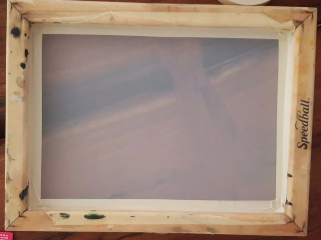
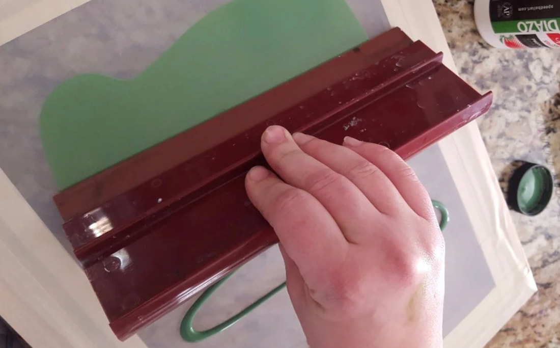
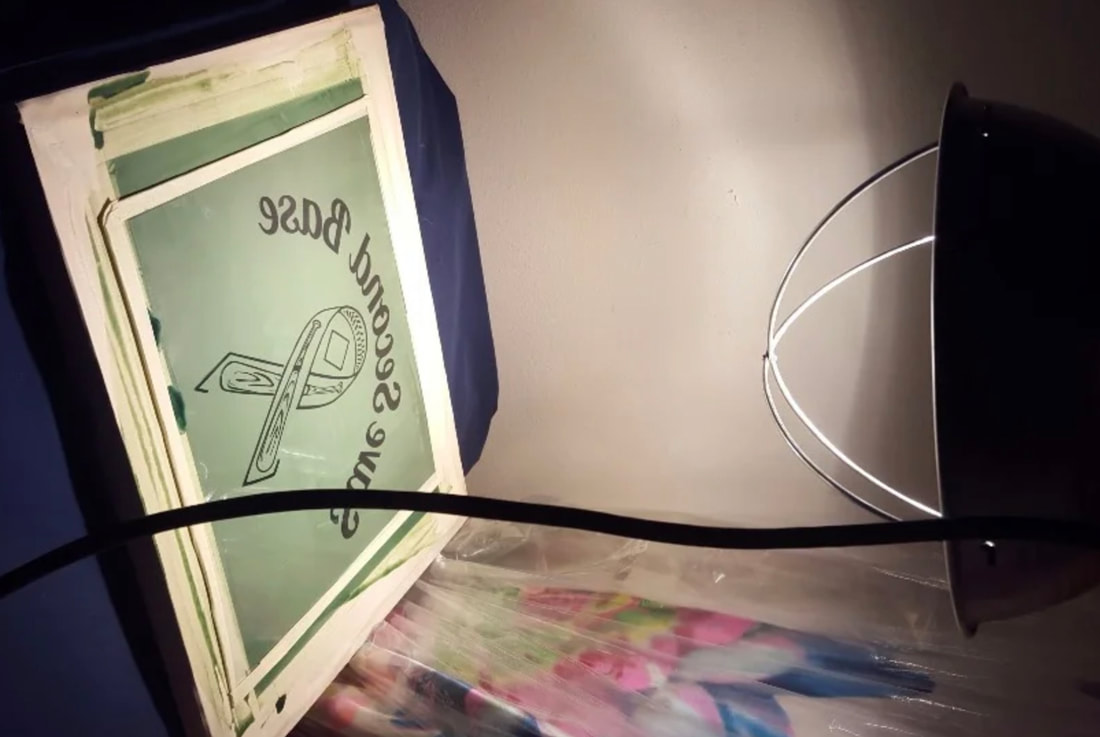
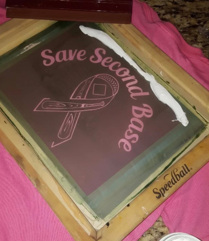
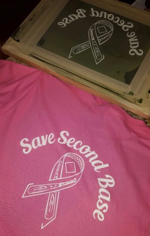
What is it?Screen printing is a printing method that consists of pushes ink through a mesh that is partly covered by a stencil. The method was first invented by Chinese during the Song Dynasty (960-1279) where it was employed to transfer patterns onto textiles. Screen printing also became popular in Japan where it was used to “create imagery on fabric”. It later made its way to the west in 18t century but it wasnt until the invention of the squeegee in the early 1900s, that the method saw any real uptake. As this new invention made it easier to pull the ink through the screen therefore drastically increasing the rate in which screens could be printed. During the 1960s screen printing it was picked up by artists most noticeably Andy Warhol who used the method to mass produce his popart works. How to Screen PrintMaking the ScreenTo make a screen print you first either make or buy a wooden frame with mesh. You then place masking tape around the edges of the mesh before spreading emulsion onto the mesh. Next you print out your design onto a clear acrylic. Once the emulsion is dry you place the acrylic on top of the emulsion and expose the entire thing for about 13-14 minutes. You then wash off the emulsion leaving you with a ready to use screen. Images found online from instructables.com uploaded by SMcCrocklin PrintingTo print, you simply take your screen and place it place down on a surface. Placing the material you wish to print onto under the screen, you then dollop some ink onto the screen, enough for it will cover your design. Then use a squeegee to pull the ink through the mesh a couple times to ensure a sharp print. Lift up the screen remove the material and you have a print. To clean your screen you simple wash under a tap and dry it off. Images found online from instructables.com uploaded by SMcCrocklin Health and SafetyWhen making screen prints, there are a few health and safety concerns that must be observed. They are:
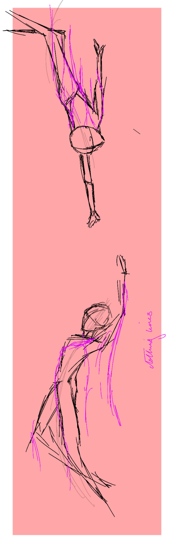
References
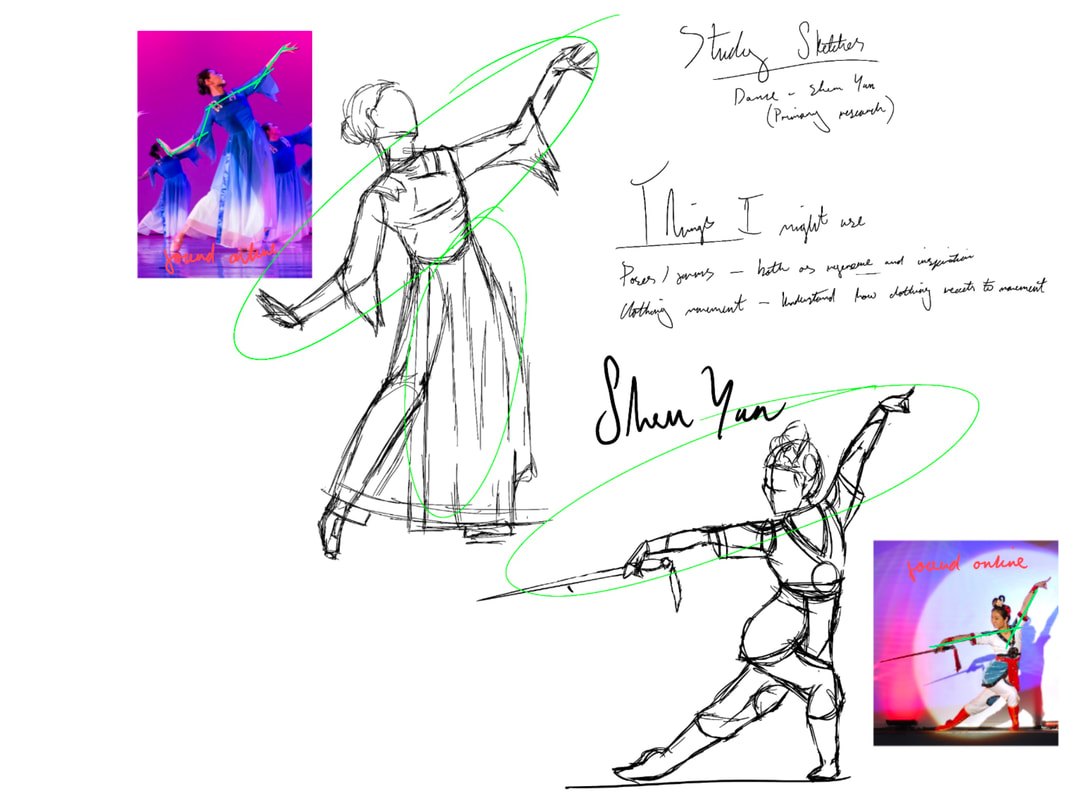
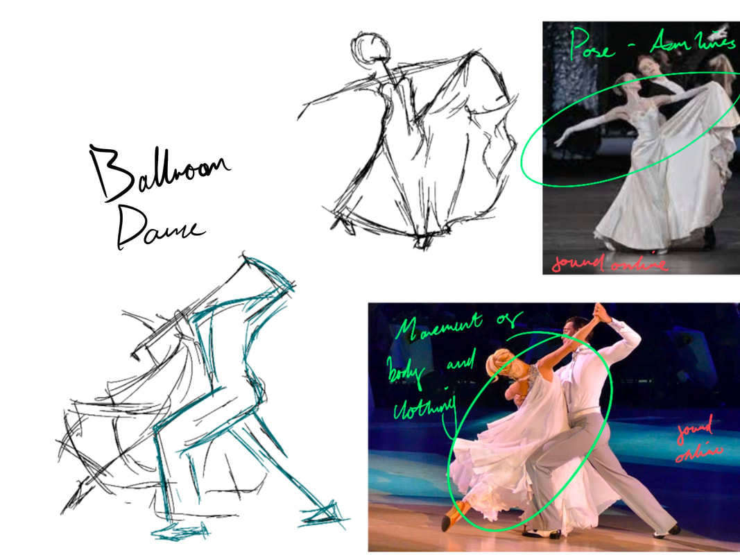
My PrintsIntroductionWith this in mind, I decided I wanted to try my hand at screen printing as it gave me an opportunity to create a textile design somewhat inspired by the Rococo pattern design. Design• Design Choices This is the design I made for my screen print. When creating this design I decided to with block black lines as this type of simplistic design would print the best. Meanwhile the design itself is based on Rococo and Lolita textile patterns. I took inspiration from Lolita as it is contemporary style that is based on Rococo, amongst other things. And I figured, it would be an interesting way to intwine my themes of Rococo design with contemporary fashion. I could also later reuse this design in my digital art to create/design outfits. My design and sketches were created in a combination of Procreate and Adobe Photoshop. I also made a coloured version of my design, to imagine how it might look should I want to carry on exploring this method and create a multicoloured print. • Problem Solving When creating my design I ran into a few dilemmas, the first and main one being trying to make sure everything was perfectly symmetrical. Which despite how easy it may seem to fix, it was surprisingly difficult even when I duplicated and flipped layers. In the end I was able to get everything perfect by flipping layers, it was just a pain to do. PrintsThese are a few prints I made using screen printing. When making them I tried to experiment much as I could printing on different materials. Initially a started with pink ink but later switched to black as I felt it just looked sharper. Though I could’ve experimented mixing different colours of ink I decided not to as I felt it would take away from the design too much. Practice SketchesI decided to create a selection of different observational sketches of ideas I had for subject matter, form, posing and design. Looking specifically at how to draw, paint and design elements I might use in my artwork for this project. Movement and FormThese are a few sketches I did of when studying movement and body forms I might include in my work. The sketches themselves are from secondary sources I found online, however I did go to see a performance of Shen Yun (Classical Chinese dance) recently in person. I specifically decided to include Shen Yun as I was inspired by the way in which the dance style uses movement to portrays a story. I also decided to include ballroom dance for similar reasons. Particularly the waltz as it is a very romantised classical dance that is easily recognisable and can be manipulated to have multiple meanings, depending upon the context in which you draw it. Something that’d go quite well with the themes of classical elegance I already had running through my project. When creating these sketches I tried to pay close attention to the form and the movement not just of the body, but of the clothes too. I specifically chose to focus in on these elements to better my understanding of they each behaved while in movement. Something I hoped would improve my work moving forwards. To ensure I knew how to go about this, I watched two YouTube videos on the matter. The first being a tutorial on how to draw people dancing, and the second on how to draw clothes in motion. When watching the first tutorial, it talks about drawing things fast so its easier to capture the motion and not overthink the details. And so I decided to try this method in one of sketch boards, that one being the ballroom dance. Meanwhile, the other I decided to sketch in relative detail so I could practice drawing clothes like how the second video talks about. I also wanted to be able to see the contrast between these two different ways of sketching so I could better make a decision upon which one (or both) to use in my future work.
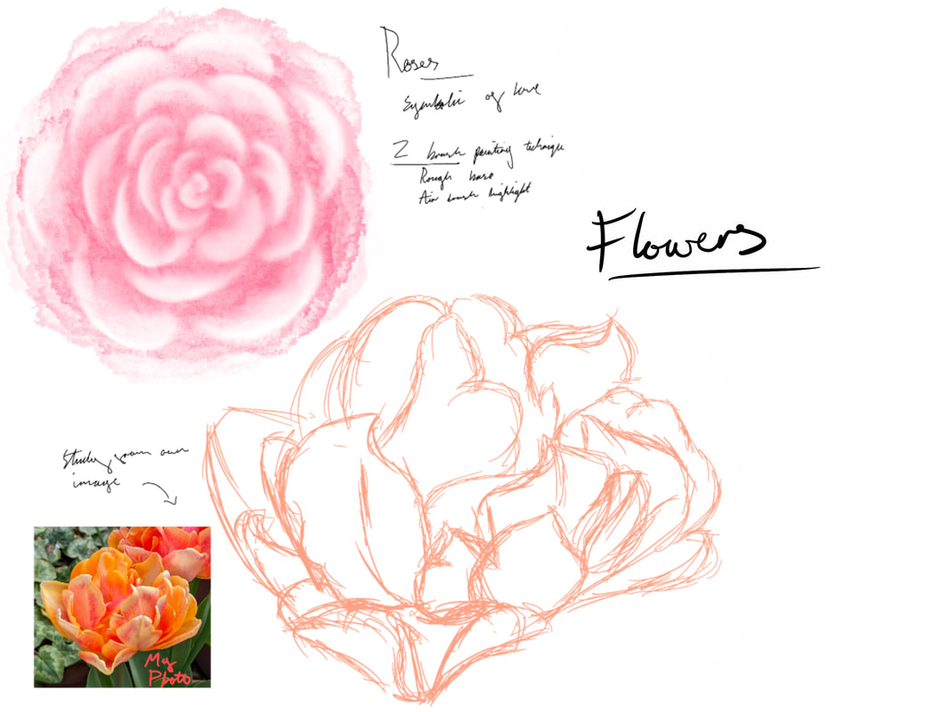
NatureThese next few sketches are of flowers and thorns, two things I might include in my work for this project. My decision to include nature as part of my subject matter is as much about symbolism as it is about linking back to my research on Rococo and Naturalism. And so I created these sketches from a couple photos I took while at a national trust property. From these sketches I then looked into different ways of shading both using traditional methods like pencil sketching and contemporary such as digitally. I then applied these techniques to my digital sketches. Both these sketch boards where made in Procreate.
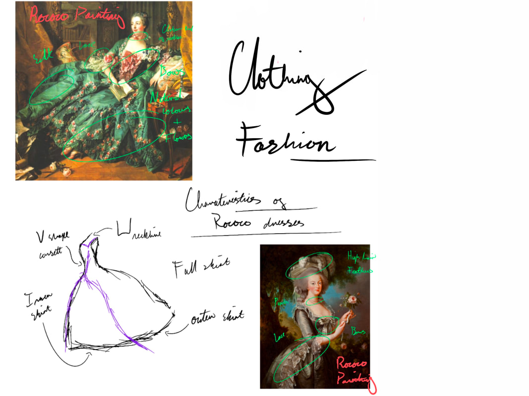
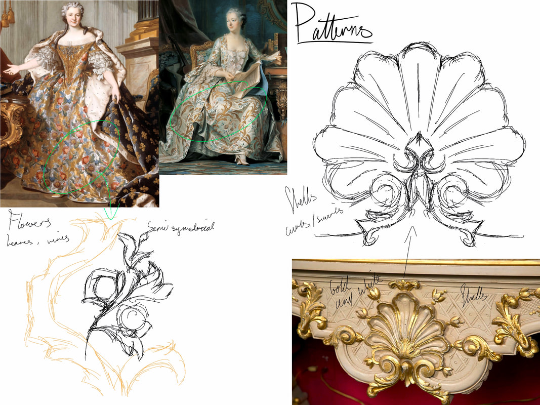
DesignI also decided to do a few sketches of the design elements I might want in my work. Particularly of the patterns and structural elements found in Rococo garments and architecture. As I had a feeling I might base any dress/outfit designs I had for my subjects, on Rococo dresses. I might also design the background of my work similarly with Rococo inspiration, I am particularly interested in the swirling patterns found in the wall features of the era. When constructing both of these design sketch boards I looked into tutorials about various design elements featured in Rococo. However I discovered there was a rather limited selection of videos so instead I had use videos that weren’t necessarily illustration centred. Such as the first video, which I used to achieve a better understanding of the structural make up of Rococo dress. So I could better draw it in my work moving forwards. The second video is a simiplied deconstruction of Rococo interior design elements, which I can use to better understand and recreate these elements and patterns.
Skin
sketch is one I made of a streamer, but I decided to re-use it to save some time. The videos I watched are featured below. The first is the one I directly drew from, in fact you can see screen grabs of me using it as reference in my video. I should also mention this first video is in the anime style of illustration. The second however is a more complicated render done in the semi-realism style. That I also watched to give me a better understanding of how to paint in this style, for possible future use in this project.
Initial IdeasAfter these practice sketches, i then drew out some initial sketches of ideas I had
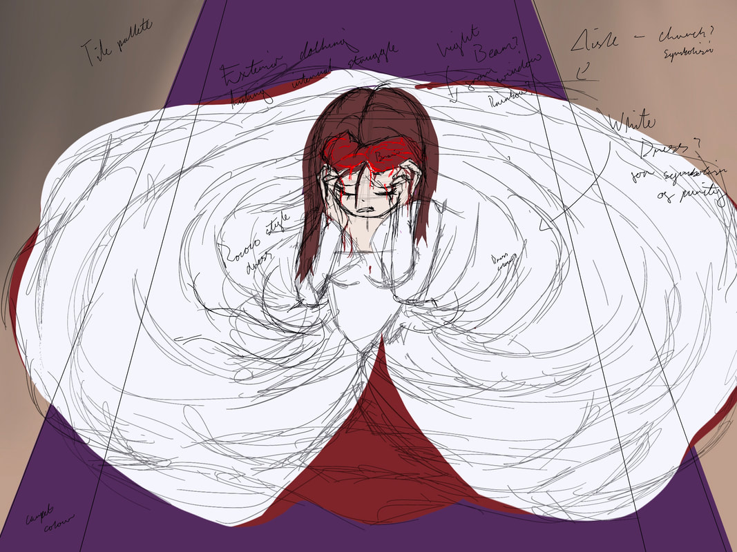
wearing a white dress symbolic of purity. Needless to say, there could be quite a few links drawn between this image and religion, specifically marriage. An analogy for forced relationships and traditions pushed onto the unwilling. In truth, this concept could be interpreted many ways, most of which don’t paint religion in a good light. When sketching this idea this wasn’t really my initial concept, but it just evolved into it during the creative process. This is most likely a result of me subconsciously drawing from my own experiences with religion as a whole. However, ultimately I decided not to continue with this concept any further as it seemed too likely to cause offence.
fitting as it re-contextualises the mythological subject matter, changing it from the traditional light pastel style and bringing it into the contemporary world with underlying symbolism and dark gothic pallet. If I were to develop this idea I would probably illustrate it in a contemporary Japanese style.
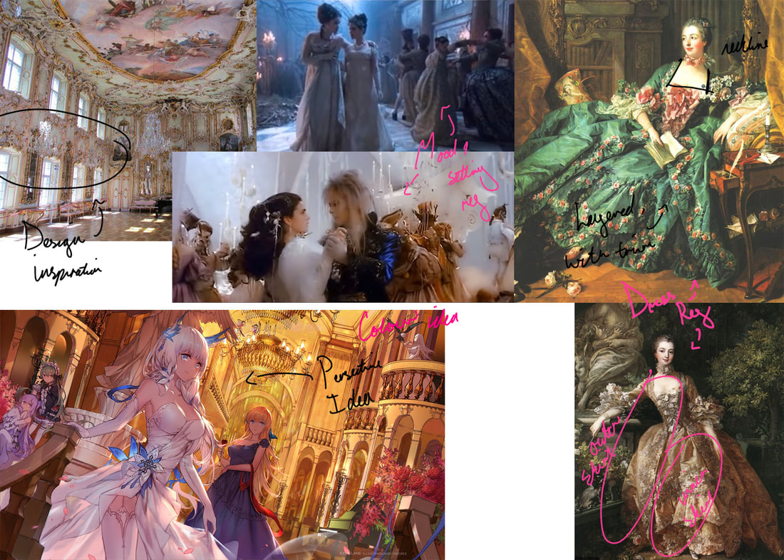
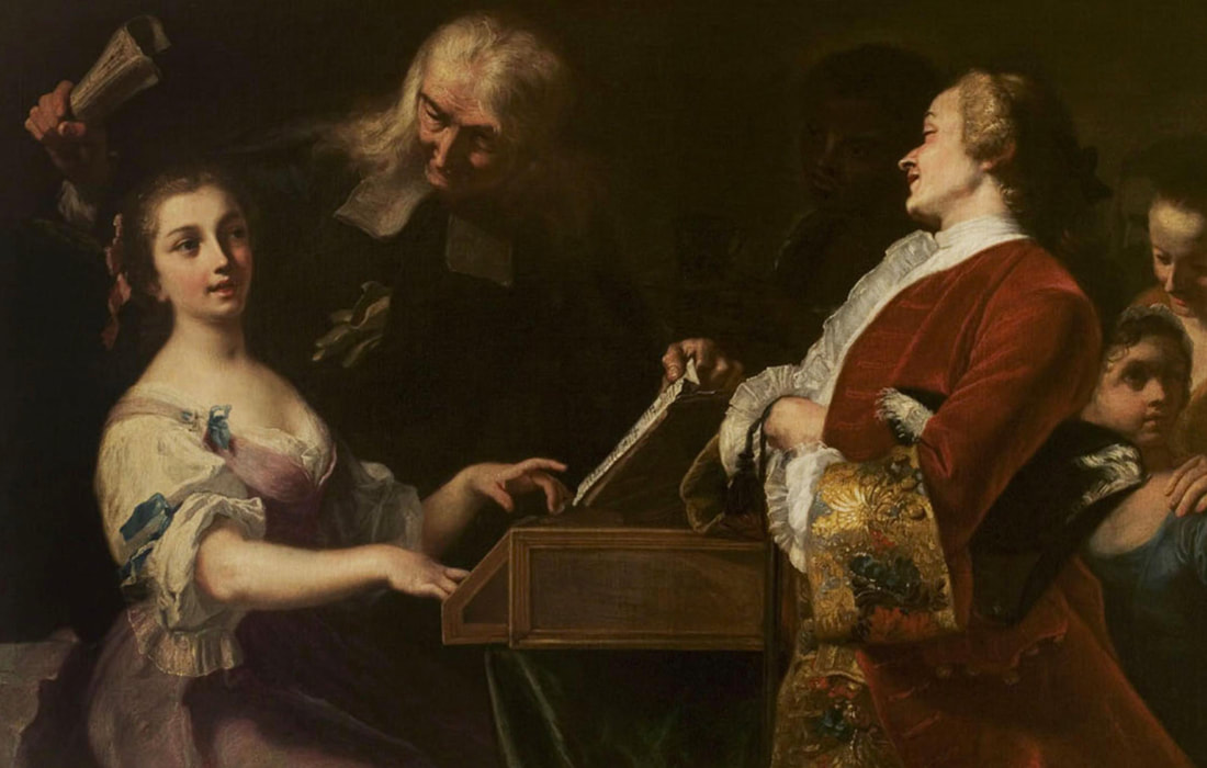
After deciding to go with my first idea I then conducted a variety of research on my chosen themes, them being Rococo, Gothic Art, Japanese Illustration and Semi-Realism. RococoIntroduction - Reason for including itGiven how Rococo fashion, art and design has always intrigued me, now seemed the perfect opportunity to explore it. During this project I intend to use elements of this style in the setting and technical application of my work, specifically using design elements from the fashion and architecture to sculpt my pieces. What is it?Rococo is an art movement dating that took place from the early to late 18th century, primarily originating in France. It was exceedingly popular with the french monarchy and aristocracy. The style itself was characterised by highly romantised paintings of the upper classes engaging in leisurely activities often surround by plants. It is also well none for its interior design that featured many elaborately crafted ornate botanical motifs typically found decorating the furniture and walls of french Salons of the 18th century. More in-depth research can be found in my essay below that discusses many the characteristics and contextual influences of Rococo.
Artist Research - Francois Boucher
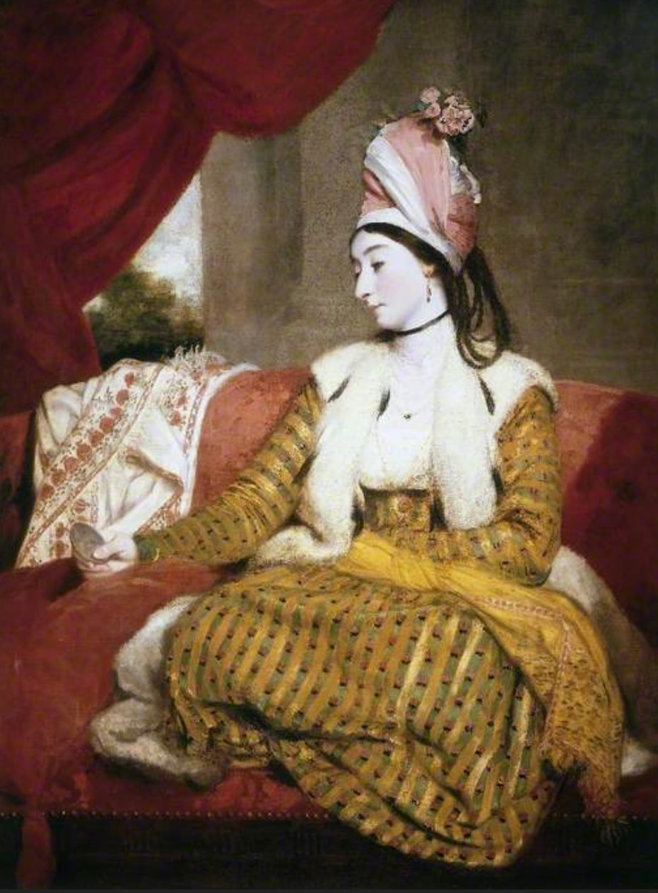
Analysis - The Triumph of VenusOne of François Boucher’s most influential paintings was his 1740 The Triumph of Venus, an oil on canvas steeped in mythological eroticism. A piece that perfectly depicts both the social and artistic backgrounds in which this artwork was created, whether intentional or not. As it mimics the grandiose stylings of the Baroque while combining it with the femininity of the Rococo, and the perceived promiscuity of the french aristocracy. The painting itself features a very stereotypical colour palette for Rococo with the light blue and pink. Two pastel colours very light and airy that are often associated with feminine qualities, similar to how the Rococo movement is considered the feminine version of Baroque. Needless to say, but this is a romantised depiction of mythology, complete cherubs, doves and most notably, naked women. Features that would of course appeal to the audience of this art, more specifically the french aristocracy who at this time sort luxury and escapism above all else. Primary ResearchI was also able to conduct a bit of primary research when I visited Compton Verney, being able to observe two painting created in the Rococo era. When there I was surprised by the scale of the paintings and attention to detail displayed in the technical application of the oils.
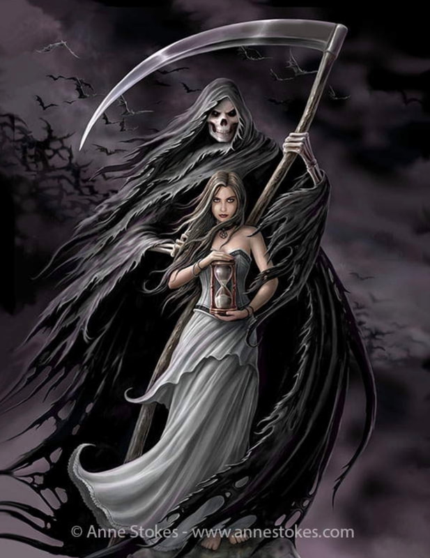
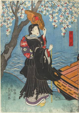
GothicIntroduction - Reason for including itThis particular influence can be split into two different, but related sections. The first being the narrative elements of gothic horror (or fiction) that I intend to weave into my work. Elements and themes such as madness, romance, curses and hauntings, found in such work as The Phantom of the Opera (book 1909, and musical 1986) and Labyrinth (film, 1986). The second is the stylistic elements that I may incorporate such as the composition and colour choice, found in contemporary gothic art. Contemporary Gothic ArtContemporary gothic art or neo-gothic art as its sometimes referred to is an artistic movement originating from the 1980’s punk scene. The style has a focus on dark subject matter using sometimes obscene imagery to convey a message. As such the movement has a somewhat turbulent past, likely contributing (in part) to the Satanic panic of the 1980s. However despite it’s rocky beginnings gothic art and subcultures still thrive to this day. Some contemporary gothic artists include; Anne Stokes, Aly Fell and Scott Fischer. Japanese IllustrationIntroduction - Reason for including itI am also particularly inspired by the stylistic elements Japanese illustration and animation as such it seemed only natural to include it in this project. Though I am more accustomed to contemporary Japanese works, I also decided to look into traditional illustrations. • TraditionalThough there are many areas of traditional Japanese illustration and art, the one I want to focus on in particular is the Ukiyo-e prints of the Edo period (1615-1868). Ukiyo-e (translating roughly to “pictures of the floating world”) were wood block prints that initially depicted the brothel and theatre districts of japan, but later depicted all forms of subject matter. Following the new wealth of the merchant classes, the style grew in popularity as it was able to be produced in mass and sold at low rates. This in turn solidified woodblock printing as a titan of Japanese illustration, spawning many sub genres of the style such as Yakusha-e (actor pictures) and Kachō-ga (bird and flower). Notable Ukiyo-e artists include Utagawa Kuninao (1793-1854) and Katsushika Hokusai (1760-1849). • ContemporaryContemporary Japanese illustration comes in many differing styles however the main one I shall be taking inspiration from is the anime/manga style. Specifically the style seen in music videos such as those illustrated by Orihara and LAM(Ramdayo) two freelance Japanese artists. This style of contemplation japanese illustration is often called anime illustration. It is typically used as concept art for animations, however it can also be utilised in a multitude of ways. One such way is in the online content creation space, where the style is often used for music videos and streamer art. Artists who create art in this style are work as freelance illustrators though there are those you work under agencies. Artist Research - OriharaOrihara is a Japanese Illustrator most well known as the artist responsible for creating the illustrations featured in Ado’s (a japanese singer) music videos. They are described as an artist that “specializing in producing image of persons living in the digital world” by J-Entertainment (a website that aims to broadcast Japanese art and media to a wider audience). However not much is known biographically about them. Analysis - ギラギラ (Gira Gira)
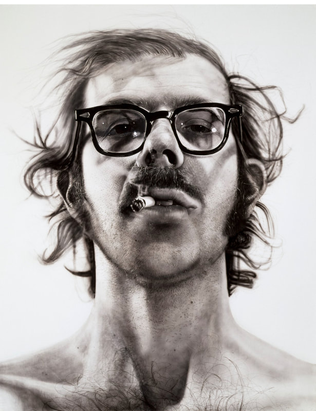
saturation of the colours gradually picks up as the song builds in intensity, again reflecting the mood of the song in the illustrations on screen. The song is about a girl who grows up in a beautiful world, yet never receives any love (only pity), as a result of a deformity. A duality perfectly encapsulates by the use of classical imagery and motifs such as cherubs, statues, angels, classical architecture and patterns. Contrasted by the cogs, scissors, scrolls, wires and knifes that frame the entire music video. A personification of how the world in the song is rough and artificial despite the beautiful exterior. As this is a music video, the illustration and rendering style is rather minimalist. Firstly, (I imagine) this was a time saving measure as after all animatics take a long time to produce. But secondly, it could also be a conscious stylistic choice. As it could be said this type of rough minimalism is a reflection of the protagonist of the video, and how she ultimately rejects the decadence surrounding her. As such it would only be fitting to draw her story in a manner that suits her. Semi-realismIntroduction - Reason for including itSemi-realism is another style I am particularly interested in, having created a couple portraits recently in this style. As such I would specifically like to expand on my abilities to create this type of art in this current project. I intend to take inspiration from how vividly light and colour are painted in the semi-realism style. What is it?Semi-realism is a style that seeks to combine elements of stylistic drawing with realistic depictions of life. An easier way to explain it would be to imagine drawing a cartoon but painting it as realistically as possible. The style is often linked to manga and anime, but can also stand alone as a way to describe any piece of work where some elements such as lighting and colour, may be intentionally exaggerated for artistic purposes. Due to the fact that semi-realism is still in its infancy there is no definitive one thing that semi-realism can be explained as being, likewise it is equally as difficult to find an artist of that specifically uses this style. Therefore making artist research rather difficult. Artist ResearchAs there is not much on artists who work in the semi-realism style, I decided instead to look into an artist who practices photo-realism, or rather did. That being Chuck Close (1940-2021). An American artist known for his large-scale portraits, he is considered one the the key figures in pioneering the photo-realism genre. A genre that aims to depict subjects in extreme detail akin to a photograph. Analysis- Big Self Portrait
which he watered down to the consistency of “dirty water”, to ultimately achieve this painting. The entire piece is in black and white, a conscious choice the artist made so highlight different textures in the portrait itself, from the smoothness of the skin to the rough of the hair. The result of which leaves the painting with a dramatic cold-hearted impact, that lays bare the artist’s face for all to see. A feet some may consider brave. When constructing his portrait, Chuck Close talks about how he intentionally choose an image that made him seem tough, with a cigarette in his mouth looking down at the audience. As this is was how he wanted to be perceived at the time. The reason for which could be many things, but one such reason could be the artist’s own insecurity. That this is an indication of how the artist only feels comfortable with his own image, when it is displayed in such a stand-off manner. It could also be a result of external circumstances, that made the artist wish to present himself in such a tough regard. References*Doesnt include essay references*
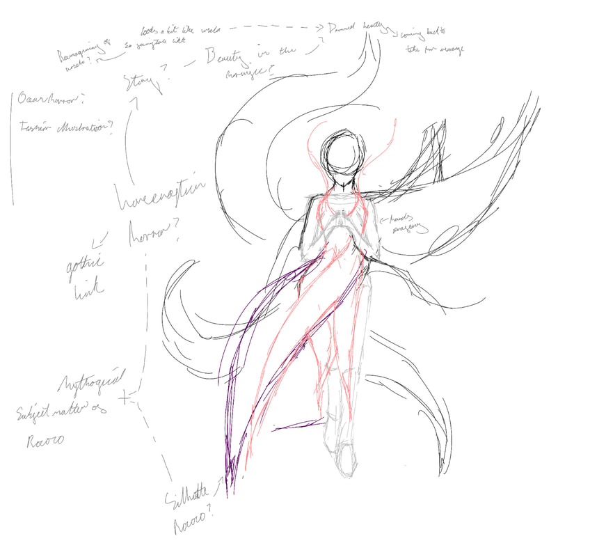
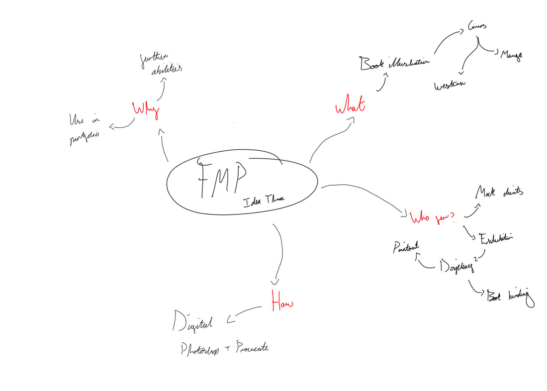
The first thing I did was generate three separate ideas, each focussing on different areas I might want to explore. Idea OneMy first idea was to create an illustration(s) based around several interests of mine. Finding a way to combine, at least some of them together with an overarching theme of meta commentary. Given how convoluted this could all get I may focus in on certain themes and topics, more than others. The themes I wish to explore include, Rococo, Beauty, Horror, Dance and Social Commentary, each of these topics include a wealth of inspirations. Proposed Artist Research
Pros vs Cons of IdeaPros
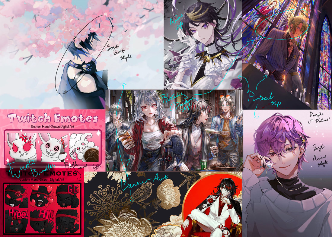
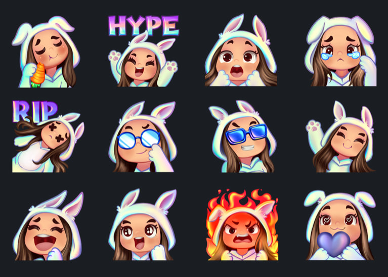
Idea TwoMy second idea was to create channel art for content creators in a mock live brief style, something I have done a lot before with my own commission work. The only difference between now and back then, would be that I would now be able to do things I wasn’t able to do previously. Whether that be due to time or brief constraints set by the client. The idea being that during this project I would create a selection of high quality channel art in the semi-realistic style I like so much (examples included in mood board). These would either be for streamers I know or larger creators I follow. Something which could provide a unique opportunity to get my work out to a larger audience, through social media using the streamers’ own art hashtags. Proposed Artist ResearchFor this second idea it is hard to pin down any specific artist as most channel art and streaming assets are down by freelance graphic designers and illustrators of varying skill. Given that definition, even I myself fit into that category. However one of the more renown freelance illustrators I’ve been able to find, is a company by the name of “Visuals By Impulse”.
Pros vs Cons of IdeaPros
Idea ThreeMy third idea meanwhile was to create a series of book illustrations either based off pre-existing works such as books and films or narratives of my own making. They would be created in digitally in Procreate and/or Photoshop and would be for mock clients. Something I could then present at the end of year show either as a digital printout or in a book format. Proposed Artist Research
Pros vs Cons of IdeaPros
Project Proposal and PlannerAfter deciding to go with my first idea, I then wrote up my project proposal and planner which you can find below.
|
|||||||||||||||||||||||||||||||||||||||||||||||||||||||


 RSS Feed
