|
After deciding to go with my first idea I then conducted a variety of research on my chosen themes, them being Rococo, Gothic Art, Japanese Illustration and Semi-Realism. RococoIntroduction - Reason for including itGiven how Rococo fashion, art and design has always intrigued me, now seemed the perfect opportunity to explore it. During this project I intend to use elements of this style in the setting and technical application of my work, specifically using design elements from the fashion and architecture to sculpt my pieces. What is it?Rococo is an art movement dating that took place from the early to late 18th century, primarily originating in France. It was exceedingly popular with the french monarchy and aristocracy. The style itself was characterised by highly romantised paintings of the upper classes engaging in leisurely activities often surround by plants. It is also well none for its interior design that featured many elaborately crafted ornate botanical motifs typically found decorating the furniture and walls of french Salons of the 18th century. More in-depth research can be found in my essay below that discusses many the characteristics and contextual influences of Rococo.
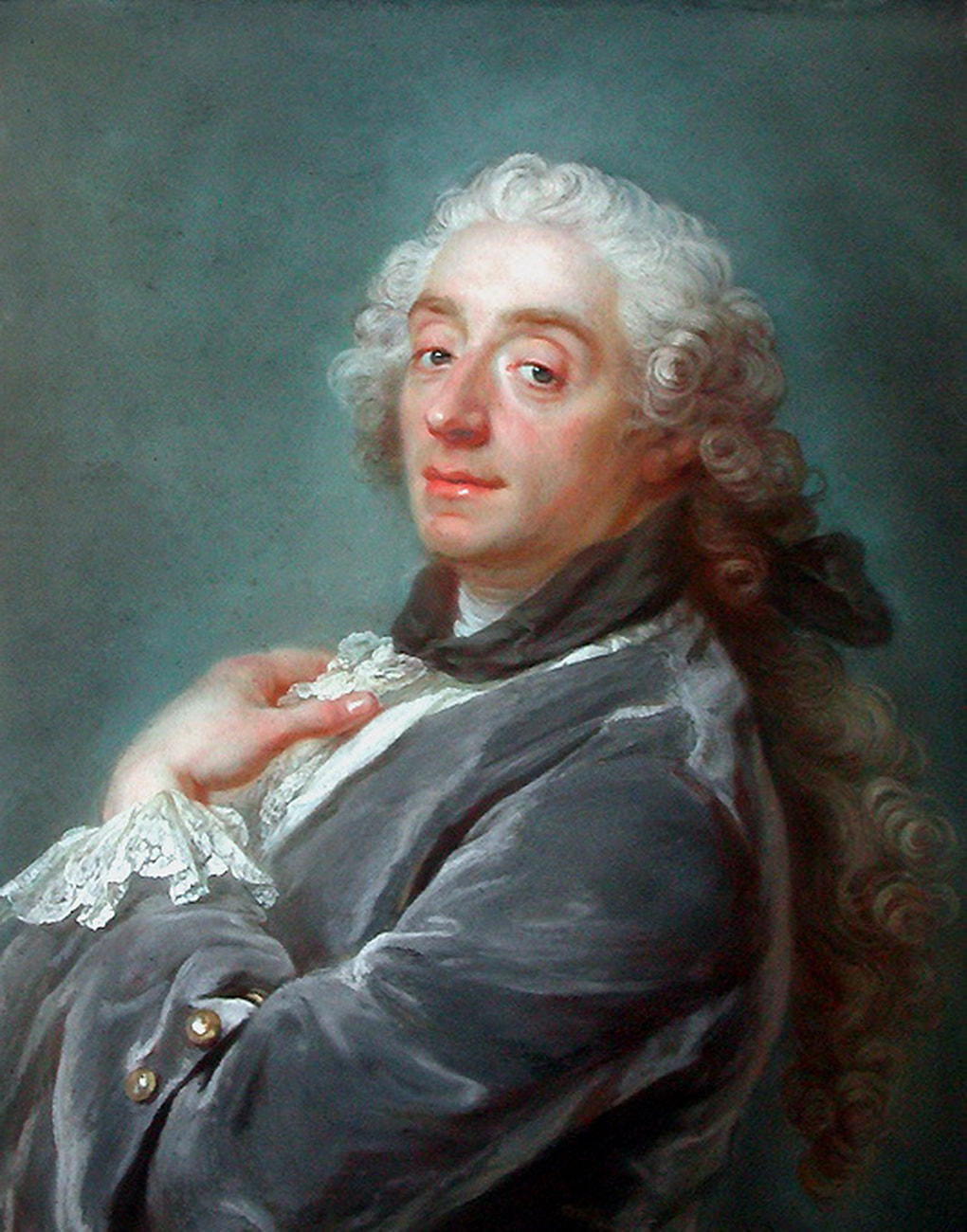
Artist Research - Francois Boucher
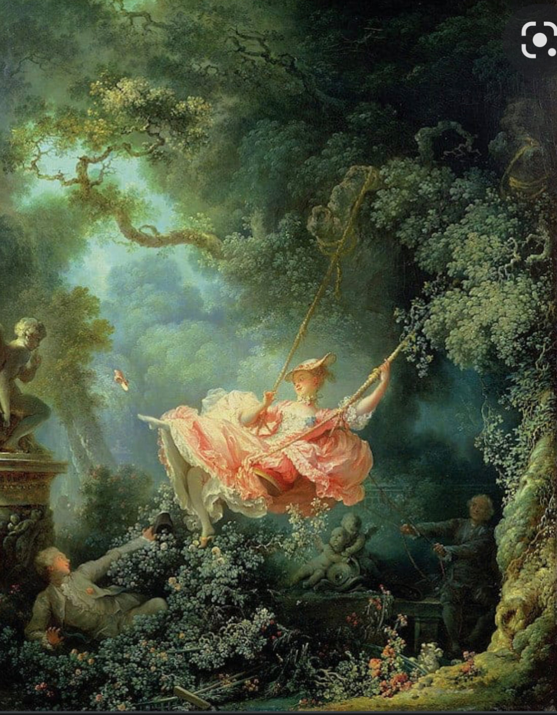
Analysis - The Triumph of VenusOne of François Boucher’s most influential paintings was his 1740 The Triumph of Venus, an oil on canvas steeped in mythological eroticism. A piece that perfectly depicts both the social and artistic backgrounds in which this artwork was created, whether intentional or not. As it mimics the grandiose stylings of the Baroque while combining it with the femininity of the Rococo, and the perceived promiscuity of the french aristocracy. The painting itself features a very stereotypical colour palette for Rococo with the light blue and pink. Two pastel colours very light and airy that are often associated with feminine qualities, similar to how the Rococo movement is considered the feminine version of Baroque. Needless to say, but this is a romantised depiction of mythology, complete cherubs, doves and most notably, naked women. Features that would of course appeal to the audience of this art, more specifically the french aristocracy who at this time sort luxury and escapism above all else. Primary ResearchI was also able to conduct a bit of primary research when I visited Compton Verney, being able to observe two painting created in the Rococo era. When there I was surprised by the scale of the paintings and attention to detail displayed in the technical application of the oils.
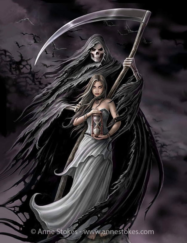
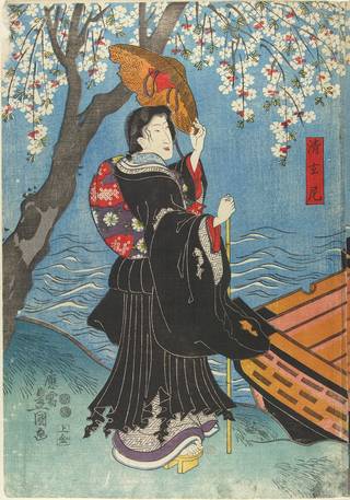
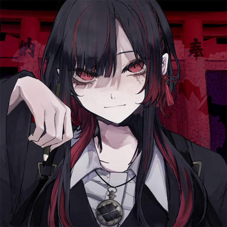
GothicIntroduction - Reason for including itThis particular influence can be split into two different, but related sections. The first being the narrative elements of gothic horror (or fiction) that I intend to weave into my work. Elements and themes such as madness, romance, curses and hauntings, found in such work as The Phantom of the Opera (book 1909, and musical 1986) and Labyrinth (film, 1986). The second is the stylistic elements that I may incorporate such as the composition and colour choice, found in contemporary gothic art. Contemporary Gothic ArtContemporary gothic art or neo-gothic art as its sometimes referred to is an artistic movement originating from the 1980’s punk scene. The style has a focus on dark subject matter using sometimes obscene imagery to convey a message. As such the movement has a somewhat turbulent past, likely contributing (in part) to the Satanic panic of the 1980s. However despite it’s rocky beginnings gothic art and subcultures still thrive to this day. Some contemporary gothic artists include; Anne Stokes, Aly Fell and Scott Fischer. Japanese IllustrationIntroduction - Reason for including itI am also particularly inspired by the stylistic elements Japanese illustration and animation as such it seemed only natural to include it in this project. Though I am more accustomed to contemporary Japanese works, I also decided to look into traditional illustrations. • TraditionalThough there are many areas of traditional Japanese illustration and art, the one I want to focus on in particular is the Ukiyo-e prints of the Edo period (1615-1868). Ukiyo-e (translating roughly to “pictures of the floating world”) were wood block prints that initially depicted the brothel and theatre districts of japan, but later depicted all forms of subject matter. Following the new wealth of the merchant classes, the style grew in popularity as it was able to be produced in mass and sold at low rates. This in turn solidified woodblock printing as a titan of Japanese illustration, spawning many sub genres of the style such as Yakusha-e (actor pictures) and Kachō-ga (bird and flower). Notable Ukiyo-e artists include Utagawa Kuninao (1793-1854) and Katsushika Hokusai (1760-1849). • ContemporaryContemporary Japanese illustration comes in many differing styles however the main one I shall be taking inspiration from is the anime/manga style. Specifically the style seen in music videos such as those illustrated by Orihara and LAM(Ramdayo) two freelance Japanese artists. This style of contemplation japanese illustration is often called anime illustration. It is typically used as concept art for animations, however it can also be utilised in a multitude of ways. One such way is in the online content creation space, where the style is often used for music videos and streamer art. Artists who create art in this style are work as freelance illustrators though there are those you work under agencies. Artist Research - OriharaOrihara is a Japanese Illustrator most well known as the artist responsible for creating the illustrations featured in Ado’s (a japanese singer) music videos. They are described as an artist that “specializing in producing image of persons living in the digital world” by J-Entertainment (a website that aims to broadcast Japanese art and media to a wider audience). However not much is known biographically about them. Analysis - ギラギラ (Gira Gira)
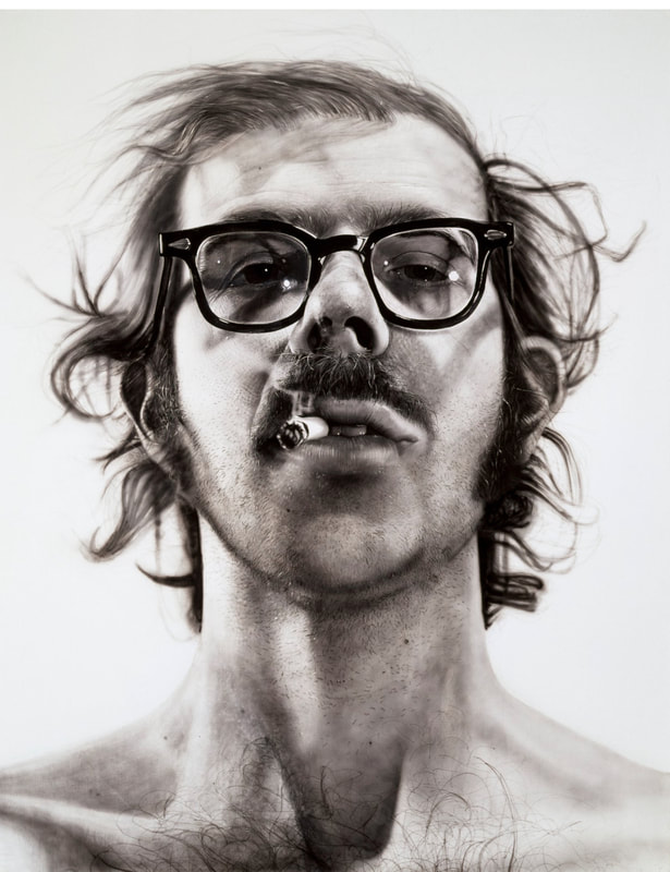
saturation of the colours gradually picks up as the song builds in intensity, again reflecting the mood of the song in the illustrations on screen. The song is about a girl who grows up in a beautiful world, yet never receives any love (only pity), as a result of a deformity. A duality perfectly encapsulates by the use of classical imagery and motifs such as cherubs, statues, angels, classical architecture and patterns. Contrasted by the cogs, scissors, scrolls, wires and knifes that frame the entire music video. A personification of how the world in the song is rough and artificial despite the beautiful exterior. As this is a music video, the illustration and rendering style is rather minimalist. Firstly, (I imagine) this was a time saving measure as after all animatics take a long time to produce. But secondly, it could also be a conscious stylistic choice. As it could be said this type of rough minimalism is a reflection of the protagonist of the video, and how she ultimately rejects the decadence surrounding her. As such it would only be fitting to draw her story in a manner that suits her. Semi-realismIntroduction - Reason for including itSemi-realism is another style I am particularly interested in, having created a couple portraits recently in this style. As such I would specifically like to expand on my abilities to create this type of art in this current project. I intend to take inspiration from how vividly light and colour are painted in the semi-realism style. What is it?Semi-realism is a style that seeks to combine elements of stylistic drawing with realistic depictions of life. An easier way to explain it would be to imagine drawing a cartoon but painting it as realistically as possible. The style is often linked to manga and anime, but can also stand alone as a way to describe any piece of work where some elements such as lighting and colour, may be intentionally exaggerated for artistic purposes. Due to the fact that semi-realism is still in its infancy there is no definitive one thing that semi-realism can be explained as being, likewise it is equally as difficult to find an artist of that specifically uses this style. Therefore making artist research rather difficult. Artist ResearchAs there is not much on artists who work in the semi-realism style, I decided instead to look into an artist who practices photo-realism, or rather did. That being Chuck Close (1940-2021). An American artist known for his large-scale portraits, he is considered one the the key figures in pioneering the photo-realism genre. A genre that aims to depict subjects in extreme detail akin to a photograph. Analysis- Big Self Portrait
which he watered down to the consistency of “dirty water”, to ultimately achieve this painting. The entire piece is in black and white, a conscious choice the artist made so highlight different textures in the portrait itself, from the smoothness of the skin to the rough of the hair. The result of which leaves the painting with a dramatic cold-hearted impact, that lays bare the artist’s face for all to see. A feet some may consider brave. When constructing his portrait, Chuck Close talks about how he intentionally choose an image that made him seem tough, with a cigarette in his mouth looking down at the audience. As this is was how he wanted to be perceived at the time. The reason for which could be many things, but one such reason could be the artist’s own insecurity. That this is an indication of how the artist only feels comfortable with his own image, when it is displayed in such a stand-off manner. It could also be a result of external circumstances, that made the artist wish to present himself in such a tough regard. References*Doesnt include essay references*
0 Comments
|
|||||||||||


 RSS Feed
