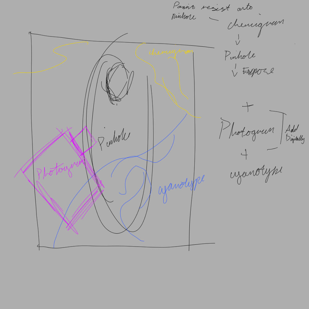
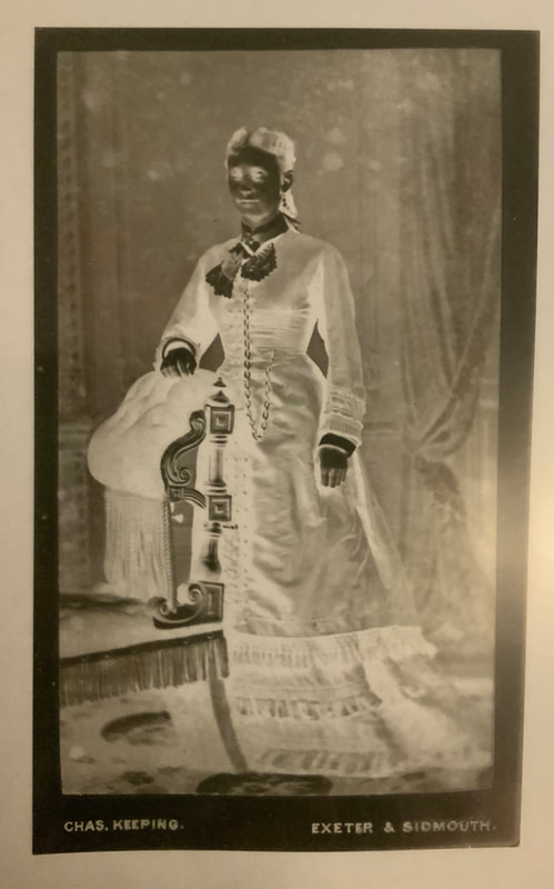
Initial IdeasFirst IdeaMy first idea was to combine all of the elements we’d leant into one piece. All tied together with an overarching theme. That theme probably being Victorian portraiture as firstly I like Victorian things, and secondly why not start with where photography first originated from, the Victorians. How it would work? Well, I’d start with a piece of photographic paper, paint some resist onto it, stick it in a pinhole camera, take a full body portrait of myself in Victorian garb, develop in dark room with a a mixture of spraying developer and developing as normal. Before finally doing a separate photogram of a Victorian item (probably a fancy looking perfume bottle). And lastly a cyanotype of some kind of pattern, again probably lace. I would then combine all these elements on photoshop and that would be the final result. Second IdeaMy second (and less fleshed out) idea was to create something a kin to what Angela Chalmers does in her work but then to also add a mixed media element to it in the form of embroidery. My idea being to create a cyanotype on a translucent fabric and then hand sew an image into it. I was thinking perhaps using flowers to create the the cyanotype and then for the sewing part maybe miss-matching flowers floating over the other flowers of the cyanotype. Though truth be told at this point I think I had already made up my mind on doing the first idea and so coming up with a second was rather difficult. Plan of Execution
After I had made the visualisation I then started thinking about all the materials I would need if I were to do everything as originally planned. The list would include; glue (for chemigram), photographic paper, one pinhole camera (and something to rest it on, maybe a tripod), one piece of lace (for cyanotype), one piece of paper coated in cyanotype, one perfume bottle (for photogram) and finally another piece of photographic paper for the photogram, plus use of the dark room. Needless to say it was at this point it occurred to me that maybe I was over complicating things and it might just be easier to cut down on a couple of the techniques for the sake of time. And so I decided I would do both the perfume bottle and lace as a photogram, and exchange the pinhole for a photo taken using a DSLR camera. Which I could then transfer onto a piece of acetate and use it to create a photogram. The health and safety risks associated with this would just be the usual darkroom and photography studio concerns. See below for both risk assessments.
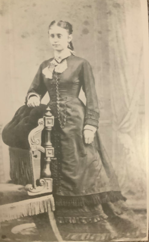
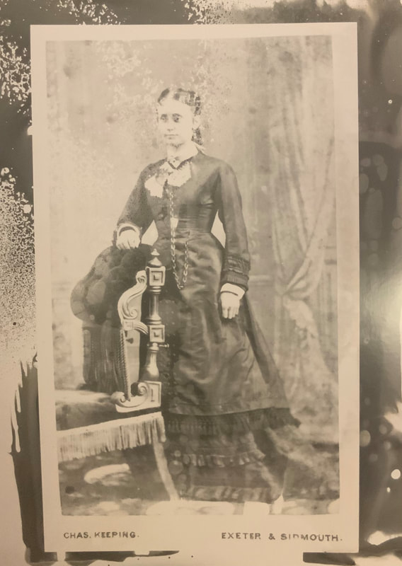
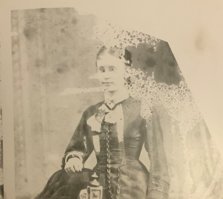
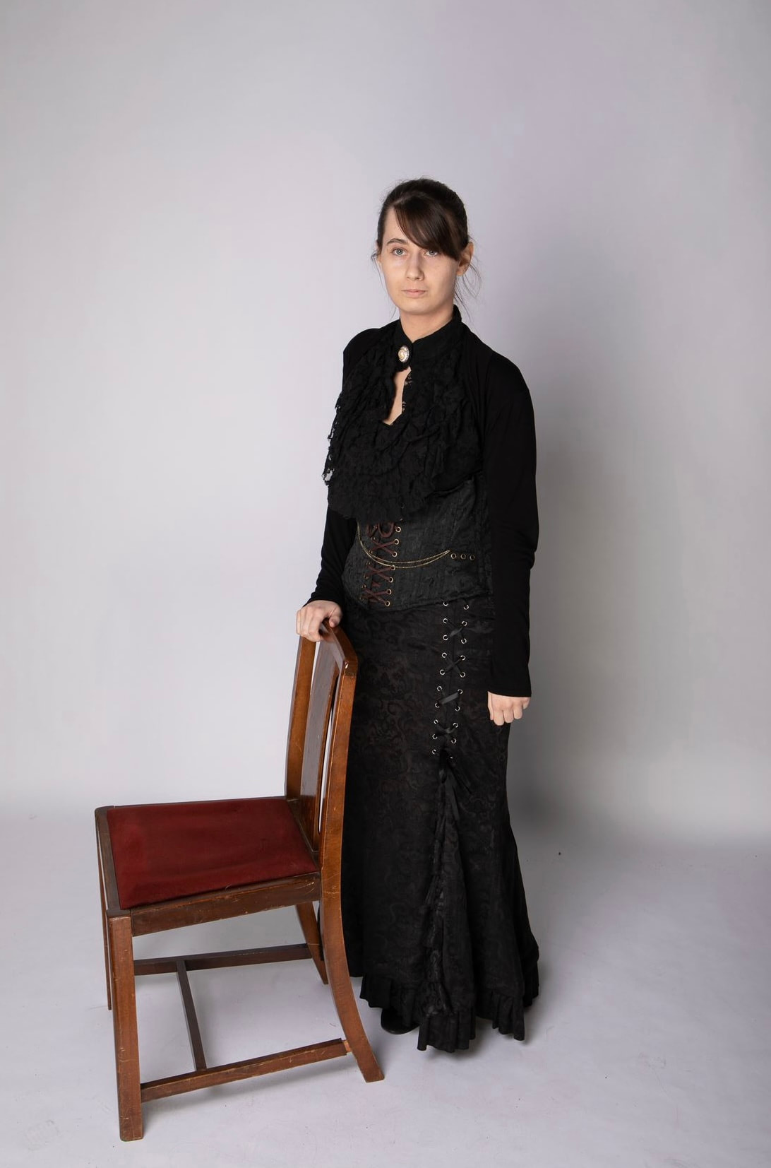
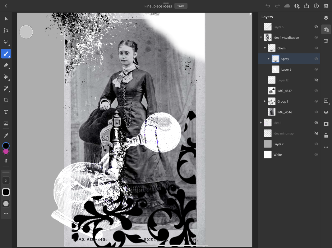
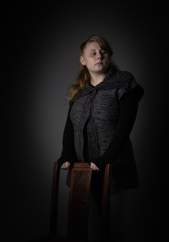
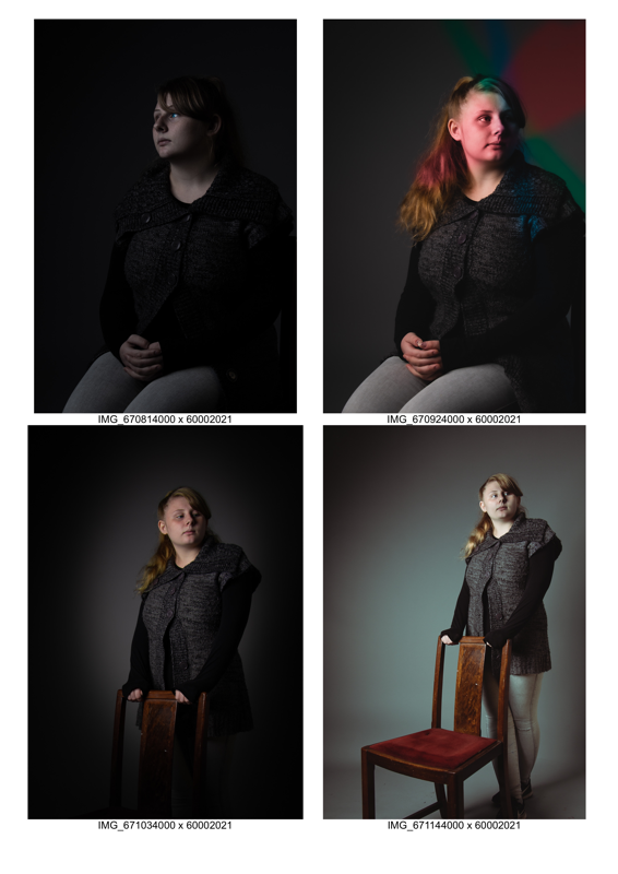
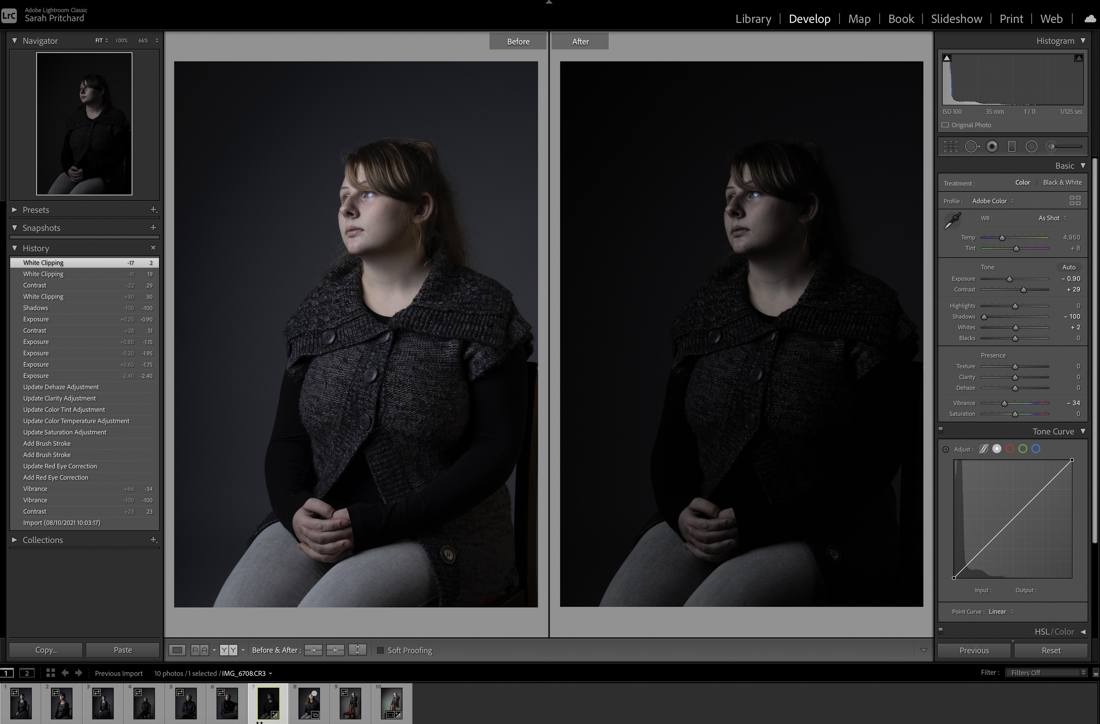
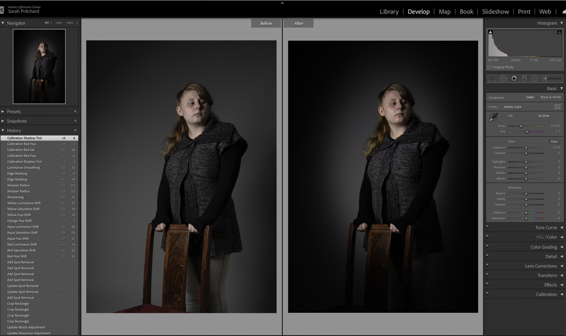
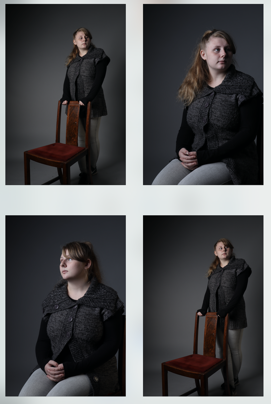
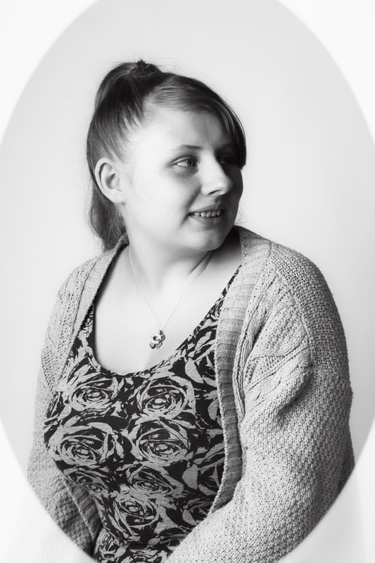
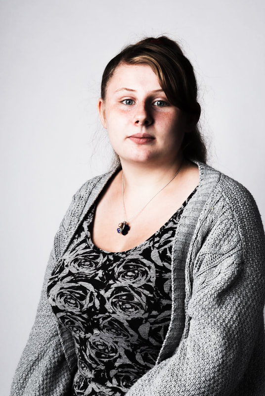
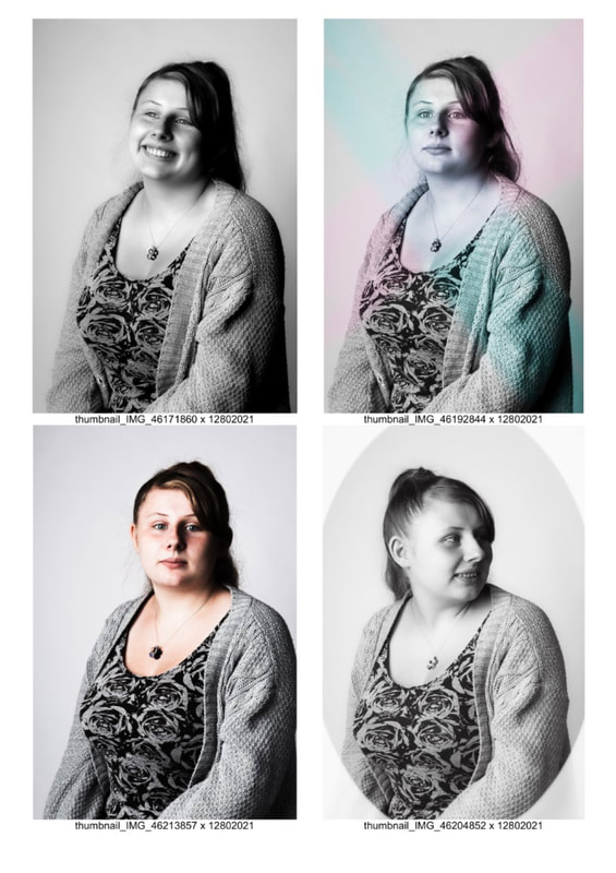
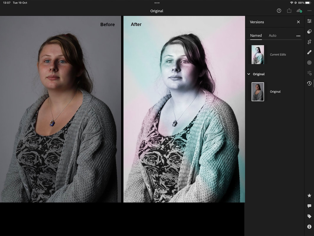
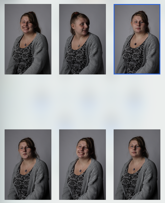
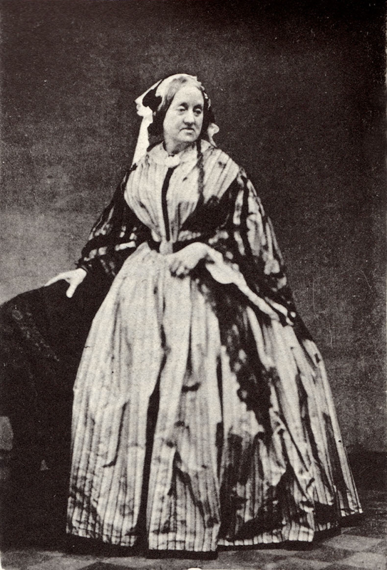
TestsThe next step would be testing out my idea. To do this I asked my tutor to print out the original photo I had found on the internet (but colour inverted) onto a sheet of acetate. Which I could then use to create a photogram in the darkroom and experiment with the development process. First thing I did in my experiment was to create a normal photogram from the acetate without using any spray on paint brushes to apply the developer, just so I had a basis to work off of. After I had done that I then created another one but this time by using a variety of sprays, brushes and sponges to apply the developer so I would be able to see how the different applications would effect the end result. As I expected the spray worked really well and it was definitely something I was going to use for the real thing. The sponge and brush however I wasnt so keen on so I decided to I’d just develop the rest of the image by placing it in the developer as you normally would. During the exposure I also covered the top right corner of one of the images with a board and my ID card just to see how it would look. This is another element I like and intend to use in my final piece. Final PieceTaking the photoFinally I was able to make my final piece. To do this I first enlisted the help of a couple of the guys in my class to take photos of me in the photography studio using a DSLR camera, while I modelled some Victorian esque clothing I had. I decided to pose in a similar fashion to what the original photo was like, the one I found online. As I was wearing a lot of black we had to light the bottom of my skirt too because otherwise it didn’t show up properly on the camera. Editing the photo (Lightroom and Photoshop)Next I then selected the image I liked most and edited it in a combination of both Lightroom and photoshop. First thing I did was put it through Lightroom, turn it black and white and up the shadows. Then I imported the image into photoshop, cut out me and a portion of the chair and then overlap that with the original image I used for my visualisation. I also cut out the figure from the original image. Initially I was thinking of substituting the background for one of my own images I have of Victorian rooms (taken while at national trust houses) however it occurred to me while going through them that none of them would fit exactly what I wanted. And so I just decided to use the background of the image I found online. Only problem with this being that I had to invent textures where I had cut out the figure from the online image since my skirt was no where near as big as the lady’s in the photo. Luckily I have experience with this kind of thing so I duplicated the wall on the left and just carrying on that pattern till it reached my hand, before smoothing out the entire thing. The right wall however was not as easy as their wasn’t really any textures I could just duplicate. So instead I used a variety of brushes to draw the rest of the wall and carpet. I also flattened out some of the details in the original carpet so it would better fit with the rest. Before overlaying a photo of a carpet on the floor part of the image to give it that more grainy carpet-y feel. Finally I ran the image back through lightroom to make it all uniformed. Oh and I also used photoshop to change the inscription on the bottom to my name and towns. Darkroom processOnce I had completed all of the digital elements of my project, I could begin on the analogue. Similarly to my test run, I asked my tutor to print out my new inverted photo onto a piece of acetate. Which I then used to make a series of photograms in the darkroom. I did one full image and two with the spraying technique. I also then did a photogram of a piece of lace and a perfume bottle which I intended to scan in and combine in photoshop. The Last Stage (a.k.a. Back in photoshop again)Unsurprisingly I then scanned in all the images I needed. Before then using photoshop to combine all the images. I decided to overlap two of the full body photos I made in the darkroom as I really liked the spraying texture on one and the detail of the outfit on the other. 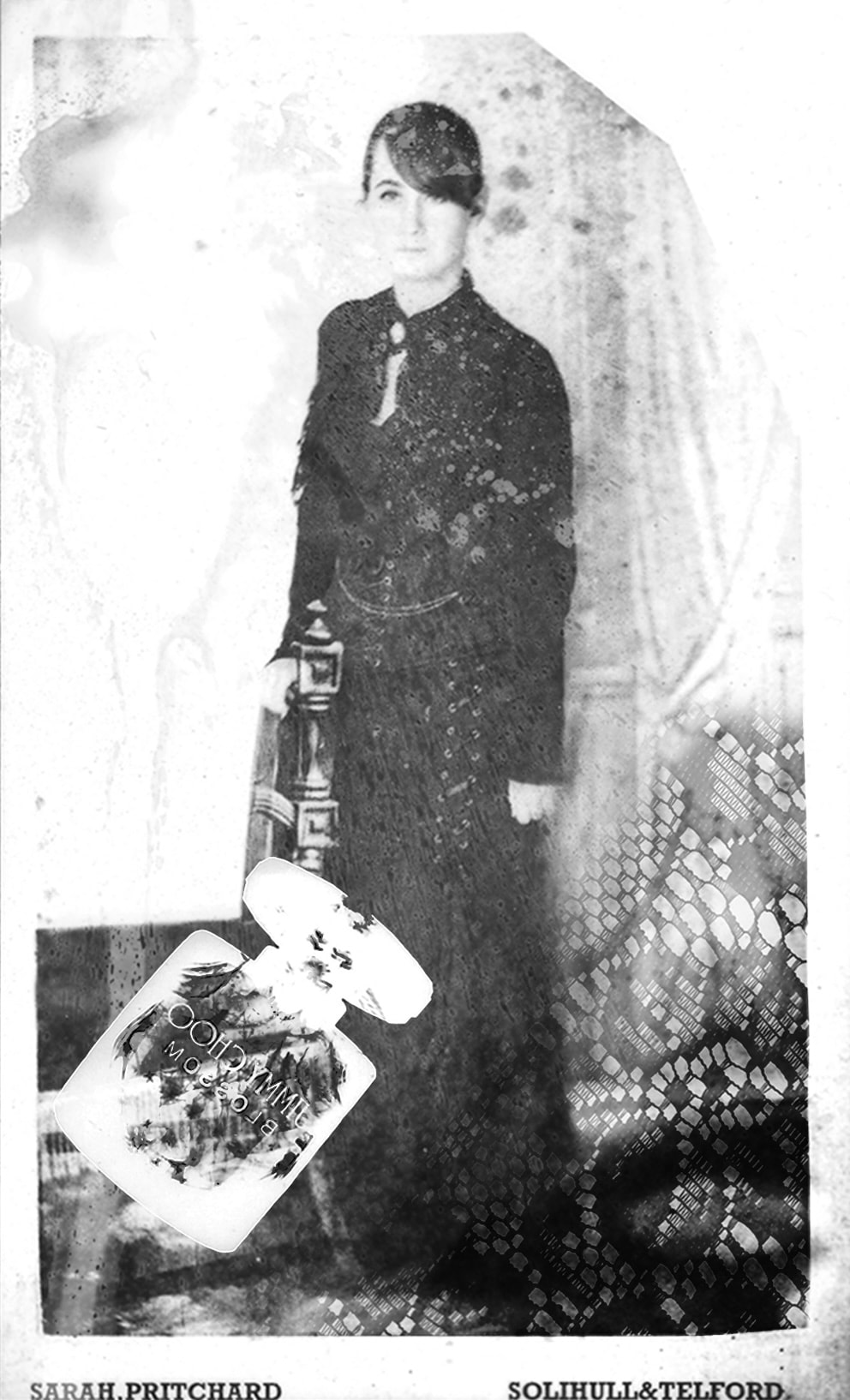 Reflection and InfluencesMust say I’m quite pleased with how this all turned out especially since their were so many steps where things could’ve easily gone wrong. Truth be told if I were to do this again I don’t think I would change anything. I am very satisfied with how it turned out not just from an aesthetic point of view but also from looking at the brief criteria. After all I think this is a perfect way to merge both the analogue and digital aspects of this unit while also tying it all back to the origins of commercial photography, Victorian full body portraiture. With a couple extra items that give it that mixed media feeling which I was thinking of doing with my second initial idea. In that regard you could say that this piece has influences from Chloe McCarrick as she uses a lot of mixed media in her works. However I’d say my final piece is more a kin to the works of Angela Chalmers, with that kind of ghostly imprint of objects overlayed onto people. Of course she primarily works in cyanotypes whereas this is photogram (amongst other things) but it’s a similar concept.
0 Comments
What is the Creative Cloud?
Adobe LightroomAbode Lightroom is an editing software primarily used to edit photography. It has a wealth of functions that can be used to develop photos including colour levels, light levels, masks, brushes, frames and filters. Adobe PhotoshopAdobe Photoshop is again another editing software but this one is and can be used for just about any static image. Whether that be editing photography, making digital art or putting together graphics. However with that being said there is, in most cases, other adobe programs that will be more suited to your specific needs such as Lightroom for photography. But nonetheless photoshop will service for basic needs. Adobe IndesignAdobe Indesign is unsurprisingly another editing software from adobe, mainly used for creating and publishing posters, flyers, brochures, presentations and magazines. In a way it is very similar to photoshop however with Indesign being catered more towards the graphics and publishing world, it has a lot more features better suited for such a need. Features such as: master pages, marks and bleeds, fill and stroke, and many more. Health and SafetyThe health and safety concerns for working with computes are as follows:
Future UseIn the future I’d quite like to learn more about Indesign and Illustrator as I have a brief understanding of both and it’d be nice to be more proficient in the two softwares. I’d also like to use the desktop version of photoshop a lot more in my work as although I’m very capable with the iPad version, I’m not so much with the pc version. In other words (as you’d expect) there’s a lot more buttons in desktop variant, some of which are very foreign to me.
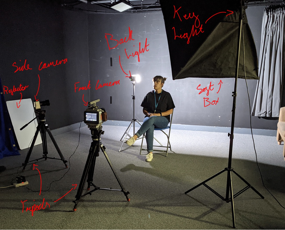
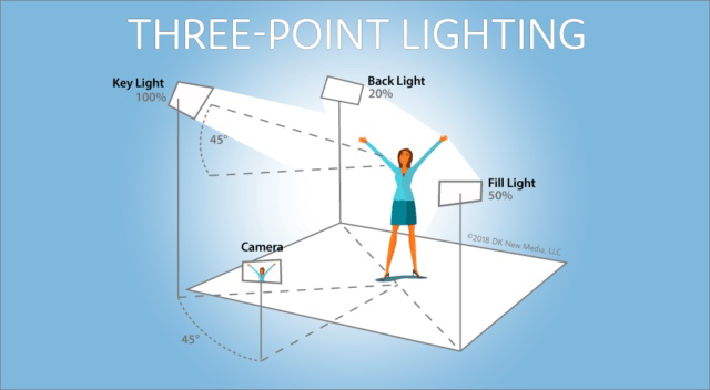
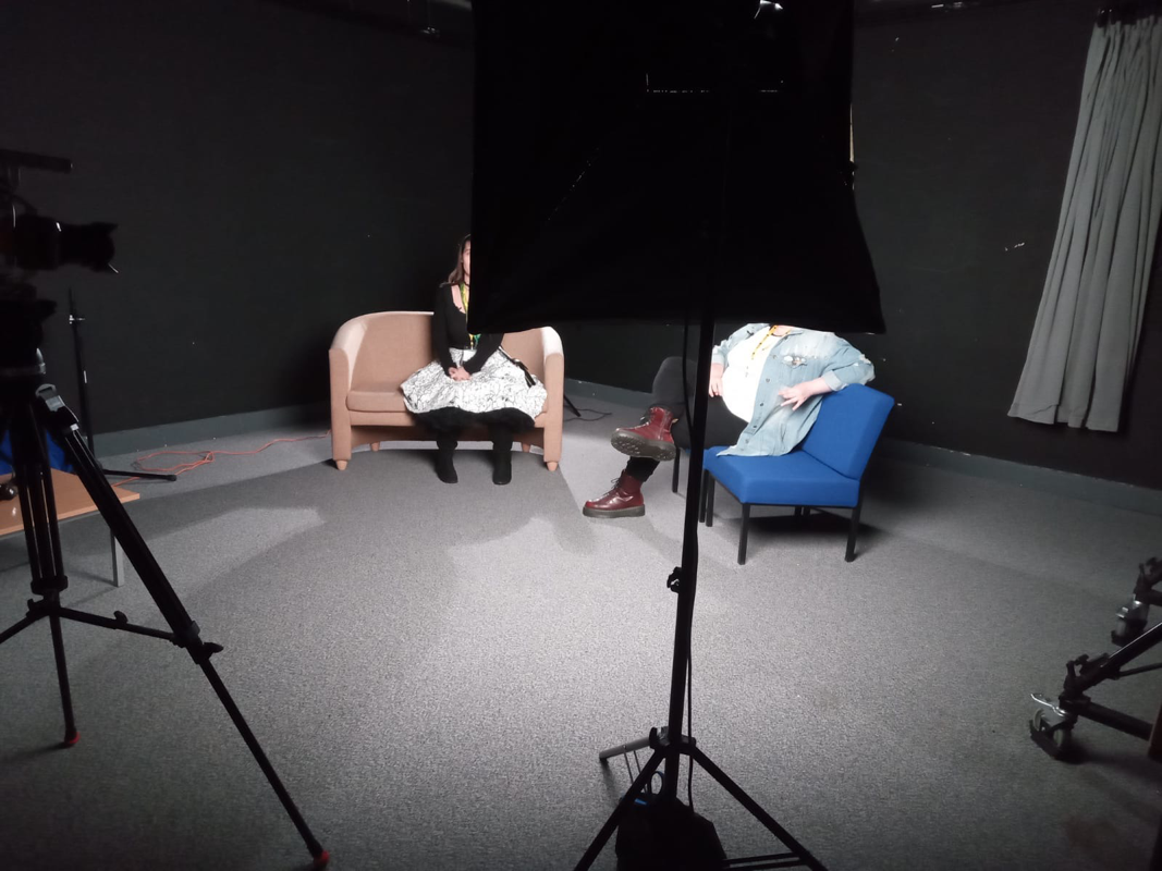
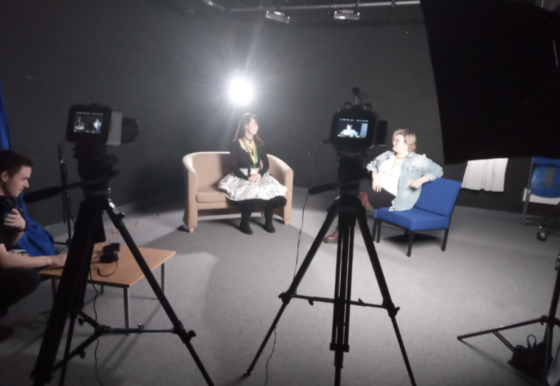
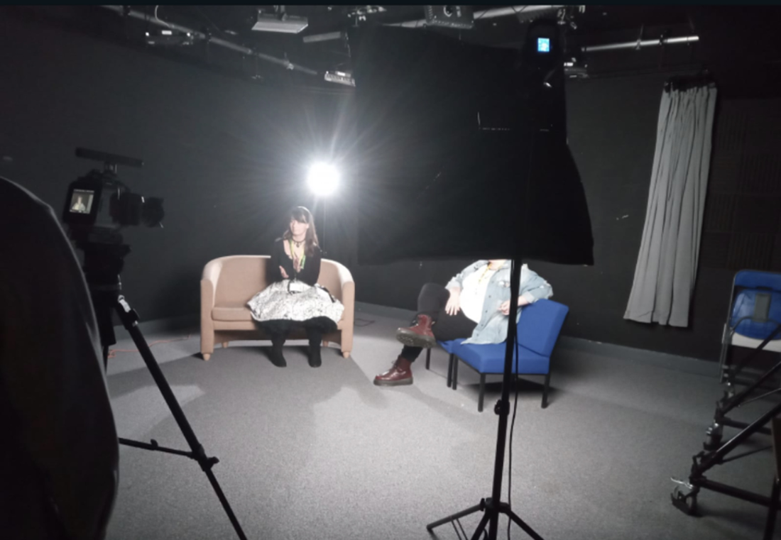
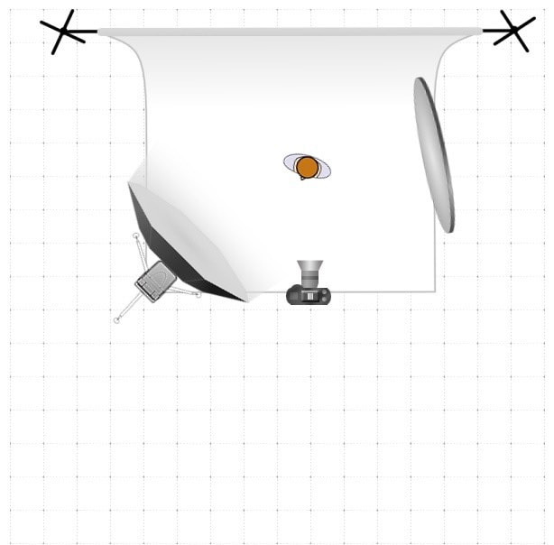
Needless to say I will 100% be using the adobe programs in the future as I feel like I already practically live in Photoshop as it is one of the main programs I use to create digital art. As for lightroom I can see myself using it in the future to enhance images in a similar fashion to what I did with my final piece. Such images I can use in my portfolio and other generalised work. Indesign is something I may also use in my future college work as it is a good way to layout information in a clear and concise manner. I could also make use of it for making and publishing books, as books and illustration do tend to go hand in hand sometimes. And illustration is what I want to do after this course. FilmingIntro to the Filming StudioThe film studios in college is unsurprisingly where most of the filming in college takes place. The studio is made up of a set of three point lights, some over head lights, a reflector, two or more black magic filming cameras, microphones of plenty (we used the clip on ones), a light mixer, changeable background curtains for diversity of colour and of course a few chairs. The walls are also lined with soundproofing foam panels to prevent echo and to reduce the interference of outside noise. LightingWhat is Three point lighting?Three point lighting is a lighting technique employed by film makers and photographers alike. It enables the photographer to successfully light the subject however they should like. Each light can be manipulated to achieve a variety of lighting effects. Each light has a specific name and purpose;
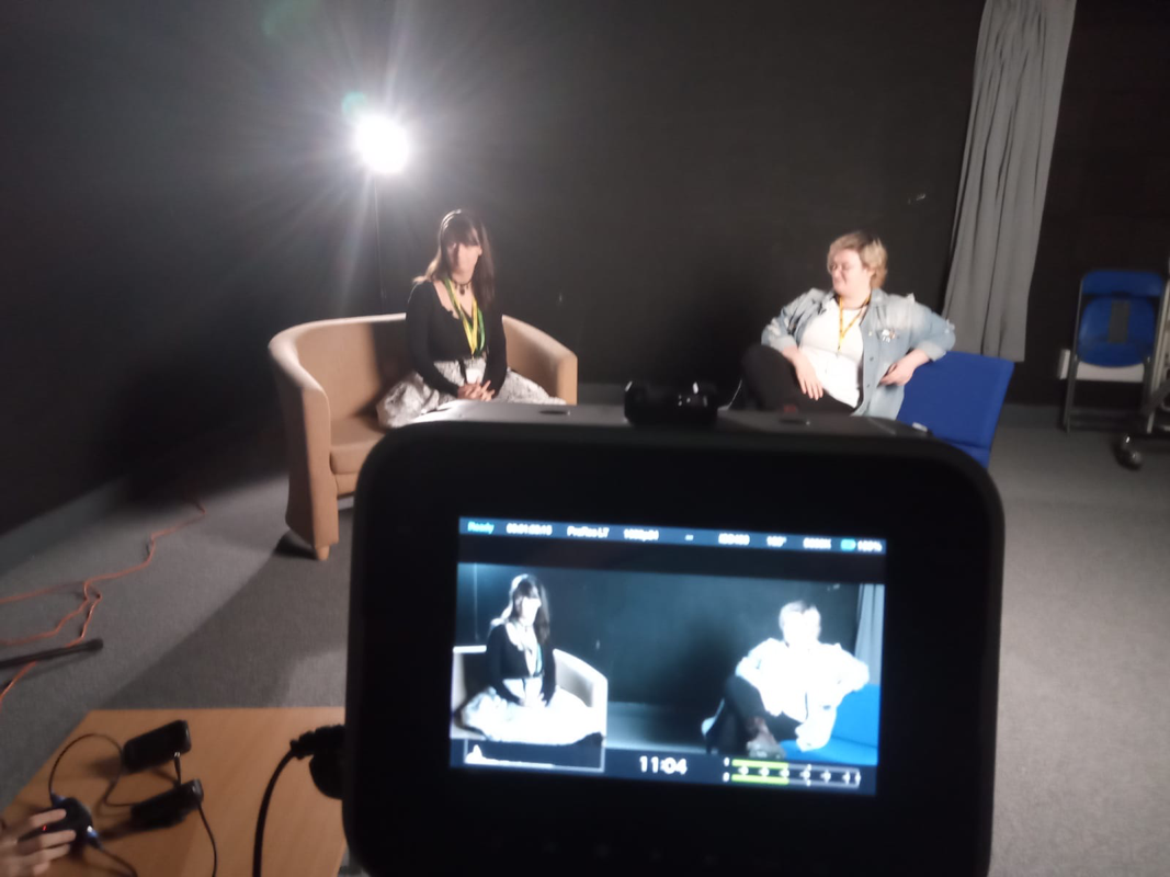
In the future I might make use of the back light to do some very dramatic interview filming, could be quite useful if I decide to go down the crime documentary route. Something which I have been considering for the upcoming documentary unit. InterviewsTo practice our filming capacities, we conducted a series of test interviews between ourselves. Using the filming studio as our set. Equipment we used is as follows; a Black magic camera, a key light and back light, and a pair of clip on microphones to capture our audio. At the beginning of the filming one of us did a single clap to be used later to synch the audio and visual. During the interview I questioned one of my friends on the existence of ghosts, as you do. Though I can’t say the interview was very concise, it was however good practice for using the filming studio to create a short piece of film. Photos of the Interview and Equipment For future interviews I think it’d be a good idea to write down a list of questions I might want to ask an interviewee in advance, that way the interview will flow a lot better and have less dead air. Photography StudiosIntro to the Photography StudiosThe photography studios are unsurprisingly where most of the professional-style photography is shot. It is made up of multiple DSLR cameras (mostly cannons), many lighting devices, an expanse of different background materials and an array of props. You can find a more detailed list of the equipment below. Health and Safety
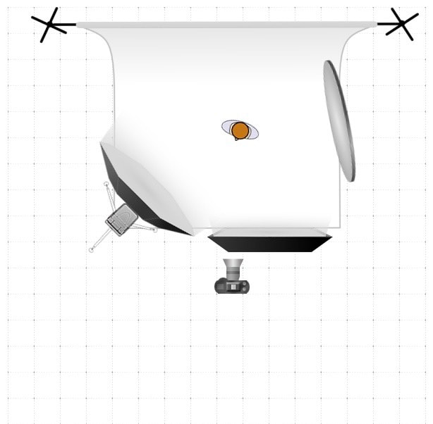
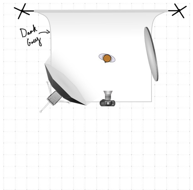
Soft BoxesA soft box is a fabric lamp shade that goes over the studio lights. It works by diffusing the light through the white material on the front of the box. Soft boxes come in many different shapes which can all be used to achieve different effects Types of Soft Boxes
Other Lighting EquipmentOther things often used in conjunction with or instead of a softbox include:
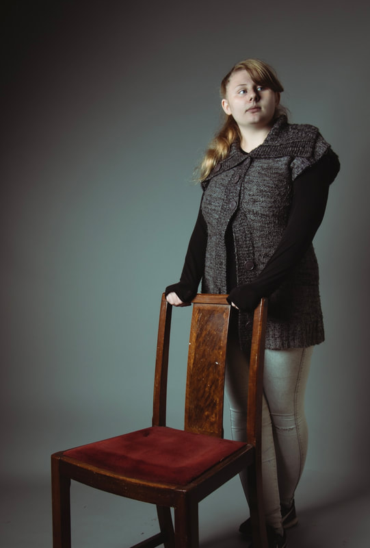
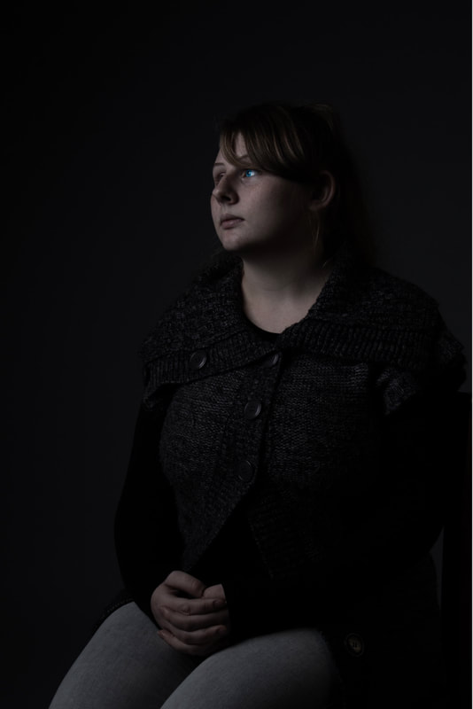
Low Key PortraitureWhat is Low Key Portraiture?Low key portraiture is a style of portraiture, typically stylised by dark moody shadows and background with sharp black and white contrasts. My PhotosAll taken on a canon DSLR camera and edited in Adobe Lightroom
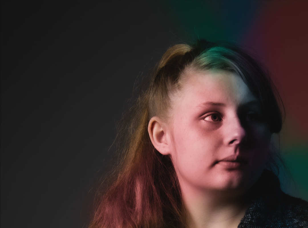
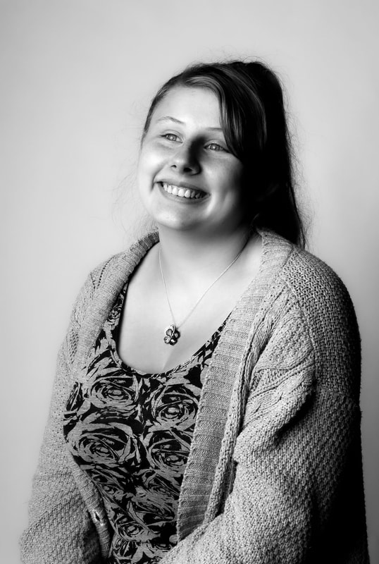
Additional Photos High Key PortraitureWhat is High Key Portraiture?High key portraiture is a style of portraiture that uses very bright lighting to eradicate or reduce shadows. Often characterised by light backgrounds, very exposed edits and the occasional white and black filter. My PhotosThese are my high key portraits, all taken with a canon DSLR camera and edited in lightroom.
Additional photos ReferencesAll information is from my notes of the lessons from my tutor Emma Jukes 1/10/21.
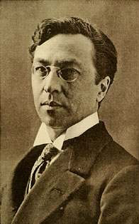
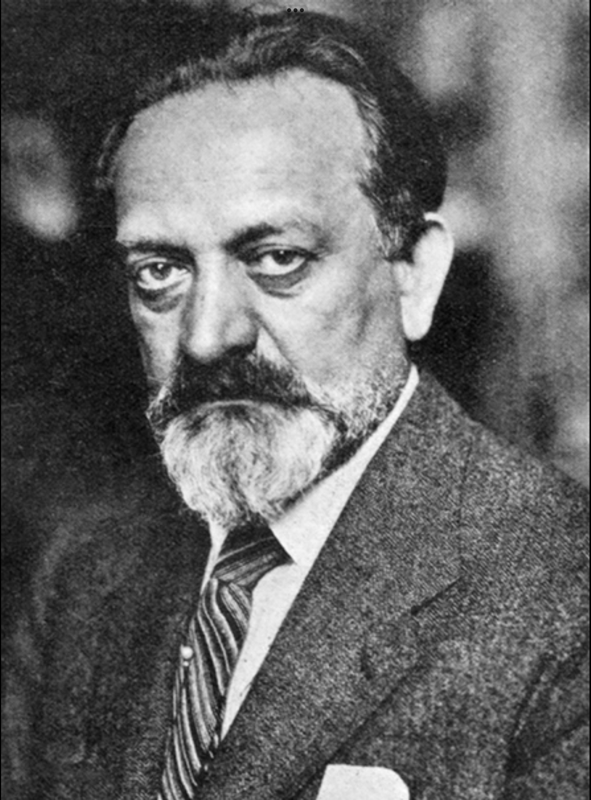
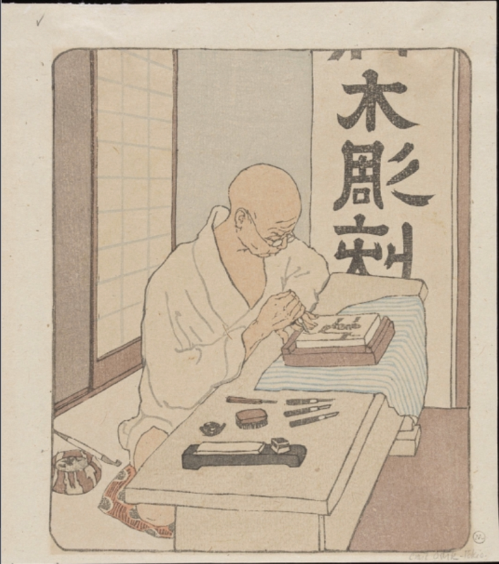
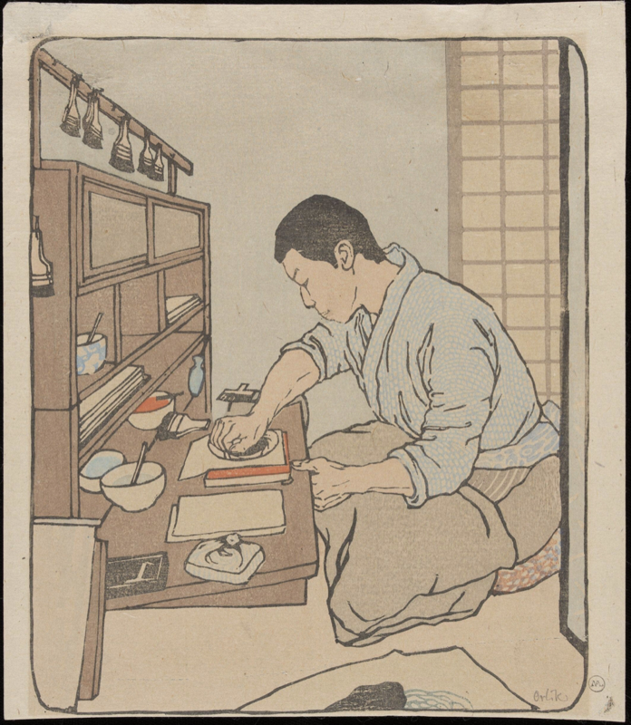
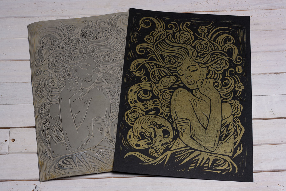
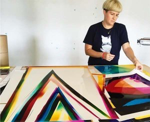
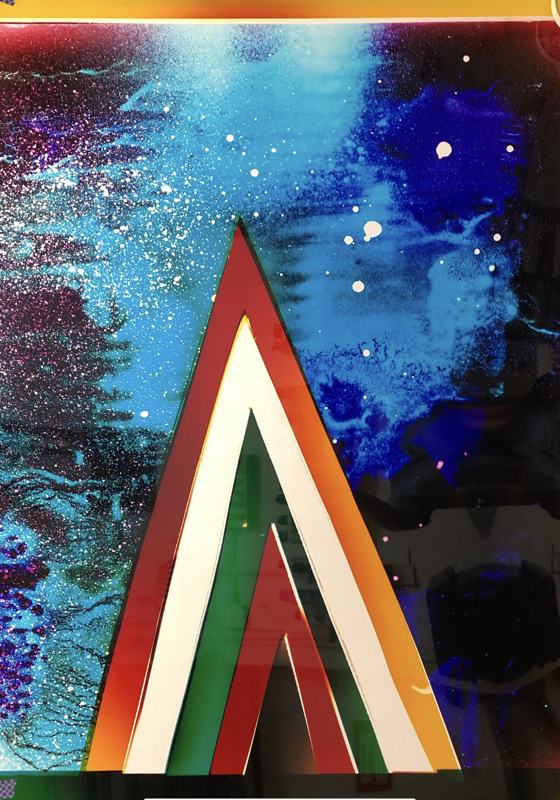
Also used this YouTube tutorial to learn how to use the brushes in Lightroom - https://youtu.be/SsVsrjR3F_s What is Lino printing?Lino Printing is a form of block printing. It consists of drawing a pattern onto a piece of lino (a rubber like substance made of natural materials) and then carving out the desired areas that you don't wish to print with. Before finally inking up the plate with ink using a roller and printing with it onto whatever surface you desire. A Brief History of Lino printingLinoleum (more commonly known as Lino) was invented by Frederick Walton somewhere around the mid 1800s. In the late Victorian era it was used as floor coverings however it wasn’t untill the 1900s that Lino was picked up by artists and used to make reductive prints. Some of the more renown Lino printing artists of the 20th century include Walter Anderson, Pablo Picasso and Henri Matisse. Historical ArtistsVasily KandinskyVasily Kandinsky was a Russian artist born in 1866, known for his abstract paintings and printings. He is widely considered to be a pioneer of the abstract movement and is also credited with being an associate of the “Die Brücke” group, a group of German artists that helped to make Lino cutting an art form. This association (I infer) may have influenced Kandinsky to take up Lino printing in the first place. Emil OrlikEmil Orlik was a painter and print maker born to a family of master tailors in Prague 1870. He is mainly known for his Japanese woodcut inspired lino prints, a style he picked up around the 1900s after travellng to japan. Contemporary ArtistsAndrea LaurenAndrea Lauren is an english print maker and illustrator who employs lino printing to make variety of patterns for textiles. Her work heavily features her love nature, fairytales and storybooks, something that is apparent from her whimsical designs that wouldn’t look out of place in a children’s book. Analysis of WorkThis small collection of butterfly prints from 2016 is one of Andrea Lauren’s many lino prints. To create this piece Lauren layered two different stamps on top of each other, first to create the colour and then the black line over the top. Though it is quite simple compared to some of the other pieces I was looking at, the simplicity of it is rather refreshing and is something I would like to try out. It is not hard to see why Lauren choose lino printing as the medium for this piece, the minimalist approach definitely lends itself to being used in textile patterns and book illustrations. Something which I know Lauren does a lot of. Derrick CastleDerrick Castle is an illustrator and print maker who specialises in creating bespoke prints used primarily for packaging and clothing design. Much of his work seems to have a biker/ retro kind of theme to it. Also reminiscent of early posters. Analysis of WorkThis is a lino print by Derrick Castle titled Little Briar Rose, measuring about 12.5x19 inches. It was inspired by the Brothers Grimms’ classic story of the Sleeping Beauty but with a modern gothic twist to it. Looking at the image, I can see a collection of flowers, a snake and a skull surrounding what I assume to be the sleeping beauty. I believe Castle included these three objects to symbolise parts of the sleeping beauty’s story. The flowers for the fleeting beauty of youth, the snake for the curse that haunts her and the skull for the inevitability of death. All tangled up in her long overgrown hair as the sleeping beauty sleeps peacefully to her untimely death. Perfectly in-capturing the twisted beauty of the Grimm brothers original fairytale. My Lino PrintsEquipment used: 2 ink rollers (one dry, one to roll the ink) A plastic board to roll the ink on A selection of water based inks in different colours A selection of paper, tissue paper and sugar paper of varying colours In order to create my lino prints I first had to create the linocut. For the linocut I choose to do a flower from one of the postcards my tutor provided. To transfer the image onto the lino I first photo copied and flipped the original image, that way when it was traced onto the lino it would be the same as the original. And speaking of tracing to trace the design onto the lino we used carbon paper (a sheet of paper completely covered in ink so when you draw on top of it, whatever you draw is transferred onto whatever the carbon paper happens to be on). After that I then cut out my design using the standard lino cutting tools before inking up the lino and printing with it. First couple prints are all in black so we could see our designs more clearly. Second lot are a mixture of every lino printing technique we could find. Including printing onto different colours, with a combination of inks. I decided to choose colours I thought would compliment the prints design, in other words a lot of green and pink as it is of course a flower. In contrast however I also experimented with darker colours such as red and black to see how the complete opposite would look. To be honest I think both colour choices have their merits, though I think my favourite would probably be the green, black and red. Just because I like them darker (but still natural) tones. Future UseI may use this technique more in the future in my illustration work as it is a good way to mass produce patterns and clothing graphics, two things I can realistically see my self doing. As firstly I am interested in making either wallpaper or fabric patterns in a similar fashion to either William Morris or Andrea Lauren. And secondly I have already digitally designed patterns for clothing, I just haven't had the chance to physically design and also print the said graphics. Something which I could do with lino printing. Health and SafetyThe lino printing process has a couple of health and safety concerns, they are as follows: Cutting Tools - Sharp edges of blades can lead to bodily harm if your hand slips when digging into the lino. Prevented by always cutting away from the body and always keeping other hand away from cutting angle. Can also use a bench hook for extra support so you’re not tempting to support the lino (in a dangerous fashion) with your other hand. In the event of accidental stab-ature, wrap hand to stay blood flow, hold above head and seek medical attention. Ink - Can make floors slippy if dropped, keep away from edges of work surfaces. Can cause skin irritation if use for prolonged periods of time, recommended to use protective creams if regularly handled. Reference Links
https://greatnorthartshow.co.uk/the-history-and-process-of-linocut-print-from-paupers-to-picasso/
https://www.guggenheim.org/artwork/artist/vasily-kandinsky https://books.google.co.uk/books?id=WS-4DwAAQBAJ&pg=PA12&lpg=PA12&dq=when+did+wassily+kandinsky+start+lino+printing&source=bl&ots=ChyGsy2n1h&sig=ACfU3U2yCfZK_QYlg2DDAfEert3mA1ZDeA&hl=en&sa=X&ved=2ahUKEwiJzfKF3L3zAhXM8OAKHRIPDVYQ6AF6BAgmEAM#v=onepage&q=when%20did%20wassily%20kandinsky%20start%20lino%20printing&f=false
https://www.jacobsamuelart.com/gallery/emil-orlik/ http://collections.vam.ac.uk/item/O875724/print-orlik-emil/
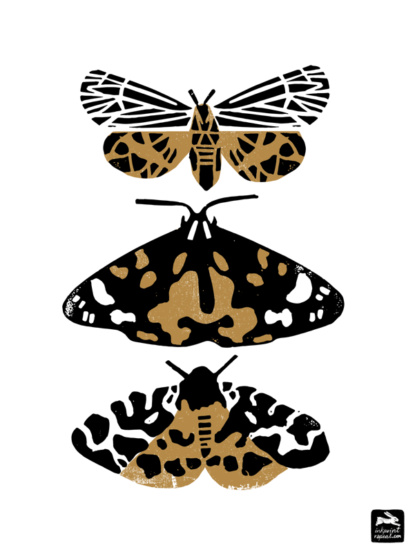
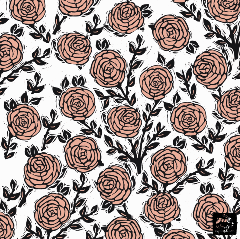
https://www.inkprintrepeat.com http://creativesafari.com/andrea-lauren/ https://instagram.com/inkprintrepeat?utm_medium=copy_link
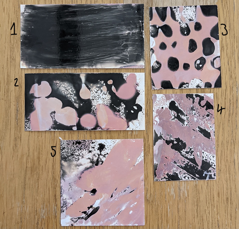
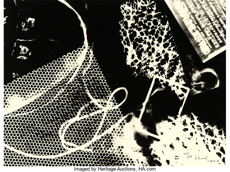
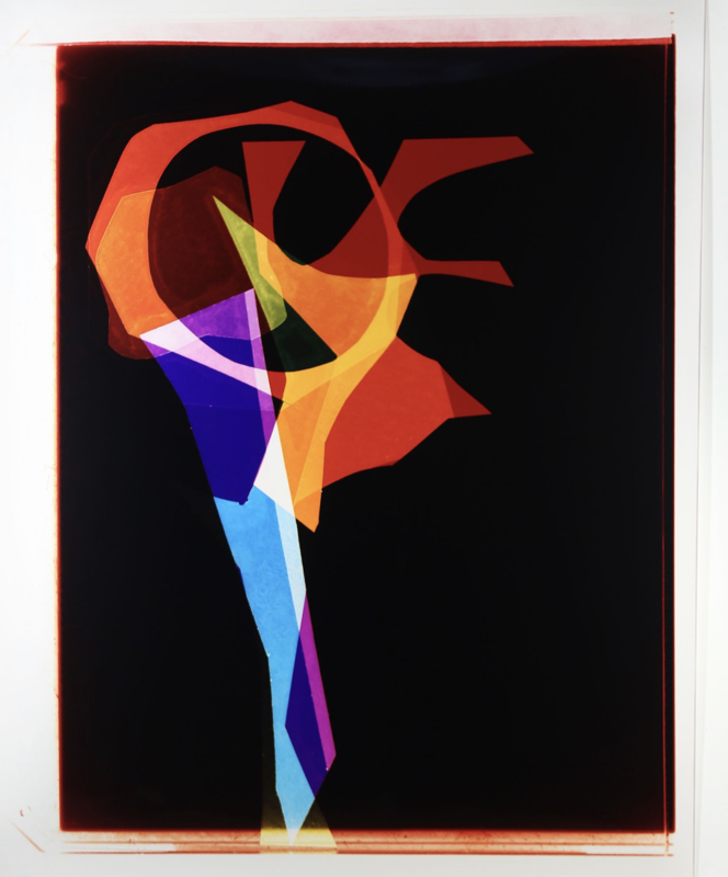
https://www.behance.net/gallery/26075707/Little-Briar-Rose-Block-Print What is a Chemigram?A chemigram is an image created on photographic paper that is neither photograph nor painting but a weird middle ground. To create a chemigram you simply take out of piece of photographic paper in a lit environment and paint a variety of resists onto it, before developing it in an equally chaotic fashion. To clarify- a resist is any material or substance that “resists” the developing chemicals, creating a barrier between the film and the developer. A couple of things commonly used as a resist are: nail vanish, butter, egg, honey, oil, cellotape and grease. Which can all be applied to the light sensitive paper in any manner you see fit, same goes for the developer and the fix. A Brief History of the ChemigramThe Chemigram was invented by Pierre Cordier on November the 10th 1956. When he accidentally stumbled upon the process while trying to make a birthday card. Cordier used a piece of photographic paper and some nail varnish he found lying around to write a simple note on the paper. When he developed it he noticed the nail varnish had begun to move and evolve into something new. And that became Cordier’s first chemigram. After discovering this new type of photograph Cordier started experimenting with different materials and processes creating a wide array of images. Despite all of this it wasn’t until several years later that Cordier went public with his “chemigram”, encouraging other to take up the technique and evolve it into the amalgamation of painting and photography it is today. Historical PhotographersPierre CordierPierre Cordier was and is a Belgian artist/photographer who is considered by many to be the creator of the chemigram. Born in 1933 he has made a wealth of chemigrams despite being self taught, well self taught until 1958 when he was invited by Otto Stienert to attend a course at his school in Germany. Cordier has exhibited his works intentionally including places such as the MoMA in New York and the VA in London. Josef H. NeumannJosef H. Neumann (born 1953) is a German “photo artist” who is believed to have invented the “Chemogram” in 1974. This so called Chemogram is an advancement of the “Chemigram” invented in 1956 by Pierre Cordier. Due to the very similar names it appears the two words and inventors are often mixed up. The difference between a Chemigram and a Chemogram is that a Chemogram first uses an enlarger to enlarge a smaller photographic image onto a larger piece of light sensitive paper. Before then applying a resist to the said paper and developing it as one would a Chemigram. Neumann also seems to combine different chemicals and a type of coloured photographic paper to achieve colourful chemigram/chemograms. But essentially, a chemogram is just a Chemigram with an extra step at the beginning and a confusingly similar name. Contemporary PhotographersNorman SarachekNorman Sarachek is an artist and photographer currently residing in America . He works mainly in chemigrams which he uses to convey a narrative. His inspirations include traditional Chinese and Japanese brushwork and calligraphy, something which is very apparent from looking at his works. Sarachek uses such equipment as calligraphy brushes and chopsticks to achieve the fine brush like lines he does with his chemigrams. Analysis of WorkThis is a Chemigram by Norman Sarachek titled Kokoro (meaning soul or heart in Japanese). It is 7 x 6 inches and was made in 2004. As is quite apparent to see, Sarachek was influenced by traditional Japanese calligraphy when making this piece. Though I can not find anywhere that explicitly states this, I assume it was made with a calligraphy brush, as I know from my research that Sarachek has indeed used such items in his chemigram works. What Sarachek does however say is that he uses a “soft resist” to create the fine expressive lines in the collection this piece is from. Chloe McCarrickChloe McCarrick is a fine artist and photographer living in London, who uses a variety of alternative photographic methods including but (not limited to) Cyanotypes and Chemigrams. Most of her collections feature an array of abstract mixed media pieces. McCarrick’s work has been exhibited at places such as the “The Other Art Fair”(2019) in America and the “Salon Nationale Des Beaux Arts”(2019) in France, to name a few. Analysis of WorkThis is a “chemigram fine art print” by Chloe McCarrick made in 2018 titled Oceanus. However despite it’s label, it appears to be combination of a couple different camera-less techniques including pinhole and chemigram. McCarrick states that to create this image she first took and developed a pinhole onto negative film. Before then painting on top of the film using chemicals. After she scanned it in she also added some digital coloration, which I presume is the blue hue present throughout the image. McCarrrick says her inspiration for this piece comes from the planet Neptune and Greek and Roman mythology. Or more specifically this piece is meant to represent the “the God Oceanus (Neptune), the divine personification of the sea - a river encircling the world”, so McCarrick states on her website. If this is the intention then it could explain why McCarrick decided to make this piece a circular frame - to further link with her idea of the planet Neptune. However with that being said it could’ve just been a happy coincidence as from the looks of it, a lot of McCarrick’s work is framed in a similar fashion. Another little video from my tutor on chemigrams. I particularly found this video rather helpful as there is just so much to remember about the chemigram making process, that is quite different from the other forms of analog photography we had been taught so far. My ChemigramsThese are my chemigrams. The first one I did was the black one. I created it using egg to try and almost an gradient-like effect. By flicking the resist across the paper. Needless to say but it didn't work out as intended. This is probably down to the fact that the egg resist was a lot thinner then I initially thought and so none of that flicking actually showed up. In hindsight this was probably because I used up all the resist trying to create the patterny effect I was going for. This is my second chemigram, to create this one I decided to drop a few drops of syrup onto the paper. And then used the backend of a paint brush to scrape into the paper, I was hoping this would leave lines around the syrup dots however this process clearly didn't work as no such lines are visible on the finished product. I could've perhaps done with either pushing harder on the brush or using a different tool. But despite this slight disappointment, I still rather like how it turned out. I particularly like how the dots blended with eachother to make these abstract shapes I seem to have. As for my third chemigram, this one is an amalgamation of PVA glue. For this one I had the idea to delliberly draw a pattern with the resist. And so I choose to apply the glue from the tube as one would like a piping bag but instead in a honey comb pattern to the photographic paper. This is the result. One of the problems with glue (something that I did not consider) is that of course it is rather runny and when you're trying to create a distinct pattern with it, well, needless to say it doesn't alway go as intended. Hence the smudged lines. All things considered though I still rather like little piece though. This is my forth chemigram. For this one I used a knife and butter in a vertical pattern for the resist. Before I then developed the image in the standard way. This was the result. Out of all of my chemigrams I think this one is probably my favourite as I really like how the knife and butter made such a striking scraping pattern. And finally this is my 5th chemigram. For this last one I decided to combine a couple of the resists together. Firstly I put a strip of tape down the middle of the image, then on the left I sprayed some cooking oil and on the right I drizzled some PVA glue. Before again developing it by spraying the image with developer and then fixer. Although the end result isn't quite as I imagined, I still rather like this little experiment. Especially the bit in the top left corner where the oil has combined with the dev and fix to give a very interesting marble effect. The bit I'm not too keen on however is the glue part as I thought it would be more stringy then it is but I suppose that's probably down to me putting too much glue on it again. As for the tape though I expected it to give a sharp line it seems a lot more skewiff. I suppose this may've have been a result of the tape not being properly taped down. Even though I swear I did tape it properly but I digress. Future UseIf I am quite honest I did not enjoy the process or making chemigrams and so I find it very unlikely I will employ this technique again. However with that being said if I did use it again, I could perhaps use it as an alternative means of creating paintings, something I have seen other artist do with chemigrams. But again it is very unlikely. Health and Safety
Of course there is also the health and safety of the actual resists used to consider. Resists used and their risks are as follows:
Reference Links
Camera-less photography: Pierre Cordier
http://www.pierrecordier.com/index.html
http://chemogramme.de/artist/ https://www.wikiwand.com/en/Chemogram
https://www.youtube.com/watch?v=ZroTh3mOlNo
https://www.chloemccarrick.com/blogs/about/about-chloe-mccarrick
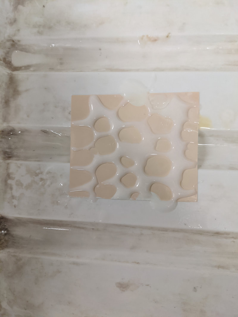
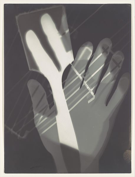
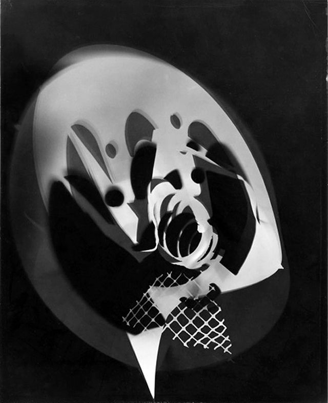
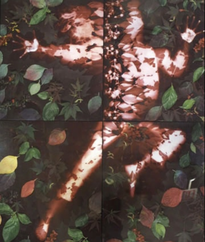
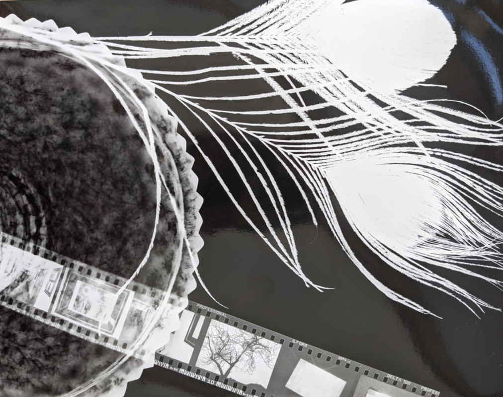
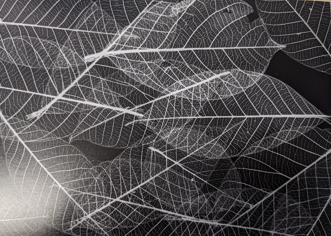
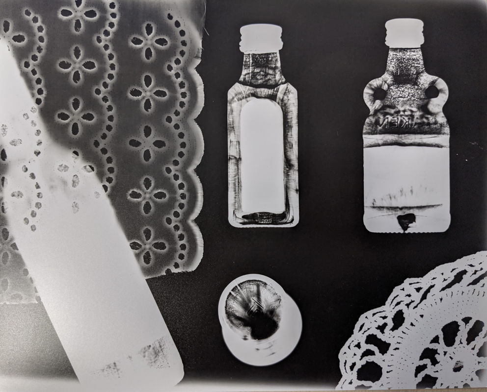
What is a Photogram?A photogram is a type photograph created by layering objects on-top of light sensitive paper and then exposing the paper for a very short period of time under artificial light. A part from when exposing the paper needs to be kept in the dark at all times as it only takes a few seconds of light for the photogram to become over-exposed. After the exposure the photogram is developed in developer, stopper and fixer chemicals for the usual time of 1:1:5 minutes. A Brief History of PhotogramsThe photogram is yet another early form of photography originating from around 1800, said to be the first photographic negative (though not the first permanent photograph as that was by Nicéphore Niépce). The photogram was invented by William fox Talbot however it is said Anna Atkins also bares some responsibility for her work photographing plants and algae using cyanotypes. Side note- apparently some people class cyanotypes as a type of photogram as you place objects onto the paper but I digress. Initially photograms were made on metal plates however they were soon replaced with photographic paper as the metal plates weren’t viable for commercial use. In the early 20th the process was picked up by modernist artists such as Christian Schad and Man Ray who gave the technique new life, creating their "Schadographs" and "Rayographs". Admittedly a Schadograph and Rayograph are very similar the only real difference I can find is that Schad made his by layering old discarded tickets and recipes he found, whereas Ray focussed more on the surrealist approach. Photographing a range of household items in varying positions and playing with how the light would bounce off them. Historical PhotographersChristian SchadChristian Schad (1894-1982) was a German painter and photographer known for his interest in Dadaism and photograms. Though born in Germany he spent much of his life in the surrounding country’s of Europe including the Netherlands and Switzerland after he was forced to flee the Nazi in 1915 because of his pacifist ideology. However despite this it is really through his travels that his interest in Dadaism and alternative art really took of, having met a few influential artists of this movement. Schad’s first photogram was made in 1918 while living in Geneva. Using his new modernism approach he was able to breath new life into the technique. Though this is not explicitly stated anywhere, it is my believe that Schad may have influenced other artists of the time to take up the photogram. László Moholy-NagyLászló Moholy-Nagy was a Hungarian artist and photographer who lived from 1895 to 1946. During his life he was a keen graphic artist and teacher with an interest in the avant-garde. He took up art following an injury he suffered while serving in the austro-hungarian army. However it was until 1925-1927 that he took an interest in photography. An interest which led him to the photogram. When it comes to his photograms he uses a lot of layering, many of them featuring hands and some kind of wire of grid. He is also said to have used other materials such as graphite, varnish and/or paint on top of his photographic images. Short video I found on the Guggenheim Museums’ website about László Moholy-Nagy Contemporary PhotographersLiz NielsenLiz Nielsen is an American artist and photographer currently living in New York City. She is one of the few photogram artists who work in colour. A result she manages to achieve via a process of different layering papers on top of each other and exposing each part of the photographic separately under different coloured lights. It is in this way some liken Nielsen more to a painter then a photographer as she uses light more as a substitute for paint, to craft an abstract array of shapes and colours. She also works in varying sizes from 100 x 100 inches to 8 x 8 inches. Analysis of WorkThis is an Analogue Chromogenic Photogram on Fujiflex (a reflective silver halide printing paper) titled either “Space Tree” or “Together” (conflicting sources) by Liz Nielsen. It was created in either 2015 or 2017. As with most of Nielsen’s work it was created using coloured lights and piece of paper to block out areas she didn’t want exposed to certain light. As for the meaning, well it’s abstract so as with most pieces of this genre the interruption is up to the viewer. If we go with the idea that this piece is called “Together” then it could be said that perhaps this amalgamation is perhaps meant to be representative of the symbol for gender- with the circle in the middle and the line coming out. Or I could just be over thinking it and perhaps the name is just a reference to how all the shapes in the image come “Together” and converge in the circle. Another interruption is that is could resemble a tool of sorts or even a vanity mirror. Of course I still have yet to look at the angle of this being a “Space tree” and if I’m honest I don’t see a tree anywhere in the image, no matter how much you try to squint. But I suppose maybe thats the point, after all we don’t know what a tree from some alien planet would even look like so I guess in a way this makes sense. Again I am very much looking for answers in a place that may not have had any to begin with. But at any rate I cannot say for certain what the artist’s intention was with this piece. That being said i did however find this statement below about the collection I believe this piece is from. “"The work is made with a lot behind it from my own world, yet the way it is read often comes from what the viewer brings to each piece,” she says. “There are surprises for me sometimes, yet at this point, so much is intentional. My hope for the work is that it opens up a space inside of the person looking at it, and that space is an invitation into a new way of seeing. At its very best, I wish for the viewer to have an ‘ah-ha’ moment, a quantum leap inside the mind.””- Liz Nelson about her Smoke Signals collection to which I believe this image is a part of, as wrote by "It's nice that" Martha MadiganMartha Madigan is an American photographer who has experimented with a wide range of photographic mediums from cyanotypes to the newest digital cameras. She started using photograms in 1972 when she picked up the technique working as an undergraduate. A lot of her work focuses on themes of life, death and “the relationship between nature and culture, and the fleeting existence of the body”- Museum of Contemporary Photography. Analysis of WorkThis is a piece by Martha Madigan titled Clara (Autumn). It is a Chromogenic development photogram print dated from 1991-1994. And is perhaps one of Madigan’s more renown pieces. To create this Madigan says she lay multiple sheets of printing paper outside and had her daughter lie on them while the papers developed in the sunlight. After successfully making a silhouette, Madigan then spread leaves over the print and exposed the image a second time. Before finally adding a third layering of leaves and taking a photo in colour using a large-format camera. To create the finishing look Madigan then combined the all the prints together and created this wonder of layering. As for what Madigan may have been trying to say with the photogram well, since her work deals with a lot of themes around life and death it could be assumed that she was going for a ghostly appearance with this figure. Perhaps one might go as far to say the figure is the embodiment of death in this image. This is of course in sharp contrast to the blooming vivid leaves scattered around the silhouette. But if you really wanted to get morbid you could say this is a burial place, where some lone soul has just laid to be covered in leaves, in the ever continuing circle of life. ‘Tis certainly a more poetic interpretation, again not entirely sure if that is what Madigan was going for but considering her other works near with similar topics, I think its a valid conclusion. Short video from my tutor on how to make photograms. It helped me to pick up any information that may have missed during the lesson. My PhotogramThis is my photogram. To create this I took a sheet of photographic paper, placed it on the enlarger and then placed objects ontop. Before finally turning on the light of the enlarger for about 3 seconds and then developing it. As you can see the objects I choose to use were two peacock feathers, a round glass bowl and a strip of film. I decided to go with a 20s theme for this image for literally no other reason then I like the 20s. The end result I am quite happy with, especially the glass bowl that has casted quite an interesting shape onto the paper below. I also rather like the film too as at the time I choose it I didn't realise you would be able to see what was on the film through the enlarger's light. And so seeing it come up on the image was quite a surprise but nonetheless not an unwelcomed one. This is my second photogram, to create this I took a selection of synthetic leafs and layered them on top of eachother on the film before exposing them under the enlarger. This is the end result. All in all I’m quite happy with it as it looks like an X-ray of a pile of leaves. However upon reflection I think it would’ve been quite nice if i had included a small focal point, say something like a small jewel or something This is my third and final photogram. It is made of a selection of bottles I found and a few pieces of lace-like materials. For this one I decided to go with a Victorian-apothecary vibe for no other reason then I could. Must say I’m quite pleased with how it turned out, especially the right side of the image with the sharp edges of the objects. Future UseIn the future I may make use of photograms in the same fashion as cyanotypes in that I could use it to create relives of items which I could then use in my digital illustration work. Health and Safety
Reference Links
https://en.wikipedia.org/wiki/Photogram
https://www.theartstory.org/artist/schad-christian/life-and-legacy/#nav
https://www.theartstory.org/artist/moholy-nagy-laszlo/life-and-legacy/#nav https://www.guggenheim.org/video/moholy-nagy-and-photographic-processes https://canvas.saatchiart.com/art/art-news/the-enduring-influence-of-moholy-nagy
https://www.lensculture.com/articles/liz-nielsen-chasing-light-through-color-a-conversation-with-liz-nielsen https://www.liznielsen.com/About https://www.liznielsen.com/Smoke-Signals https://www.itsnicethat.com/articles/liz-nielsen-photography-220218 https://blackboxprojects.art/exhibitions/6/works/artworks-37-liz-nielsen-space- tree-2015/
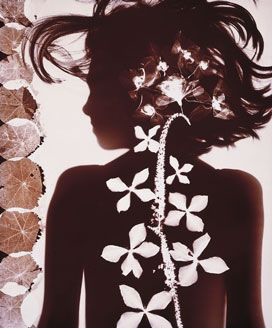
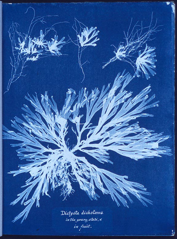
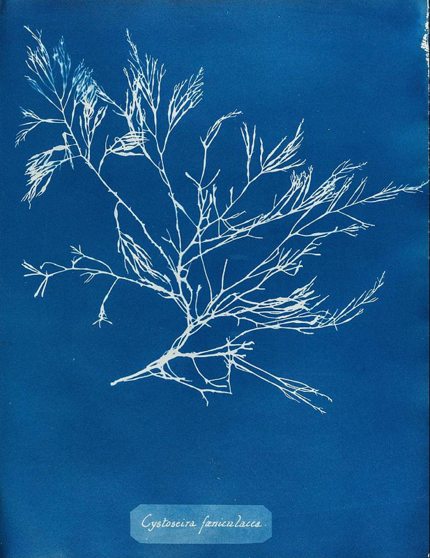
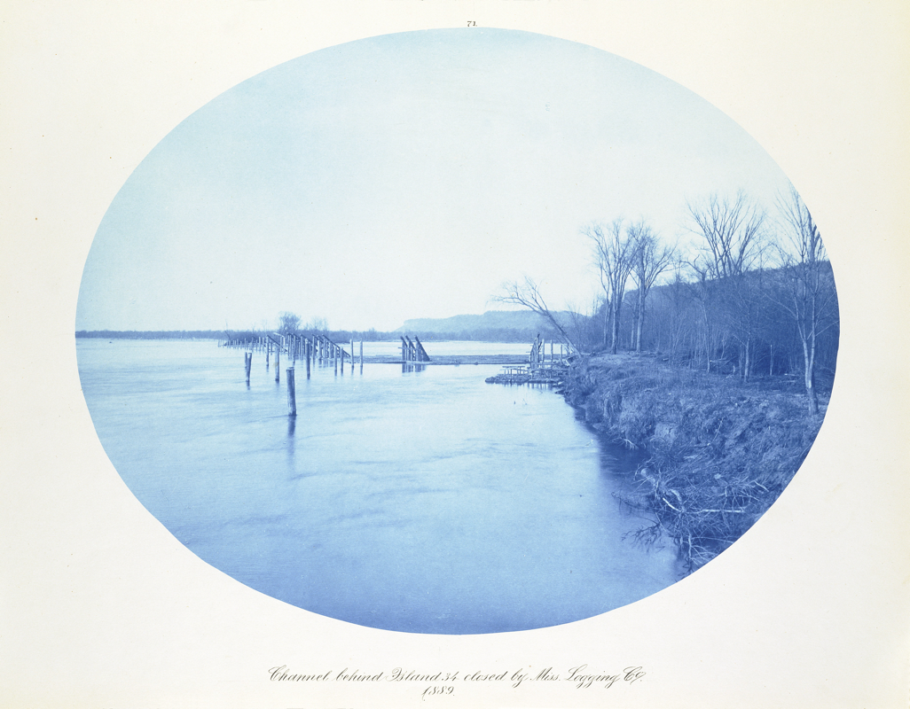
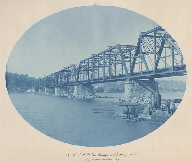
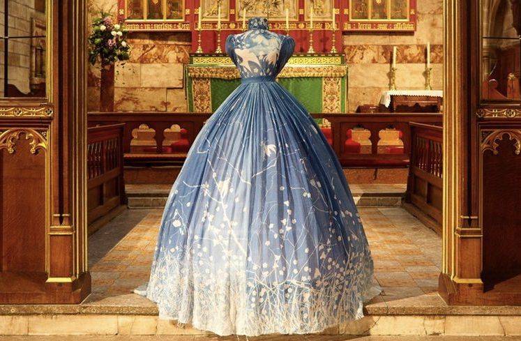
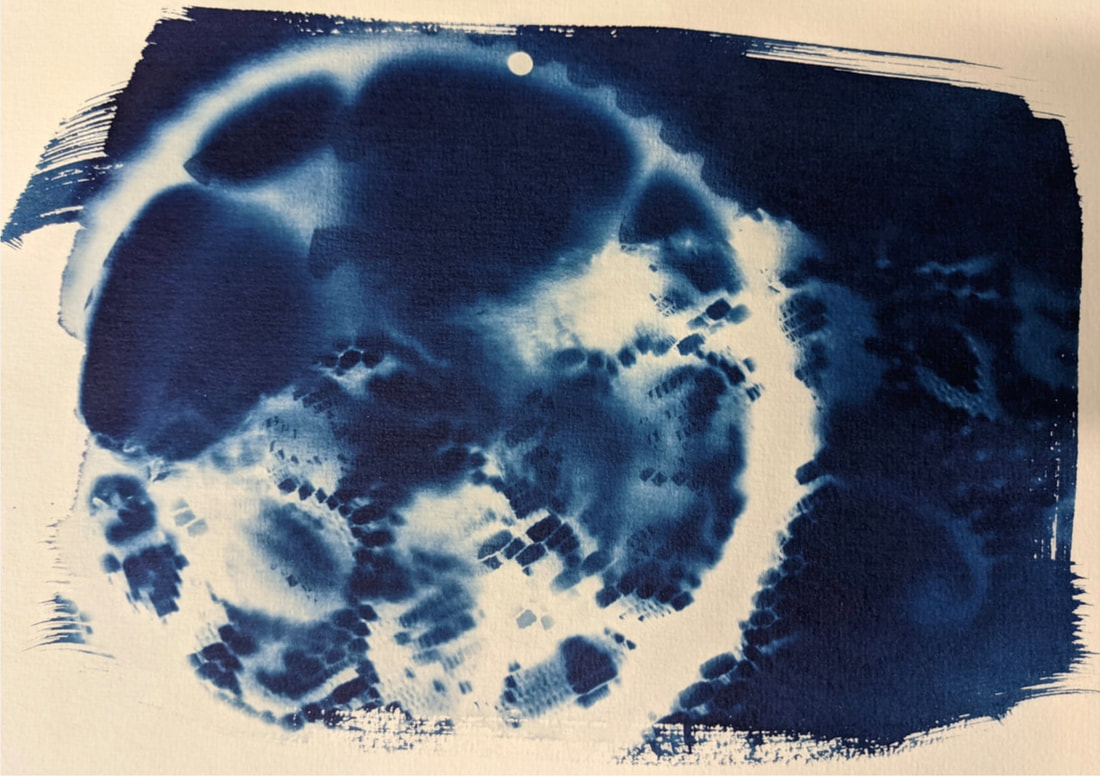
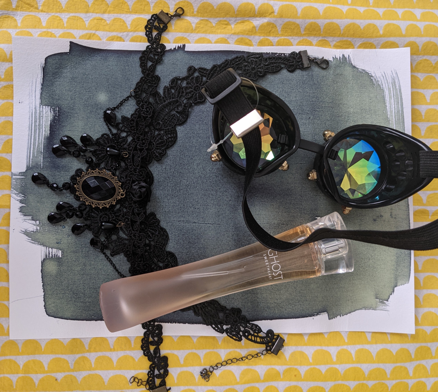
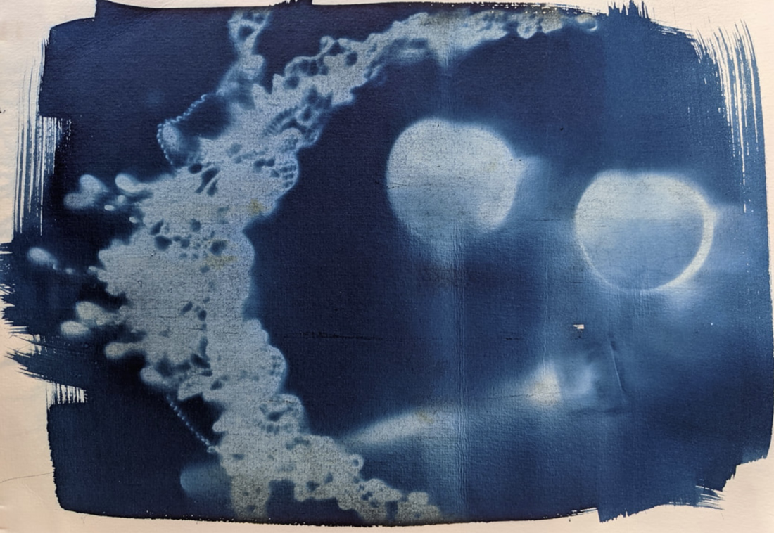
https://www.mocp.org/detail.php?t=objects&type=tag&f=1772&s=&record=0&tag=leaves What is a Cyanotype?A cyanotype is another type of early photography, consisting of a piece of paper with a mixture of potassium ferricyanide and ferric ammonium citrate painted onto it. To use it you simply place objects on the paper in a dark room and then take it outside to expose in natural light for about 20 minutes (may need more of less depending on the light level). Unlike some of the other early photographic methods to you do not need to use any of the developing chemicals to develop a cyanotype, instead you simply wash it under cold running water. This washes away the water-soluble part of the solution leaving the blue pigment in the paper. A Brief History of CyanotypeThe Cyanotype method was created in 1842 by the astronomer John Hershel. He originated the method as a way of copying his notes however despite this, the Cyanotype would go on to have many different applications including making blueprints and relief-like photographs of objects. The peak of cyanotype usage was during the Victorian era in England however as the century progressed and photographic methods advanced, it’s usage fizzled out. In modern times the cyanotype has slowly come back, being picked up by many contemporary photographers and artists. Historical PhotographersAnna AtkinsAnna Atkins (1799-1871) was a cyanotype photographer, known for her cyanotypes of flora. She is considering to be one of the first female photographers and the first to illustrate a book with photographic images. Atkins had a few major influences in her life that contributed to her interest in plants and photography. Most notable being her father John George Children (a renown chemist, mineralogist and zoologist) and Henry Fox Talbot, a friend of her father’s that taught her about his photographic inventions. Analysis of WorkThis is a cyanotype by Anna Atkins. It is called Dictyota Dichotoma (Forkweed) and is dated 1849-1850. It is perhaps one of Atkins more renown pieces and is currently on display at the New York Public Library. As you can see it is a cyanotype relief of Forkweed Atkins published in her book Photographs of British Algae: Cyanotype Impressions. This image would’ve been very useful for both the public and the scientific community for identifying such plants as this was the first detailed photograph the likes of which had not been seen before. As for why Atkins might’ve chosen to create this image well, with her scientific background I think it would be safe to assume she did it to document botanical specimens for future reference for whom ever should need it. Henry BosseAnother historical photographer who used cyanotypes would be the German-American photographer, Henry Bosse (1844-1903). Known for his landscape cyanotypes which he created using large glass plates and sheets of french cyanotype measuring around 14” x 17”. Most of his photos are of engineering project along the upper Mississippi river. Contemporary PhotographersAngela ChalmersAngela Chalmers is an English photographer and artist who uses a combination of water based media such as cyanotypes and watercolours throughout her work. Most of her work explores themes of femininity and objects traditionally associated with it such as wedding dresses and christening gowns. When asked why she says she likes to explore “narratives and a sense of history through her work” hence the why she merges old, less-commonly used methods such as cyanotypes with the more commonly used watercolours. Analysis of workThis is a piece by Angela Chalmers called “Something About Mary”. It is a dress ( or a textile sculpture as Chalmers describes it) covered in cyanotypes of flowers, plants, birds and the image of a woman which may have been representative of a Miss Mary Craven. Chalmers created this dress in 2015 for the St Martin’s church in Scarborough after she fell in love with the stories of the church’s founder Mary Craven (1814-1889) and the Pre-Raphaelite artists that were responsible for the interior design of the church. It is for this reason I believe Chalmers decided to make the design out of cyanotypes as that sharp blue and white contrast is very reminiscent Victorian art, particularly the arts and crafts movement. As the long branches and flower pattern on the dress itself look at bit like something you might expect from a William Morris wallpaper of that time. Though with that being said the choice to include flowers could’ve been more of a conscious one as there is a story Mary Craven was once caught stealing flowers from the church grounds. I’m not entirely sure how significant (or reliable) that story is in the grander scope of things but nonetheless it is an interesting anecdote for Chalmers to reference in her piece. Some of the photos Chalmers has taken of the dress have an almost ghostly presents about them, having been taken from the back and framed it such a way that it looks like someone is actually wearing the dress. Perhaps Chalmers meant for it to seem like the ghost of Mary Craven inhabits the dress. Photographing it in such a way it looks like someone is praying at the church’s alter, something which I imagine Craven did a lot being the primary investor of said church. Barbara HazenBarbara Hazen is an Californian photographer who works primarily in cyanotypes and platinum palladium (a type of printing) processes. Her work explores themes of memory and family in an almost scrapbook like fashion. Many of her photos have been featured in publications such as B&W Magazine and Critical Mass. Hazen has also had a number of solo and group exhibitions. Video of my tutor explaining cyanotypes. This helped me to refresh my mind and remember anything I had forgotten from the initial lesson. My CyanotypesThis is the cyanotype I made. It is a layed piece made placing a bike cassette ontop of some lace and then exposing it for about half an hour. I choose these items as I thought they seemed quite steampunk together and I love me a bit of modern vintage. Im quite pleased with the end result, though I must admit I'd had preferred it if the lace and gear came up a bit sharper. I suppose that's probably a byproduct of placing the gear on the lace which could've easily blown in the wind and disrupted the exposure. However with that being said I do like my little cyanotype, especially the bit of lace under the gear as it's come up rather well. This is probably down to the fact that the gear itself was holding that part of the lace in place throughout the exposure. After making my first cyanotype I decided to make a second, this time using items I had at home. For this one I decided use: two necklaces with a lace texture I layered on top of each other, a perfume bottle which I hoped would give an interesting impression with how the light would behave with the liquid and glass. And finally a pair of steampunk-esque goggles I have. I then exposed the entire thing for probably about 5 hours of actual sun light; I didn’t really intent to leave it that long. Initially I was only going to leave it for about an hour or two since it was such a cloudy day, but I just kind of forgot. In the end, it probably is a tad over exposed but all in all I think it turned out alright. I’m particularly happy with the sharp edges of the necklaces and the ghostly imprint of the perfume bottle. Admittedly I would’ve liked there to be more detail on the goggles since the lenses themselves are such a weird shape. But I suppose that is the problem with cyanotypes, in that they capture the shape but not necessarily the texture of an object. Something I did consider but figured would be alright since light can pass through the lenses of the goggles. But regardless I still kind of like it. One thing I did notice after the fact was that my second cyanotype is in fact a light blue in the areas where it should in fact be white. This is probably a result of not washing all of the chemical out which in turn causes the paper to change to a light blue as there was still pigment in the "white" areas. Next time I should probably wash the cyanotype for longer to ensure all the chemical has dissolved. Future UseI might use cyanotypes in the future as I quite enjoyed the process and I also rather liked the end result with blue and white. Though it seems unlikely I will use this technique in the future I could (if I so choose), use it as a means of collecting 2D relives which I could then incorporate into my illustration work either digitally or analogue-ly. Health and Safety
The two chemicals used in the cyanotype process are ferric ammonium citrate and potassium ferricyanide. Though neither pose a risk, some people have been reported to have allergic reactions. T'is for this reason it is advised to wear gloves when handling the chemicals just in case. It is also a good idea to wear a mask if you use the powder solutions to make up your cyanotypes. Though very unlikely it is possible to create hydrogen cyanide gas when potassium ferricyanide is heated to above 149˚C or combined with an acid. As this is a poisonous gas it is heavily advised not to heat or add an acid to potassium ferricyanide. Reference Links
https://en.wikipedia.org/wiki/Cyanotype
https://arthistoryproject.com/artists/anna-atkins/dictyota-dichotoma-forkweed/
https://americanart.si.edu/artist/henry-bosse-6667 https://en.wikipedia.org/wiki/Henry_Peter_Bosse
https://www.axisweb.org/p/angelachalmers/ https://www.friendsofstmartins.co.uk/artist-in-residence/
https://barbarahazen.com
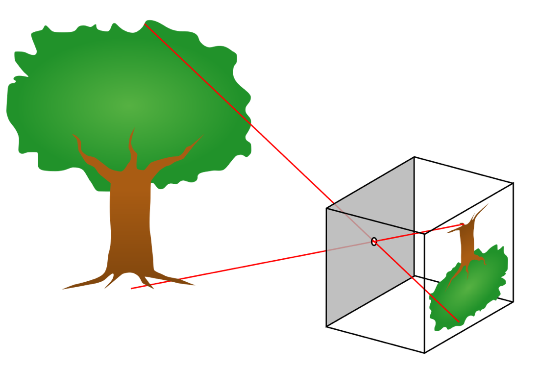
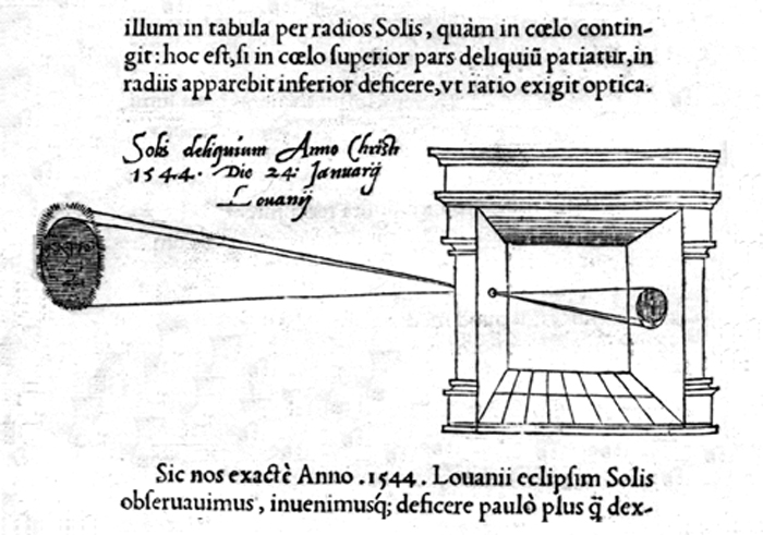
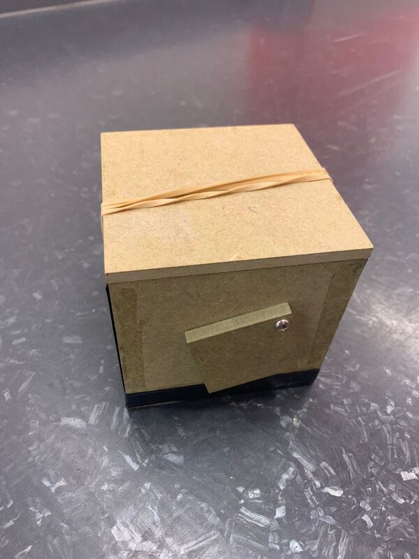
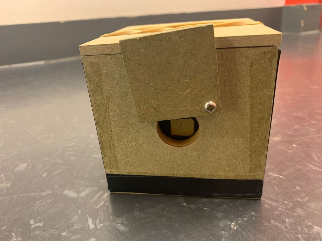
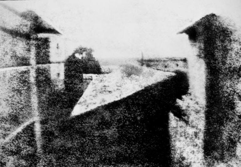
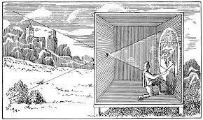
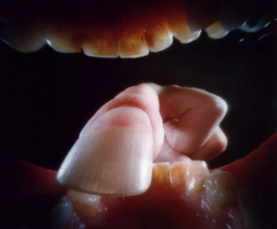
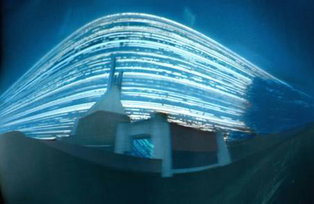
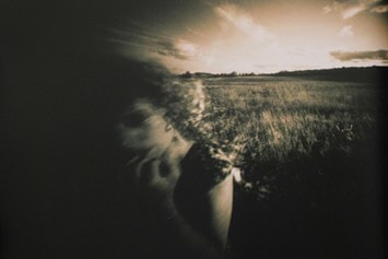
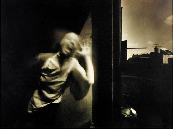
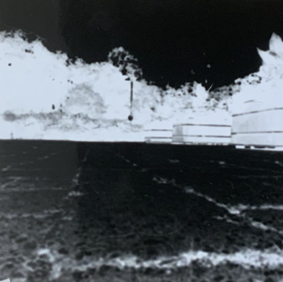
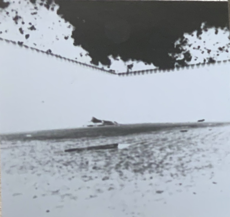
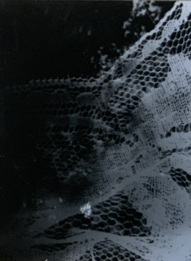
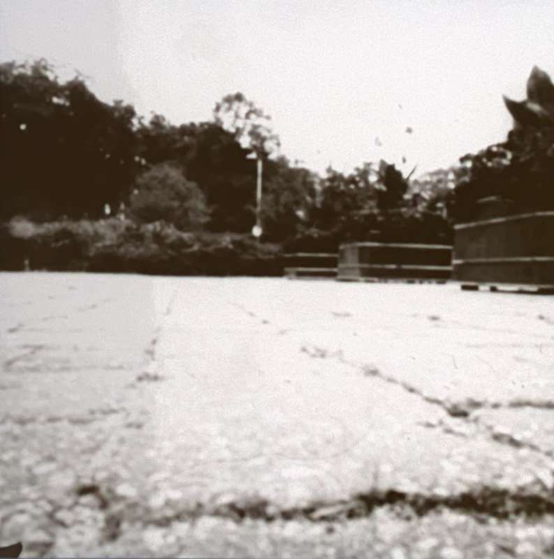
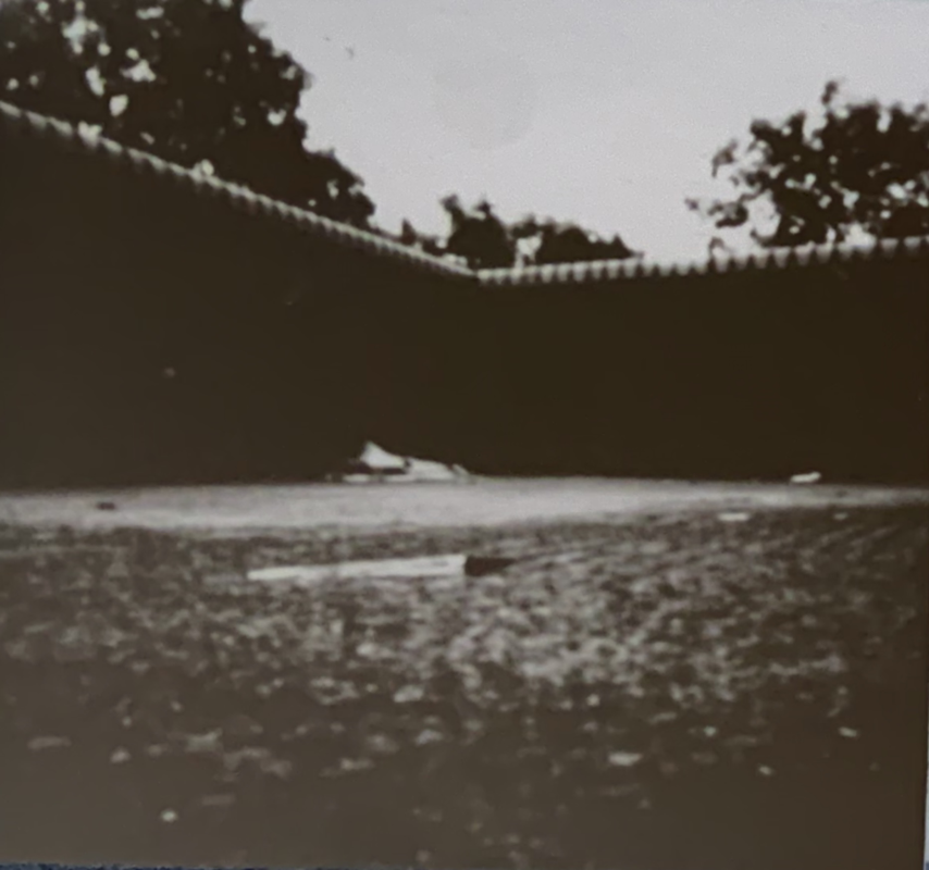
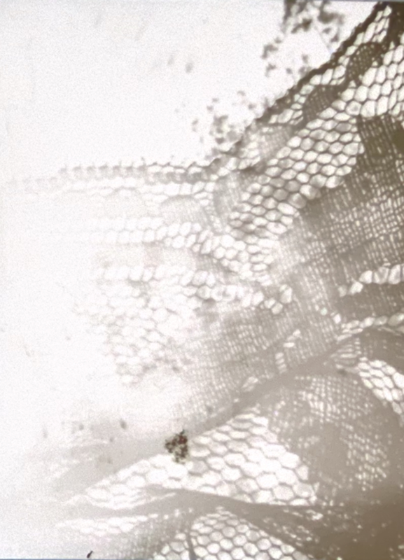
What is Pinhole Photography?Pinhole photography (also known as the "camera obsura") is a type of photography that involves creating a light-tight room or box and then punching a small pin sized hole into one of the sides. The light from outside the box is then projected onto the opposite side of the hole. The image can then be recorded using light sensitive paper or film. A Brief History of PinholeThe first recorded pinhole photo was taken in 1827 by Nicéphore Niépce. However despite this there is evidence that pinhole photography has been around for a very long time, though be it in more rudimentary forms. The earliest description of what we now call “pinhole photography” can be traced back as far as 500BC, where such descriptions have been found in Chinese Mozi writings. Of course pinhole photography wasnt just limited to the Chinese. Over the last 2000 or so years it has spread across the world in various adaptations where it has picked up a few different uses, one of which being its use as a drawing aid for 17th century artists. Historical PhotographersA few notable historical photographers who used this technique include such people as; The 10th century Arab physicist Ibn al-Haytham who described using the Camera Obscura effect to study light and the stars. The Renaissance Artists Leonardo da Vinci, Leon Battista Alberti and Flippo Brunelleschi whom all helped to advance the understanding of the Camera Obscura and the basis of the one-point perspective. Nicéphore Niépce the 19th century French inventor who is believed to have taken the longest surviving photo using the pinhole technique. Contemporary PhotographersDespite its age pinhole photography is still used today by a number of modern photographers, all achieving a wide range of different effects. A few of the more renown photographers who use this technique include; Justin QuinnellJustin Quinnell an english photographer born and raised in Kent and one of the more notorious pinhole photographers of recent. Mainly in part down to his habit of taking photos from inside his mouth, creating some very unique perspectives. Not to say that’s the only pinholes he’s made but they are certainly some of the more striking. Analysis of workThis is a pinhole photograph by Justin Quinnell. Done by placing one of his “smileycams” in his mouth. A “smileycam” is what Quinnell calls his tiny small pinhole cameras he uses to take exposures from inside his mouth. Fun fact he also sells them on his website. In this particular photo he has his finger in his mouth creating an interesting composition in that his finger is the main centre point of the photo that slowly brings you out to his teeth which frame the photo. It’s interesting that Quinnell choose to have a completely black background for this photo, perhaps it was intentional to contrast the light pinks and whites of his hand and finger. Or perhaps it was just so not to over-complicate the image. At any rate the end result is nonetheless striking. As for the colour pallet of the image, its a lot of dark colours with a splash of warmth. For this it could be extrapolated that Quinnell perhaps boosted the saturation of the image though that could just be how the photo looked originally Barbara EssBarbara Ess, an American pinhole photographer known for her dramatic large scale photos. She often left the intention of her photos vague as to encourage people to come to their own interruptions about her work. Ess first got interested in pinhole photography when she stumbled upon a diagram of a Camera Obscura and decided to build her own. She said she was particularly drawn to the technique as “my mind works better when my means are narrowed” referring to the limited capabilities of the pinhole compared to say the modern cameras. Analysis of workThis is a pinhole photograph taken by Barbara Ess. It is from 2000 however I do not believe it has a name, with that being said it was however used as the cover of Ess’s photography book “I am not this body” published in 2005. The subject of this photo is of course Ess herself moving through a field. The composition of this image is quite interesting as you have the blurred image of Ess in the foreground and then the seemingly never ending expanse of field behind, pared with the long glow of the horizon at the very back. All encompassed in this monochrome hue giving the image an almost morbid feeling- as if there was an impending doom about to befall the subject, metaphorically speaking. Considering as Ess has always said she aims to photograph that which cannot be photographed, I’d say this interruption is quite a valid one. Whether or not that was the actual intent behind the image I can not say but nonetheless it is certainly interesting how many interruptions could be conjured up by this image. Now as for the method, from the looks of it it’s just a simple exposure taken by Ess as she was walking through a field- I’m extrapolating as I can’t find anything that explicitly states how she created this image. Tutor’s VideoVideo helped me to understand and visualise how pinhole cameras actually work as I had a hard time understanding how a tiny hole in dark box could even make a photograph to begin with. Also helped to refresh my memory when it came to typing up this blog. My PinholesThis is my collection of pinholes photographs I made. The first pinhole is a photo of the flower bed outside of the college’s main entrance. The second a small wall around the back of college. The third is a tad more complicated in that in was taken under a tree in a flower bed looking up to the sky, it also has a piece of lace that has been placed inside the actual pinhole box but I shall explain more momentarily. To create these pinholes we first selected a pinhole box each (a wooden light-tight box lined with black card with a tiny pin sized hole in the front to allow the smallest amount of light through that is needed for the exposure). Using the dark room we then took a small pic of photographic paper and placed it in the box. Sealed it back up and then took it outside to do the exposure. The day we did the first 2 pinholes it was rather overcast so we did each exposure for roughly 30 seconds. After we resealed the box that we then took it back into the dark room , took the photo out and developed it. I gave my photos each about 1 minute in the developer , 1 in the stopper and 5 in the fix before finally washing the chemicals off for about another 5 minutes. This is the end result. Though I can't say my photos have any hidden meaning or some kind of special merit to them, I do believe these first 2 were good practice for myself in learning what and how pinhole works. As for the third one, I created that one a couple days later, after wondering what and how putting objects in the actual pinhole camera would effect the end result. I decided to use some lace I found, firstly because lace has a lot of gaps and so would let more light in then say other materials, and secondly because I just like lace. As I previously mentioned when taking the photo I decided to place it under a tree in a flower bed. Why? Well I wanted the texture of the lace to come up quite sharp on the image and so figured a more intense exposure might work and because I didn’t want to over complicate the photo by having too much in the background (like a massive building for example). And so the light spotting of leaves seemed like a good alternative. I did also hope to get some of the flowers from the flower bed in the frame for a little extra layering, but it would seem the pinhole camera itself was too big to place between the flowers in such a way that you would be able to see them in the photo. Upon developing I do think this photo may have been a tad over-exposed. Probably because I angled it directly at the sun and didn’t take that fact into account when deciding how long the exposure should be. I exposed it for 30 seconds, the same as the other two photos I had taken previously. Future Use of PinholeIn the future I may make use of the pinhole technique as it goes quite well with my interest in the Victorian aesthetic and the more occult side of things (things like ghost photography for example). I could also use it to create reference images for my drawings if I fancied doing something ghostly and grainy. Health and Safety
Reference Links
https://www.alternativephotography.com/pinhole-history/ https://en.wikipedia.org/wiki/Pinhole_camera
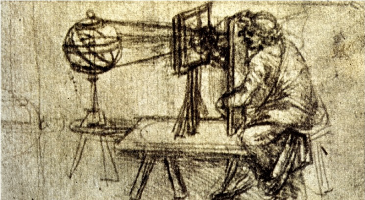
https://www.researchgate.net/figure/The-camera-obscura-sketched-by-Leonardo-da-Vinci-in-Codex-Atlanticus-1515-preserved-in_fig1_291379167
https://www.lomography.com/magazine/64615-a-conversation-with-the-pinhole-wizard-justin-quinnell
https://www.lensculture.com/books/4103-i-am-not-this-body-the-pinhole-photographs-of-barbara-ess https://www.dazeddigital.com/art-photography/gallery/29603/0/barbara-ess |
|||||||||||||||||||||||||||||||||||


 RSS Feed
